This is my new and improved front page. I think that it is still not perfect but us a vast improvement to my music magazine cover. I would firstly like to talk about the changes I made.
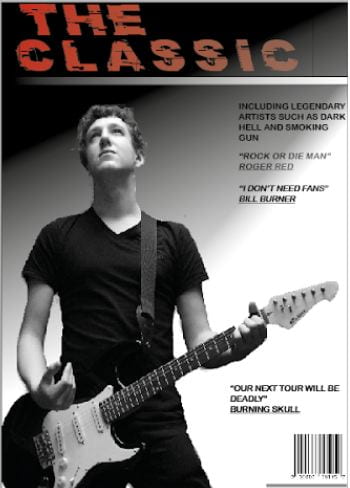
- I changed the font for the main title. This was because the old font wasn’t working and I needed a fresh masthead. I also changed the colour and it is the only part of the page in colour which makes it stand out even more.
- The next change was the image. I used an image from the location shoot because I believe I took some that would be perfect for a solo shot on a front page, I also think this particular image works well for the style and genre.
- Next was the layout of the page. Although it isn’t drastically different to my original page I think the new layout and simplicity looks much better and overall much more professional.
- Finally the main bulk of text has not changed much but I did make sure it was clear and simple which it is and I also think it does look fairly professional.
All together I think that this draft was much better than my first draft but I still think improvements can be made and I hopefully can create a much better third draft.