Category Archives: Component 1

So… How can an image communicate meaning

Firstly I think that the camera is the most important feature.  I think creating a sharp image with the right light levels mix with the right shot and angle is really important,  Shutter speed controls how much light will get into the image so it important to keep a close eye on that.

How does an image communicate meaning? Well its a mixture of lots of things, mainly focusing on camera angles,shots  and techniques while also focusing on clamps ( Costume, lighting, acting, make up/ hair, props and setting). You could also use the blumler and katz theory.  By focusing on mise-en-scene you can also create and carve a good story from one image. Using all the things I have spoken about, you can make the audience feel the image and really understand it on a more advanced level.  If you do all of this well you can not only make the audience understand the image but also make the audience feel emotion such as anger or happiness.


Communicating My Brand


Click the picture to take you to the pinterest page.

After creating my rock fans ‘dating profile’ I did research to create my mood board. My pinterest board includes alum cover, posters, colours, designs, photos etc. I will refer to this mood board when I create my music magazine and it will hopefully allow me to have a clear theme and keep me from running out of ideas. I picked out key images that would display the rock genre well and like I said keep me from running out of ideas.

After finishing my mood board I have picked out some things I really want to include in my music magazine. Firstly I want lots of skull designs and also lots of darker colours. I also like the idea of the masthead possible looking like its been carved into wood, to me that fits ‘the classic’ title and will work well on my cover. I also added a few guitar images to the mood board and I wanted these because I was thinking if someone is in to rock music they also will be in the instruments that create that music so on my cover I might dedicate a small section to the instruments such as guitars and drums.

My Audience Profile

To understand my audience I needed to search on you gov website. I searched for 2 main bands with 2 types of rock genres. One was green day which are a punk rock band one was acdc. The age of the audience was generation x for the more hard rock and millennial’s for the punk rock. With this information I decided to focus on punk rock.  So the audience was likely between the ages 20 and 40 years old and also more likely to be male. I based the research for the ‘dating profile’ on this age group.


For the dating profile I used the green day audience and researched a  lot of things that are associated with a millennia. I searched everything from what job and car he had to what pet he had. Everything on the profile is supposed to be related to a millennial. But I also included some rock interests as the information used was from the audience of these bands.


Branding Ideas + Mission Statement

The genre of magazine I will be making is a rock magazine.  I want to go with a few genres of rock music but I will focus on punk music and  also classic rock.  The reason I wanted to go with the rock genre  is because I like the classic rock music of the 60s all the way to the 2000s. There are also many bands I could add to the magazine giving me lots of options when it comes to the design of the magazine. I will name my music magazine ‘The Classic’ and the main cover image will likely be a classic rock band. The reason for the name ‘The classic’ is for a number of reasons, one being that the name explains what will be inside the magazine which is classic types of rock music, but it also in my opinion adds slight brand recognition to the name and also creates a feeling of premium quality about the product.

The mission statement I created for my magazine.

We aim to provide a magazine for all rock music lovers. We want to give fans interesting stories and information about their favourite bands and artists. We will feature any type of rock from country rock to classic rock.


So… I’m ready to make some media!

My magazine  genre is rock music. I want it to include a few genes of rock but I will probably have a rock/ metal band for my front cover.

Acting/ Facial expressions 

The first thing I want to focus on is the way the model/s look on the cover. Is there body language and facial expressions attracting customers. I will also want to focus on where the model/s are looking on the cover are their eyes  looking at the text on the page or looking directly towards someone reading it.

Costume/props/makeup and hair

Secondly I want to focus on what the model/s are wearing. I want the genre to be clear from what the model/s are wearing  and I would also like it to portray a message. Props will go with costume and I will have to find props that fit the genre and show the same message as the costume. Make up and hair also fits in with this as it is very important for the overall look of the model/s , again I want the makeup and hair to portray a message of rock music, this could be punk, metal or more classic rock.

Lighting and location

Next I will focus on lighting and location. I want the model/s to be clear so I will have to use a well lit location. The location will probably a plain background so I can take away the background just leaving the model/s , this will allow me to create any rock themed background I want using photoshop and indesign.

Use of camera

Finally I will think about how I will take the photographs. For example will I add a slight angle to the photo or use a close up or long long shot for the cover image. Another thing I want to focus on is layout, my idea is to have the main cover image directly in the middle of the image  with the masthead above the main image  with  other bits of text to the side and below.


My Tour Poster

To make the tour poster I first had to get some ideas on what to add to the poster. I got a collection of ‘punk’ themed tour posters and CD covers. I saw a recurring theme of black, cartoons, skulls and violence.

Below is my finished tour poster. I didn’t want it packed with text so I made it fairly simple, but my main theme is dark and depressing and that is shown through the black and white colour choice and the image of the model looking moody directly at the camera. I also added cartoon skull around the page to add to the theme.  I added reviews and how to buy tickets in smaller writing to make sure other bits of information were seen such as the name of the band, the location and date and also the “final tour” to make bring in the audience. I wanted to add this so there would be demand for it as it would be the last show.


Click the image for the pdf.


My Magazine Front Page Swede


The image on the left is my own copy of the magazine that I created and the image on the right is the real thing.

Our task was to recreate a magazine of our choice and make it look as much like the real thing as possible. I decided to copy a NME magazine with the artist Joe Strummer on the cover. I wanted to create an almost identical magazine and I think I got close to that goal.

My strengths 

I think I did well in the overall layout because I got everything in the right place accurately. I also think that the small details on the magazine like the certain lines under words and in the yellow plug were done well.  Finally I think the colours overall were quite good  especially the yellow plug.

Weaknesses

I think that my mast head/ title could have been improved on as the font wasn’t quite right ,  I also think the fonts in general were not perfect and the main cover image wasn’t as similar to the original as I wanted. But I think I struggled most on the fonts.

We all used indesign as a way of recreating our magazines. The skills I have used in creating this are researching, indesign usage and basic photoshop usage. To learn these skills I got teacher feedback and I watched youtube tutorials.  When I was creating the magazine on Indesign the first skill I learned was how to put an image into it. I needed to add the main back image, so I had to look around on google to find the background image from the magazine without all the writing/editing on top. I learned to create a rectangle and drag the image into it and I molded it to fit the page by dragging it and sometimes using shift to create an even image. I then needed to add text to the magazine. I used the box tool from before but instead of dragging an image inside I just used the text tool. I then had to play around with the various fonts to try and match the writing of the actual magazine. I placed different bits of text around the page and tried to make it copy the original as much as I could.

Here are two of the videos I used to learn skills below.

The Camera Talks

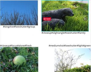
After the photo shoot I took my 9 favourite images that I think worked well and told a story. I used hashtags to describe camera techniques and show meaning in the image.

An example of finding meaning in these images probably works best with the mushroom picture. I think it show loneliness and isolation and I think the image shows this through the positioning of the main object and how the camera focused on the main object and blurred the surroundings.  The image is also shot from a higher angle further showing the object to be alone and below everything else.

The skill of picking out meaning and stories from an image will help in creating our magazines as it means we can pick the best images to fit our genres and our narratives.

Technical Camera Terms

When using camera there is a number of things you need to keep in mind mainly being:

Shutter speed, ISO and aperture.

Firstly shutter speed. This is how quickly the shutter moves over the lens.  The higher the shutter speed the clearer the image.  But in different levels of light a faster shutter speed and a lower shutter speed can give the image light. For example a if you take a photo in a dark room you need to let more light into the camera and so a slower shutter speed is needed. If you are in a bright room a faster shutter speed is need to let less light in.

when it comes to ISO we usually leave that on automatic and let the camera do the work to get the best image.

Lastly there is aperture.  Put simply its how open the front of the camera is and depending ion how open it is you will get more or less light. More open means more light and less open is less light.

The next big thing you need to remember when using a camera is camera angle. You can have various camera angles but the most common are high and low angle and a wide angle.

The last thing to remember is camera frame. There are lots of frames you can use. For example  Mid shot, medium shot. long shot, extreme long shot, close up and extreme close up.

Different angles and frames can really change how a scene is portrayed. For example  a close up shot on a character can give that character importance and the audience might focus on that character without being aware of it.  Another way focus is placed on a character is through camera focus, what I mean is if one character is perfectly clear and in focus the audiences attention would be on that character and not another character that is not in camera focus.

Here are my images that I have taken. They are mostly nature shots and they range from close up shots to long shots. I used various shutter speeds  to get different amounts of light into the image.  I also used different angles  to create some sort of story from the image.

One image that I think that worked well is this image. The reasons for this are that it is a clear image that has the main part of the image is perfectly in focus and a story can also  be picked from the image. Images. For me a story of the solitary plant in the centre is shown through the image.

A Front Cover Analysed

I chose this magazine cover to analyse because I liked the dark background and the bright design of the free CD. The language “conquered” used on the cover fives the impression of this tour being a victory and victorious.  Also the words “rocks out” shows that this rock band is very good. Also the band being described as “intense” will also be good as rock fans are likely to want a hardcore and intense performance.

Demographics and psycographics are used  to put audiences into groups.

Demographics include:

  • Gender
  • Age
  • Financial situation
  • Ethnicity

Psycographics include:

  • Hobbies
  • Interests
  • Attitudes

I don’t really know The Black Keys but the magazine  drew me in and I like how the main image covered some of the masthead, this is done because the brand of magazine is so recognisable that you can guess that its uncut, even if you don’t know the magazine they leave jsut enough that you can easily fill in the gaps. My favourite  part of the magazine is how the magazine can be eye catching and attract the audience yet not be that colourful, therefore they designers used techniques to attract attention rather then flashy colours.