Category Archives: Preliminary Print Tasks

My Tour Poster

Above is a mood-board I created which includes many different Country and Western tour posters. It is really important to research past examples of tour posters so that you know what to incorporate into your tour poster and it gives you an idea of what kind of stuff you may want to include in yours too.

After reviewing the posters it is quite clear that there a specific font used in many Country and Western posters. People also like to use lots of brown colours and landscapes. I believe that this is to show that Country and Western is quite a mysterious genre and they are trying to show a bit of the places that they are from and what inspires their music. I have also noticed that lots of the tour posters made for female Country stars uses quite bright colours and lots of pink. I think that this is used to show the classic All American girl that is so often idolised in Country and Western music. These are things that I will definitely consider when making my Tour Poster.

My Finished Tour Poster

Click on Image to see pdf

This was the tour poster that I created for the Country and Western genre. I tried to use typical conventions such as a big bold title, Country and Western fonts, tour dates, where you can access tickets and I used a brown background. However I think I could have used more conventions for example I think I could have used a tag line under my title, more text, a link to the website and possibly more colour. My poster stands out because the headline is bold and the models outfit is pretty and bold however I think it is quite simple and could get lost amongst other posters. All in all, I’m happy with how it turned out because you can definitely see that it is in the theme of Country and Western but it could definitely be tidier and it could have more typical tour poster conventions.

My Peer Feedback


My Magazine Front Page Swede

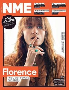
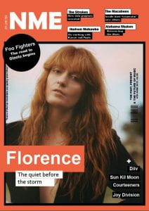
I can use in design to recreate a music magazine cover. For example I was given a music magazine cover that I was instructed to recreate to look as similar to the first one as possible. To the side is the actual magazine cover and on the left is my recreation. I have learnt how to use many parts of in design. For example I have learnt how to crop and resize images. I have also learnt how to work with text and fonts and I have learnt how to make shapes and change the colours of the shapes and backgrounds.

I am proud of the overall result of my magazine. I think that it looks extremely similar and the colours I have used are almost identical. The only thing I would change is the picture I chose. I don’t think it was a bad picture I just wish that it had been more similar or the same. This task has helped me massively in understanding in design. This is great because I am much more confident about it now and I will find it much easier to find my way around it when making my magazine. Below I have linked a few videos that I think are really helpful in teaching you how to use in design.


The Camera Talks

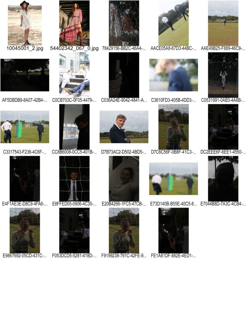
I can tell a story with a camera. In this task we were put into groups of three and we were assigned the job of taking at least fifty photos using different angles, distance and framing to tell a story. We used a variety of shots including, closeup, mid shot, wide shot, two shot, low angle and high angle. We used a DSLR camera for this task which definitely improved the quality of our photos compared to an i phone or something similar.

In one photo our model is looking through a window into the distance. This connotes a feeling of mystery and it shows that he is deep in thought. This was done through the use of dark lighting and the closeup shot. The low angle shot we took shows the girl looking upwards with a small smile on her face. This illustrates the idea of a possible love story in which she is dreaming about something. This creates a feeling of happiness and enjoyment.

Through doing this exercise we learnt the importance of camera angle and distance. We now know that considering both of these is very crucial when trying to tell a story. When making my music magazine I will review what kind of angles and distances I use so that I can create the best possible photo for my magazine. Through doing this task it has also shown me further how mise en scene is used to create meaning.

My Image That Uses Mise En Scene To Communicate Meaning

I can use mise en scene to communicate meaning. Below is a mood board I created in preparation for a country western themed photo shoot that we made for a tour poster. I did this so that I could grasp an idea of what colours and ideas fitted with my vision so that I could make a better piece of work. It is important to consider fonts, hair and makeup, costumes, body language, facial expression and find inspiration from other shoots or media made in the past because it allows you to develop an idea of what your target audience is interested in and what sells so that you can make the best possible kind of media for the current market. I added a picture of what looks like quite a country landscape. This will help going forward because I now know that research is extremely important when making a piece of media and I now know to do this when creating my music magazine.

Made with Padlet

We then collected items and accessories to dress our model in that we thought communicated a country and western theme. After dressing our model we asked our peers to analyse our outfits and stick post it notes onto our model with one word that they felt described our models intended aesthetic. We did this so that we could reflect as producers on how we used all the conventions from our chosen genre to encode our models with the appropriate mise en scene and if the audience was able to decode it correctly. In my opinion when creating our country and western star, we did use the correct mise en scene because I feel that it was clear who our model was. For instance, she was wearing a “cowboy” hat (pictured below).This definitely creates a feeling of country because these hats are worn by country and western singers everywhere. In fact when you think of country music that style of hat is something that lots of people immediately think of. Our audience also read our image correctly as well. An example of this would be the post it notes saying “hippy” and “quirky”. We were definitely trying  to go for quite a quirky country and western hippy vibe so it was great to see that we were able to communicate that through our costume.  It has helped us a lot to get feedback from our peers because we now know going forward to see what their opinions on our costumes are so that we can create the best outfit possible in our future projects.

This is my final chosen photo. I think it definitely relates back to my mood board and the Country and Western genre because my costume is very relaxed and has many generic Country themes. These include the guitar, the Country style hat, the sunglasses and the flowing dress which is similar to the images in my mood board. I think my chosen image works better then the rest of the images we took because I am looking out into the distance as if I am singing a song which really captures the essence of country. The use of mise en scene is really important when taking photos because it allows us to communicate feeling and emotion through things like, costume, hair, makeup and props. If I was taking the same photos in a completely different outfit it would create a whole new meaning which shows just how crucial mise en scene is. This has helped me massively because it will help with with planning for shoots and doing good research for projects. I think that I am much more prepared for photo shoots and how to consider mise en scene when creating my music magazine in the future.

Print Media That Communicates Meaning

The tour poster below tells a story. I have analysed it to show you. I did this so that I could deconstruct why certain certain choices are made when making media. I found that all the denotations have connotations. The reason for this is so that the media attracts the intended audience so that they can maximize sales. For instance the clouds in the background feel quite ethereal. This connotes the idea that the tour will be quite dreamy and almost outer worldly.

It is very important to learn why every image in media should have meaning behind it because it will help us to think about what our choices when we create media signify and what they communicate to our intended audience. I now know that when I create my music magazine I will have to consider the colours, fonts and pictures I use.