Category Archives: Uncategorised

Digipak Draft 3

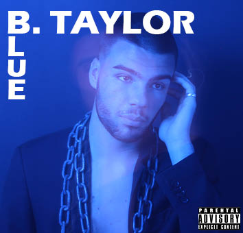
Below is my draft 3 of my digipak. I also decided to take pictures of it in a CD case. I did this so that I could see that I could see what my digipak looked liked as a real album and if it is conventional to other albums of my genre. Using feedback that my teacher gave me from her screencastify I made many changes which make my digipak look much more professional and conventional. For example I changed the fonts I was using throughout my digipak, I made the disco ball look much brighter using photoshop and I tidied up a few mistakes that I had made along the way. Overall I am really happy with how my digipak has turned out but for my final draft I will need to make a few more touch ups, for example I need to work on the lettering further.


Feedback From Peers – What Genre Does It Represent?

To help myself to understand if my digipak aligns with my chosen genre (hip hop) , I wanted to see of my peers around me could decode, the branding, star image and metanarrative and choose my chosen genre. I gave them a piece of paper which had seven different genres on it and asked them to tick which genre they thought suited my digipak.

    • Pop –  /
    • Hip Hop – /////////
    • Indie Rock –
    • Alt Rock –
    • Rock –
    • EDM –
    • Folk –

Receiving feedback from my peers has helped massively because it was clear that most people identified the correct genre. This was extremely helpful because I now know that I am going in the correct genre and with a few more edits I will be done.

Timeline And Marketing Ideas

In order to prepare for my artist’s actual social media page, I decided to make a timeline using padlet which showed an idea of what posts I wanted to make in the order of when I want to post them.  When creating my timeline I considered AIDA, adding a guerilla marketing campaign, uses and gratifications and the paradox of a star so that audiences can feel like they can relate to him but still feel in awe of him at the same time.

Made with Padlet


Marketing Ideas

I thought it would be important to consider guerilla marketing techniques that other artists have used and possibly implement these ideas into my social media page. I used sandbox which has compiled multiple artists different marketing campaigns. One that particularly stood out to me was the top campaign created by M Huncho and his team. In his marketing campaign he did a chicken shop date interview which are often viewed millions of times across multiple different platforms. This would be a great advertising strategy for my artist as well because most interviewees are hip-hop musicians like my artist and the audiences viewing the chicken shop dates are of my target audience.

Shoot Two Reflection (narrative)

For our second shoot which was narrative based my group aimed to focus on gaining shots that looked and felt quite euphoric and airy. Therefore we decided to shoot in a large field where the grass was overgrown. For costumes we also used decided to incorporate very light and floral patterns. For example one of our models wore a white, flowing dress with small blue flower across the fabric.

Photos from the shoot – 

What Went Well – 

  • The location was great for the feelings they we were trying to portray
  • The light and airy costumes also help to connote feelings oh happiness and euphoria
  • We were able to gather shots from a variety of different distances

Targets For Improvement – 

  • We could have gathered more shots so that we have more to work with when it comes to editing
  • Some of our shots have power lines or tall lamp posts like you can see in the second photo which is slightly unprofessional
  • We could have set ourselves a longer time to shoot so that we didn’t rush the process as much as we did

First shoot contact sheets

Today I created my star image. I did my photo shoot for my magazine cover. In my shoot I used mise en scene. Mise en scene includes makeup, hair, posture, costume and various other things and I used camera to convey the star image that suits the conventions of my genre which is EDM. I did this in order to make my front cover star seam bubbly, young and outgoing. I have encoded all of these things in the hopes that the reader will decode this to get a preferred reading.

Branding Ideas And Mission Statement

Today we officially started work on our music magazine! First we were set with the task of deciding what genre we were going to pick. I decided to pick EDM. This is because I have never really listened to that genre so I thought it would be interesting to work on something new and I thought it would be a good opportunity to play with bright colours and interesting fonts. I have also noticed that there aren’t many female EDM artists and lots of the music is not often targeted towards females therefore I thought my magazine could be. It could also be a good unique selling point for my magazine. Our second task was to develop possible names for our magazine. I came up with a few but eventually decided on Electra. I chose this because it is similar to the word electric and the name Electra is also the name of a Goddess who was known for being quite strong and powerful so the name is then targeting listeners and empowering women.

Above is an image of the world cloud I made. I made this word cloud to help grasp an idea of what I wanted my magazine to include and look like. I’m really happy I did this because I now know what different sections I am going to include in my magazine and what colour scheme and other things I will consider when creating it. I considered the four uses and gratifications theorised by Blumer and Katz which are entertainment, education, social interaction and personal identity. This helped me to create a picture in my mind of what would be best for my target audience.

Mission Statement – Electra brings strong, powerful women together to honour emerging talent and amazing EDM music in a world where the scene is heavily populated by male artists and audiences. We want to empower women to become new creators and listeners and most importantly, we want to party! Elektra is quickly becoming one of the worlds most famous electric dance music magazines because of the sheer amount of inside scoops on the latest festivals and our one to one tutorials on how to learn the skills to becoming a great DJ. We hope you join us in becoming the next generation of amazing female EDM artists.

My Tour Poster

Above is a mood-board I created which includes many different Country and Western tour posters. It is really important to research past examples of tour posters so that you know what to incorporate into your tour poster and it gives you an idea of what kind of stuff you may want to include in yours too.

After reviewing the posters it is quite clear that there a specific font used in many Country and Western posters. People also like to use lots of brown colours and landscapes. I believe that this is to show that Country and Western is quite a mysterious genre and they are trying to show a bit of the places that they are from and what inspires their music. I have also noticed that lots of the tour posters made for female Country stars uses quite bright colours and lots of pink. I think that this is used to show the classic All American girl that is so often idolised in Country and Western music. These are things that I will definitely consider when making my Tour Poster.

My Finished Tour Poster

Click on Image to see pdf

This was the tour poster that I created for the Country and Western genre. I tried to use typical conventions such as a big bold title, Country and Western fonts, tour dates, where you can access tickets and I used a brown background. However I think I could have used more conventions for example I think I could have used a tag line under my title, more text, a link to the website and possibly more colour. My poster stands out because the headline is bold and the models outfit is pretty and bold however I think it is quite simple and could get lost amongst other posters. All in all, I’m happy with how it turned out because you can definitely see that it is in the theme of Country and Western but it could definitely be tidier and it could have more typical tour poster conventions.

My Peer Feedback


Hello Media Studies

Over the next two years studying media I would love to improve my media skills immensely. In my opinion I feel that my strengths definitely lie in the creative side. I have a powerful imagination and I enjoy brainstorming ideas for upcoming projects. I am also good at time management and keeping up to date with the work put in front of me. Things I would like to learn and improve on during media studies include:

Creative skills –

Things I feel confident in on the creative side include design. For instance set design and costume design. I am also good at picking suitable fonts and colour schemes. However I would really like to improve my photography skills.

Technical skills –

I am not very confident with my technical skills. I know the basics of how to use technology but I would really want to learn how to use photoshop and just edit photos in general. I would like to learn how to use airbrush and how to change lighting.

Transferrable skills –

My strong points include teamwork and leadership skills. I am also pretty organised. However, I would like to learn how to multi task better and learn how to take criticism better. I also want to be better at independent working and not looking for reassurance or ask for help too much.