Category Archives: Component 1
A New Improved Front Page
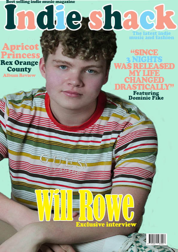
Here is my new and improved front page for my music magazine, the changes I have made are as follows:
- I added weight to the masthead and main cover line which is my main cover stars name (in white to add more boldness)
- I added a plug (Best selling indie music magazine,and the latest indie music and fashion) and captions including more artist features.
- I also enlarged the image of the main cover star.
Targets:
- Explore text placement for captions more
- Add issue no and price
- Make the plug ‘the latest indie music and fashion’ stand out more
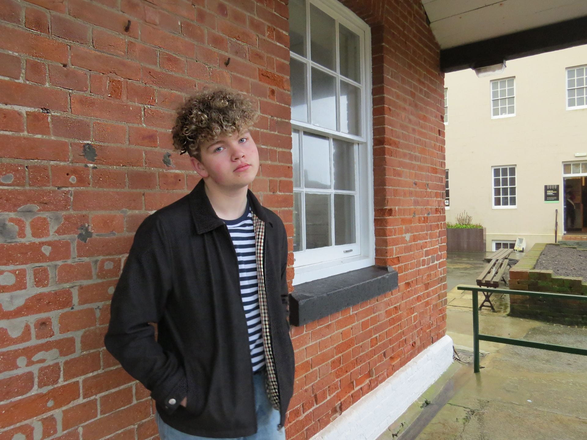
Second shoot contact sheet(s)


Draft of front page

Here is the first draft of my indie music magazine that i created on both Photoshop and Indesign, in order to set up some targets I decided to ask a peer to asses what I had done and come up with 3 targets for development. Shown below are my targets.
- Add more artist features
- Make the masthead bigger
- Add in some plugs
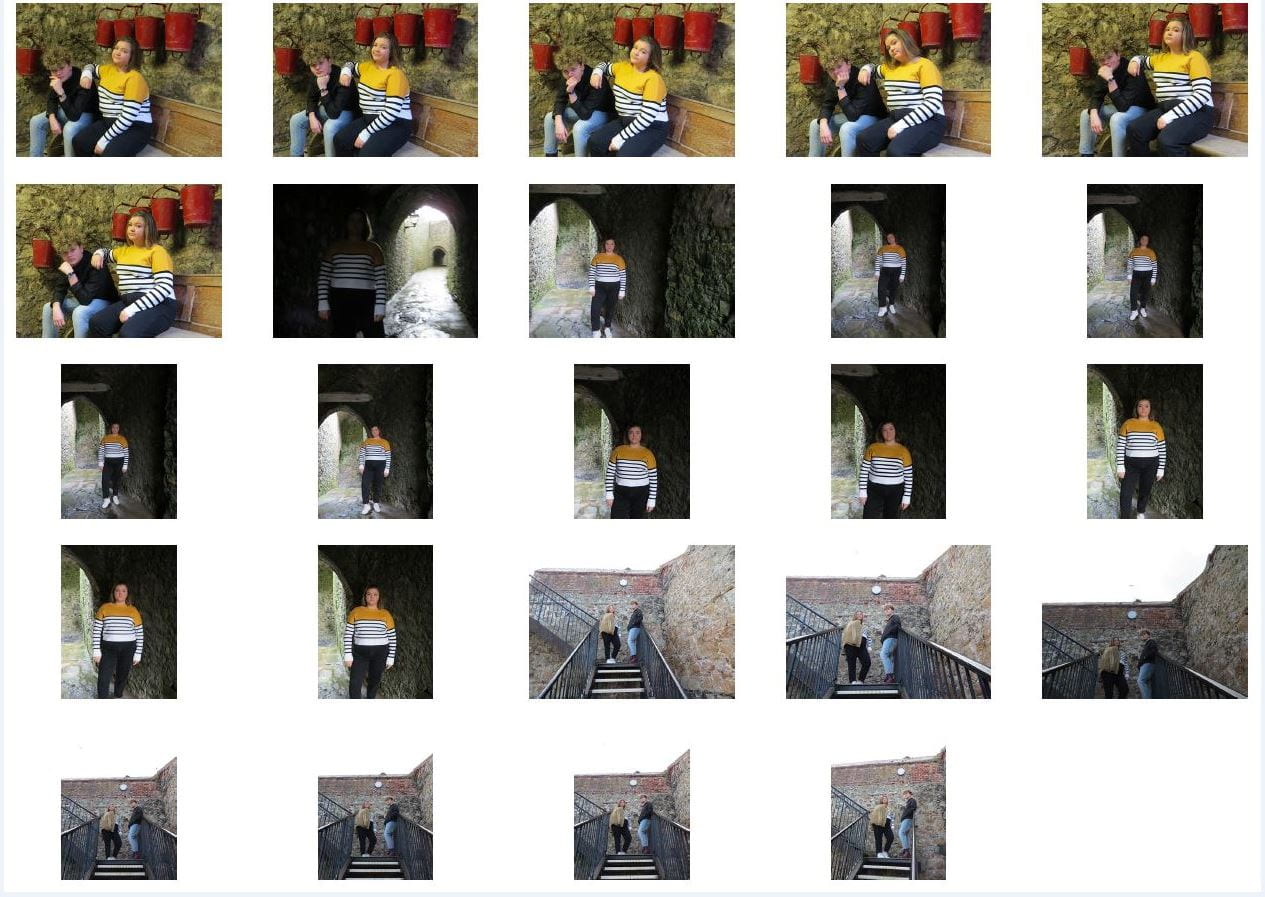
First Shoot Contact Sheet(s)


Shown above is the contact sheets which include the images from the shoot of my star image in the genre indie. I believe the shoot went well and I have managed to get at least 10 very good shots. Due to the hot shoe not working on my camera the lighting wasn’t as good as I would’ve liked it to be but I can alter this on photoshop and make the images more brighter with a soft light.

Mast Head Designs

Here are some ideas of font designs, which I have selected for my masthead, for my indie magazine. I aimed to choose fonts which supported my genre best, and I believe that the best one which is conventional to the indie genre is the second to last font. I will be changing the colours of the font and using a indie colour palette to do this.
Shown below is my final masthead, I decided to use three colours which are conventional to the genre and colour palettes used in this genre, the colour also adds boldness and makes it more aesthetic especially the blue.To add to the indie feel of this masthead I made the colour order different on ‘indie’ and ‘shack’, this adds edginess and a care-free vibe.

So… I am ready to photograph my star
I am now ready to photograph my star, I will be sure to stick to my brand values and mission statement when completing my shoot. This includes making sure I keep up my mission brand values for my magazine which includes edgy, aesthetic, mellow, modern and approachable content. To achieve this I will be using the techniques of mis-en-scene which will help me to create a narrative. My stars costume is conventional to an indie style and aesthetic e.g striped shirt, chinos, and doc martens. The lighting will be mellow and soft to illustrate the relaxed nature of the magazine which is a brand value of mine as the genre is relaxed and mellow. For acting I will ask my star to pose in a way which represents the genre and is a conventional pose, e.g for my genre head on hand and looking into distance. Makeup will be none and props include fake glasses which are also conventional of the genre. The use of camera I will use will include aperture, shutter speed, appropriate angles and framing which I will use to represent the mood, genre and star image of my star. I will be sure to also include the conventional layouts of music magazines e.g Masthead, cover lines, cover stars etc. When completing my shoot I will be sure to keep in mind Hall’s theory of preferred, negotiated and oppositional reading in order for my target audience to be able to decode the media text. Maintaining the star image of my star is very important and I will keep in mind Dyer’s ‘paradox of the star’.
Production Meeting Agenda for 1st Photo Shoot
For my music Magazine ‘Indie-shack’ I will be completing a photo shoot for my main cover star, my aim is to capture the perfect image which uses mis-en-scene and camera to represent the star image and genre. Shown below is my production meeting agenda.

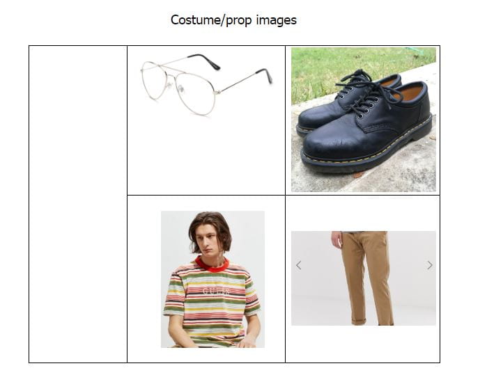
Costume for my main cover star
So what am I up against?
In order to gather ideas of aspects I need to include in my music magazine to make it stand out from the competition I carried out a research task. Shown above is all of my research and conclusion from this research.
Star image- theirs and mine
In order to gather ideas for the cover star of my Indie/indie-pop music magazine I carried out research into a cover star of my genre. Shown below is a link attached which shows my findings of an indie-pop star, Rex Orange County.
https://prezi.com/view/0CYjEO6v8Hw0PRCRufMj/
I also created a slide which includes my styling for my cover star including outfit and props.