Here are some magazine conventional design features to further my understanding on what a good contents page should actually look like.
Some important factors of a contents page…
>Editors Hello
>Page Numbers
>Hyperbole and Superlatives in headlines
>Word and Image cues
>Graphic illustrations and designs
>Magazine name and Mission Statement
Using the techniques above, I will ensure to target my target audience as well as physically possible to make it unique and personal not only to be but also the people consuming my media. The points above will help draw my target audience and i will consider all parts of AIDA to do so.
The purpose of these different conventions is to anchor an audience into what they’re consuming with out there being an overwhelming sensation. Every single feature of a contents page is used to make something unique
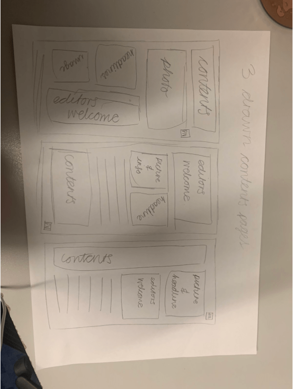
Now I have three hand drawn diagram of my contents page to make an idea of the many possibilities in which a contents page can be re arranged.
Some catchy headlines…
>The chill life of Kyla Bradley
>Everything you need to know about Kyla Bradley
>Queen of R&B
>Secrets of an R&B star