MY OPINION
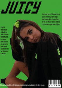
This is my first draft for my music magazine, I believe that my front cover is pleasing to look at because of the colour and the bold masthead. I also think the costume and make-up on my model make my magazine work really well as the image matches the personality to my genre, I also think that the contrast in colour from my model is eye catching.
However, I think that the background colours and costume colours make the front page to basic as there isn’t any colours that pop. I also need to cut my models sock out of the corner as it makes the image look unrealistic. Another issue is the text, I need to choose fonts that relate to each other and I need to add more text at different sizes to make it appeal more interesting to look at.
PEER ASSESSMENT
- Likes the colour
- Image relates to genre
- Needs more writing
- Make some text bigger as it’s hard to read
- Place image more central and possibly on masthead
- Change barcode
- Add more colour