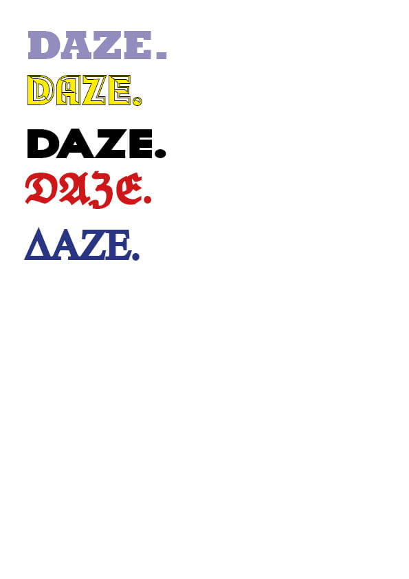
Masthead Designs
These are some possible masthead designs for the front cover of my magazine. My favourite font is the third and fourth, I tired out a few different colours on the fonts to test which I liked best but I’ve decided that the typeface colour would vary depending on the colours and tones of the rest of my magazine. I like the third font as it is bold and easy to read, it’s slightly in your face which makes a statement, and that’s what I’m looking for within my magazine. I think it represents rap/hip hop as being bold and adventurous. I also like the fourth font as it is quite different yet I get rap vibes from it, even though it’s slightly unusual and unique with its style. If I was to use typeface three, I think adding a subtle design would make a big difference, for example adding drop shadow, stroke or texture etc.
