
Before we go out on our location shoot, you should have a mock-up, draft of the Contents Page.
You will have your ‘lick n stick’ to refer to but make sure you do some extra research to find out what is conventional for a Contents Page.
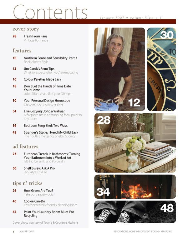
It is an INDEX, MENU for what appears in the rest of the magazine with page numbers for REGULAR AND SPECIAL FEATURES.
It will also contain some photos that relate to the featured articles.


- Title: The main text on the page will be the title saying ‘contents’ to indicate that this is what will be on the page.
- Main image: There will always be a main image on the page that stands out the most and will usually be much bigger than the others that feature the page.
- Sub-headings: Magazine contents pages will be set into different categories depending on what type of articles are inside the magazine. The sub-headings on the contents page are usually in a bolder font that grabs the person’s attention more. The biggest font usually for the headings will be 14pt.
- Ordering and structure: The articles are set in a chronological order so this makes it easier for the reader to find what they want to read. Also there will be a few words for a few articles within the magazine, this will then give the reader an insight on to what will be inside.
- Colour scheme: The colour scheme used on magazine contents pages will usually relate to the theme of the magazine. It will also be simple and not contain too many colours so that it is easy for the eye to read and they don’t distract the reader.
- Layout and other contents : The contents page will sometimes include the title of the magazine,the issue date, a picture of the front cover, contact details and the credits for the front cover
- Editorial: there is often a short piece from the Editor, celebrating and signposting the contents of that particular issue.
