Representation and The Star

Standard

A key concept in Media Studies is Representation and Ideology.

TASK 1 – WHO DO YOU THINK YOU ARE! 

  • The Star Image game.

TASK 2 – The Theory. 

  • This slideshow below tries to explain what representation means and how we can use music star image to illustrate the concept. Also this will act as research into the design of your own star, which you will be photographing in the weeks beginning 13th & 20th November.

TASK 3

Explore the Representation of a given music star as it is constructed in their  META-NARRATIVE

  • Choose ONE music star who would feature in your genre of magazine.
  • Create a slideshow
  • Find examples from a range of texts surrounding your star (their meta-narrative). See the slide show for ideas on evidence meta narrative
  • For each of your images include a description of how they are represented through the image or the tweet or the article.  You should have around 10 images and examples.
  • Summarise in 50 words the representation of the star – what are the ideologies surrounding your star?
  • On the final slide, include images of costume, hair and make up (Mise En Scene) that you will try and style your front cover model in next week.  Include adjectives for how you want them to be represented, portrayed etc.


Finding Inspiration – Communicating my Brand

Standard

In Search of Design Ideas

All designers are constantly on the search for ideas they can appropriate (borrow) and incorporate (blend) into their own work.

You need to do the same for your magazine.


A Design Inspiration Process (My Example)

I have decided to make a magazine similar to Kerrang.

Of course I had to understand my audience and what media they consume and use this information to give me ideas for my inspiration search.

I looked at a number of back issues of Kerrang and used YouGov Profiles Lite for artists that appeared on those front pages. I took snips of their audience’s demographics and their media consumption, particularly the other musicians/ artists / bands which cropped up. Here is my research on my audience and what media they’re into.


Pinterest

I then went in search of picture, words, designs as well Photoshop & Indesign techniques I thought might suit my Kerrang styled magazine.

To gather my images together I used Pinterest, which allowed me to pin my ideas to a board I called ‘Magazine Moodboard’. You’ll need to install the Pinterest tool bar button in Chrome in your profile. This will give the ability to ‘Pin’ images you see in a Google search.

I used the following search terms in Google after the band names or artists listed in my YouGov research.

  • ‘Lyrics’
  • ‘Album Art’
  • ‘Logos’
  • ‘Tweets’

I also searched for ‘Design’, ‘Graphics’ and ‘Typefaces’ along with with the following #adjectives, which I associate with Kerrang and the bands / artists which appear on it…

  • ‘Grungy’
  • ‘Urban’
  • ‘Raw’

This is a link to my Pinterest board

TASK – Get Inspired & Do some Research…

You should follow the same process as above.

  1. Do your audience research on a magazine similar to the one you want to make.
  2. Sign up to Pinterest, install the button in Chrome and create a new inspiration board.
  3. Search the media your audience is into, as well as designs, logos, colours, lyrics, tweets.
    1. After you have pinned about 50 images, go back to your Pinterest board and delete about 10-20% of the pins so you’ve got a board of around 40-45 pins, which seem to have some design coherence.
  4. Explain your pins
    1. It is important that you explain why you have chosen the images and what design features are attracting you. If you look at my board, I have edited the pins to explain what feature I like about them and how I might use them in my magazine.
  5. Link your Pinterest board in a blog post called ‘Developing the Brand’ and reflect on how useful you found this as a way to gather ideas for your own design, which starts next week…

Your Magazine – It’s Decision Time

Standard

LESSON 1

Task 1 – What genre?

Pick a Genre – probably best to choose a genre of music you understand, like and can be excited about. That said, some genres of music have very specific conventions and might be able to provide you with much more scope for design decisions and copy style. If you are undecided perhaps choose a very obvious genre i.e. punk, heavy metal?

Research various genres – you will be amazed how many sub-genres and sub-cultures there are. These are just a few.

Task 2 – Choose the name of the magazine. 

Use a generator app or a thesaurus for a simple, catchy and relevant name of the magazine. It has to be catchy and relate to your genre and brand – make it relevant to your target audience.

  • Bonus, Fault, Exchange, Storm, Louder, Open Mic, Score, Epoch, Placebo, Audio, Stream, Hustle, Phonic, Whisper, N&U (new and unsigned), Orbit, Swipe, Double Tap, Like, Status, Plectrum.

Task 3 – Brand Wordcloud/Mission Statement – Blog Post

Create a wordcloud that includes all the words that relate to what might be your mission statement  for your magazine.  For example will you magazine feature: new talent, unsigned artists, fashion, concerts, festivals, be edgy, anarchic, energetic?  Address all 4 of the Uses and Gratification that Blumler and Katz talk about to ensure maximising your sales to ensure that your contents will appeal to their use of the text.  Include the name of the magazine in a different colour.

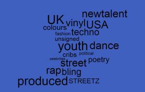
This is an example wordle for a HipHop/Rap magazine called STREETZ.

Blog post – introduce your magazine and its name. Outline the genre and then create a couple of lines for its mission statement which will also be part of the wordle on the magazine’s brand.

This is a link to a perfect mission statement – the second half is the one you should go for!

LESSON 2

Task 4 – Facebook profile

Now that you have an idea of what your audience is all about, you need to know more about the audience. Using yougov.uk and your imagination, create a facebook profile of your target audience. Keep them in mind all the time when you are designing to ensure you are hitting the target, satisfying their needs and giving them predictable pleasure.

You may have to think laterally to find a similar audience member to search for their profile in yougov.co.uk.

  • Make a copy of this Facebook profile and complete it for your target audience.  Use your research to inform your status, details, favourites, interests etc and also use your imagination.

Previous Students’ Work

Standard

How will we mark your product?

Please work through the questions in this slideshow.

Complete your blog post on previous students’ work and evaluate the skill evident in one of the examples.

Your Tour Poster

Standard

This is your chance to shine now. This is your chance to put all your technical skills with Indesign and your knowledge and understanding of how font, colour, images and language can help communicate a story.

BRIEF
A client has come to you with an image of themselves as a performer. Their style of music will belong to a particular genre. They want you to design a poster for an A4 page in a magazine, advertising and promoting their forthcoming tour. You must include the following:

  • Name of artist
  • Name of the Tour
  • Dates and Venues
  • Other information like: where the album can be bought/downloaded, tickets available from and prices etc.

Why not use the previous album cover presentation as a start for inspiration?

Consider AIDA – attention, interest, desire and action.

Look at this presentation of CD covers that relate to specific genres and you will see how ‘conventional’ the colour palettes are for each individual genre.  Make sure you too follow the conventions but create an innovative and eye catching poster.

Finally, include all your relevant research/planning documents such as a brainstorm, sketch, stick n lick layout.  Remember, Mrs Hibbs said you should doodle, muse and research before you open up your Indesign.

Self Assess Your Mock-Up

Standard

Self Assessing your Mock Up

For the purposes of this self assessment please judge your work against the following headings

  1. How well did you manipulate photographs (including cropping and resizing)
  2. Did you integrating image, illustration and text accurately?
  3. Did you follow the colour scheme on the original page?
  4. Did you follow your lick and stick analysis of the conventions of layout and page design?
  5. Were you consistent/accurate in your use of fonts and text size?
  6. How well did you use Photoshop & Indesign?

Your Blog:

Please insert a copy of your mock-up; a Jpeg thumbnail links to a PDF version of your front page.

  1. Beneath that you should write three sentences on what you think works well on the page and that you are happy with.
  2. Then three sentences on areas which you would like to improve on or were unhappy with.

Use the assessment criteria above for areas to discuss.

Then seek out up to 3 x tutorials on InDesign, which will help you improve on your skills and design techniques next week, when you make a tour poster.

Desktop Publishing & InDesign

Standard

Lesson 1 + 2

Serena will take us all through the basics of:

  • PHOTOSHOP – how to cut out an image and ‘improve’ it (find your poster image to practise on).
  • INDESIGN – how to create a poster template, place a photo, add text, change colours etc.
  • You will be allocated a specific edition of the iconic music magazine, NME (New Musical Express).
  • The aim is to recreate the layout and to recap on the main conventional design features of a magazine cover.

Lesson 3, 4

  • You will be allocated a specific edition of the iconic music magazine, NME (New Musical Express).
  • The aim is to recreate the layout and to recap on the main conventional design features of a magazine cover.
  • Using Indesign – recreate/copy the cover you have been allocated.
  • Each of you will create your own version but you can work with your partner in terms of sharing ideas for fonts etc.
  • You do not need to find the exact photo – any one with a similar grouping of performers or artist will do or in fact you can add in a box with a cross through it if you really can’t find one that will do.
  • The main aim is that you have some fun with Indesign – find the right fonts, play with the sizing, kerning etc and do your best to lay out the cover with a conventional layout.
  • Here are some suggestions for cover photos – see the first slide for caveats on what you will and won’t be able to do with them but it might save you time trawling the web.

Lesson 5 + 6

  • Reflect on how you did – find 3 strengths and 3 weaknesses.
  • Set yourself some targets by finding @ 3 self help YouTube tutorials for any aspects of Indesign that you struggled with and embed the videos in your self assessment post.  Make sure you watch them in full this weekend in preparation for your own album poster design next week.
  • You may amend your draft 1, but it is important that you spend time exporting as a JPEG and a PDF, uploading  to your blog.
    • Remember to introduce the content (your mock-up front page)
    • Reflect on what you have learnt
    • Link in the online tutorials that will help you improve your use of Indesign next week.


Complete Analysis of a Magazine Front Page

Standard

Task

Complete a thorough textual analysis of the music magazine you have chosen from the previous class slideshow (some of the research will already have been done for you).  Choose a different one from the one  you did an audience profile for.

The analysis should include the following:

1) A description of their target audience.

  • To help you, you should use YouGov profiles lite
  • Another way to help you understand the target audience (of a commercial media product) is to look at the adverts within it.
    • Not the ads on their websites, (those are generate by cookies that help web companies follow you and give you personalised adverts), but the adverts they put inside the magazine (if you can find those).
    • You should also refer to the attached audience segmentation document to help identify a suitable classification for the target audience.

2) You should also explain their brand, which is defined in their mission statement.


(If you understand the audience and the brand this will help you unpick the design. The designers and editors will have had the audience and brand at the heart of their decision making and so should also be at the heart of your textual analysis.)


3) Identify & label the design elements of the front page (see previous post for help).

4) Consider how those design elements are shaped to communicate meaning, which will reflect the brand and mission statement.

Here is an example from a previous student that includes some very detailed observations:

This is the format we would like you to follow and use the sub-headings included. Some of the sections can be bullet pointed or lists, but others will require some analysis to include the terms: represents, implies, suggests, signifies etc when doing a textual analysis.

Use this link so that you can take a copy of the slideshow and insert your own image and do your analysis.

Magazine Audience & Brand Identity

Standard

What is the first thing you notice about a magazine cover on the shelves? Image or Name (Masthead)? Probably both, but the image and the name are vital design features to catching the reader’s eye and standing out amongst all the other titles on the shelves. They form an instantly recognisable BRAND.

You can see from these Mastheads how different they are in size, typography, language and tone. They are clear signs and symbols as to what the magazine is going to contain, the genre or music and therefore attractive to a certain target audience – a certain demographic. This is its BRAND IDENTITY and should be obvious from the front page of the magazine.

Masthead and Brand Identity

Click to see a range of Music Magazine Mastheads

You will be allocated a music magazine cover from the slideshare and it is your challenge to do some research on that magazine.

Using the yougov.co.uk site and the profiles section, find the magazine and insert the profile by using the snipping tool.

Then do some research as to the mission statement of that magazine and a little about the initial impressions, images, language used on the front cover to attract the target demographic.

Use this audience segmentation sheet to see if you can allocate a certain group to the intended target audience of your magazine and explain why in your annotations.

Once you and your partner have researched the magazine allocated, annotated your slide with your findings, you must present your ideas to the class in a short 1 minute presentation: who is the magazine aimed at, what is the genre and how can you tell that from the images and words on the front cover?

12B Music Magazine Covers

12C Music Magazine Covers

12D Music Magazine Covers

You should then take a copy of your own slide which will then form part of the blog post titled: ‘Audience Profiling’.