CAMERA TALKS

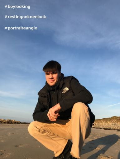
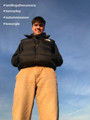
For this task, I had to take a selection of 9 photographs that included differentiated angles, for example, closeup angles, high angles, low angles, distance angles etc. I chose Barnaby Taylor to be a model for this shoot. For this shoot we were located at Rousse beach, to add the sun was shining in our favour. Barnaby followed instructions given by myself on how to present his movements and where to stand for the duration of the shoot – by doing so, I personally feel I came out with some photographs of a good standard which coincide with the criteria.  I am now able to tell a story, convey a narrative using both  MES and camera.

I managed to complete the task with the understanding of                ‘Mis En Scene’:

  • Facial expressions
  • Colour
  • Body language
  • Proxemics
  • Pose
  • Costume


CONTENTS PAGE DRAFT

Below is have inserted my contents page for my own  Music magazine. To create/design my contents page, I had to do this through Adobe InDesign. The photo located in the center of my contents page was edited in Adobe Photoshop; by doing so I was able to transform my photograph from natural colour/lighting to black and white –  also changing the contrast and exposure of the image. I believe my fonts are readable and expresses my chosen genre of Indie.

My shot distances were minimal due to wanting close up photographs.

Due to carrying out an extensive amount of research of contents pages, as shown below:

My design of my contents page is created in a similar way to a contents page I saw when carrying out my research. After taking ‘Mise en Scene’ into consideration, I was able to create an image which not only fits my genre of Indie but also attracts my target audience.

Below I have inserted my drafted contents page for my music magazine:

  • The numbers are great
  • Perhaps some shadow on them to make them pop a little or some on the copy within?
  • Feel the image almost detracts….who is she, caption?  needs to be bigger? more contrast in the black and white? What does it look like with lower opacity in the background, behind the numbers as a larger photo?
  • Look at the coverline texts and spacing as they are quite different in some of the numbers? Get some continuity.
  • Page number for the actual contents page?
  • What do colours on the numbers look like to differentiate a little more to make it easier for the reader to see them?

WHAT IS A CONTENTS PAGE?

Inspirational contents pages

When designing anything it is essential to research, evaluate and analyse what you have found when carrying out the study. I decided to take it upon myself and research, through Pinterest, music magazine contents pages which include all conventional features of a magazine. When creating my own contents page I will regularly refer to my board located on Pinterest.

  • Page numbers
  • A short description of each topic
  • Images and word clues
  • Graphic illustrations and designs
  • Hyperbole and superlatives in headline
  • A reminder of the magazines name and a mission statement

I will use my research to assist me when creating and designing my contents page for my music magazine, by using all of these features, it will help me produce a music magazine that attracts my target audience and consider all aspects of AIDA – making it a successful music magazine and contents page.

Hand Drawn Draft Layouts


5 Catchy Headlines ( I will use in my contents page)

  • Unplugged
  • The Arctic Monkeys – “snap out of it”
  • May I shoot you?
  • The surprise issue
  • Come and see the blinding

Reflection

I would like my music magazine and contents page to reflect my chosen genre of Indie accurately. After the front cover of the magazine, the contents page is the second most important feature. It is essential that the audience is attracted to my magazine from the front cover and contents page at first glance. I understand that the front cover and contents page cannot be overwhelmed with images and bold typefaces, this will not catch the eye of my target audience  due to the cramped aspect of the magazine. To be able to make my contents page a conventional contents page I will include the attributes as follows: page numbers, short description of each topic, graphic illustrations, a reminder of the magazine name and the mission statement etc – I will also include an overview of the magazine content. With my understanding of AIDA, I believe I can create an effective contents page which will instantly gain interest from the reader, if I am successful my magazine should attract, entertain and inform my target audience.

DRAFT 1 OF FRONT PAGE AND ASSESSMENT

Self Assessment

It is incredibly important to assess any work you have carried out, this makes it a lot easier to see where improvements are needed. The only way improve you work thoroughly is to critique it until you can see exactly what needs changing. Self assessing my first draft of my front cover will make it easier for me to create my final piece as I can look back on my previous work and see what is and what is not best to do. By following the strict criteria on the blog, I hope to create a magazine which is unique so that it attracts my target audience. In order to finalise my magazine to the best of my ability, I shall follow instructions and feedback given by my teacher. Here is my first draft of my front cover page:

  • My masthead design is proportioned adequately to fit around my background image. The colours coincide with my chosen genre of indie. The typeface I have used for my masthead is big and bold, making it easy to see. The overlapping of the font is unique and will stand out more to my target audience. On the other hand, my chosen typeface is not suitable for my magazine culture.
  • By placing the image of my model in the centre of my front cover, it takes up the whole page – this leaves spacing around the edges to add information of what the magazine is about, but also what is inside. The borders along the edge of the magazine decreases the size of the image making the model photograph less visible to see.
  • Using different DTP has allowed me to make a front cover which stands out. I had antecedent knowledge which I put to use through Photoshop and InDesign. I edited the image of my model through photoshop, making the photo brighter, increasing contrast etc. InDesign aided me when creating my magazine – allowing me to create a front cover in a particular way, examples of this include, bold masthead designs, pugs, and inserting barcodes.
  • The colour palette of neutral colours, reflects my genre of Indie well to my target audience. Indie is a genre that is favoured by middle aged people – these people would like a magazine cover which resembles indie culture.
  • I used a couple of different fonts: no more than three as this would make the front cover overcrowded and hectic.
  • ‘Mes en Scene’ that I used in my front cover gives off a peaceful and relaxed feel because of the pose the model is portraying. Indie culture like neutral and brighter colours; many people from the indie culture like bright eye shadow which is why I replicated the idea on my magazine front cover.
  • I chosen certain language phrases such as “exclusive 1-to-1 interview”, “a chance to win 6 VIP tickets”, and “a prestigious interview…Nirvana”, these certain types of language features are useful to entice the reader into the magazine and is appropriate for my target audience. I have used the word “exclusive” which will make the reader feel privileged reading the article, as if they are reading something no one else knows.
  • Conventional design features are essential in magazines, I have many on my magazine front cover, for example, masthead designs, a barcode, price of the magazine, issue date, and a main cover star – Aimee Regnard.
  • I believe I have used InDesign and Photoshop in productive ways, I used Photoshop to cut out my main cover star using select and mask and inserting the image on a plain, white background. I used InDesign to create my magazine and use conventional features to make my magazine realistic.

Personal self assessment:

  • I have used Neutral colours to go with my chosen genre of Indie. I would like my magazine to be of a  natural style – by doing so, this will coincide with my target audience’s preferences.
  • By using a varied range of colours (bright, neutral and bold themes), throughout the front cover, it puts the magazine with a better chance of success due to the eye-catching fonts and colours used.
  • I haven’t used more than three different fonts within my front cover. This puts my magazine at an advantage because it inhibits the magazine looking both ‘messy’ and ‘rushed.

Teacher targets:

  • To use fonts and type faces that relate more with my genre
  • Prepare a lot more for the shoot itself regarding makeup, hair style, and clothing which suits my chosen genre of indie
  • Be more creative with my style of magazine (carry out more extensive research)
  • Next time I would like to use the black background in the studio rather than the white studio background just as a result of personal preference
  • Design a more creative masthead for my front cover
  • I will also design an album cover for a magazine using one of my photos from my shoot to add to my front cover.
  • sharpen the image
  • masthead nearer the top – can overlap the background boxes
  • too many pugs….
  • overuse of the Hollywood font?
  • put the barcode and price on the RHS


HELLO MEDIA STUDIES

Throughout my A Level media studies experience I am hoping to intensify and enlarge my skills within the subject. To be able to achieve and successfully use these skills I will need to be a prosperous media prosumer and detective. In order to do this I need to approach lessons and tasks with an open mind even if I am struggling with the set study, by having a positive mindset I will have faith and believe that I will be able to complete the task in the end. In addition, these are some of the skills I will need to develop:

Organisation & Time Management Skills/Technologies:

  • I’d like to think of myself as quite and organised person – however, I feel like being a part of A Level media studies will help strengthen my organisation skills in this sector of the subject.
  • I feel as though my time management in all aspects is positive, although focusing on this segment in media will help me advance in the future within all aspects of life.

Planning Skills

  • Personally for me I find planning things extremely helpful, it is also something I quite enjoy.
  • I am keen to increase my level of skill in planning and developing more ways in which are most beneficial. I feel it will be very useful for media studies, eg. mind maps and planning for shoots.
  • To produce a strong piece of work, planning is essential.

Communication Skills

  • To be able to use communication skills is so important in A Level media. Mainly because most of the work is group work and or communicating with the teacher.
  • When working in a group with communication that is slow, it can lead to final pieces not being as successful as they could be.

Creative Skills

  • In the next couple of years and months between, I would love to develop my creativity skills.
  • I would say I am a creative person and I feel as though I am quite confident to put down my creative ideas on paper to create a final piece of work.
  • To be able to achieve this is in my two years of studying media studies, I will need to be prominent in widening my knowledge by executing  lots of research and creating Pinterest posts on the subject provided.

Since joining the Sixth Form Centre a term late it has really brought out my inner determination I didn’t think I had, meaning most of my catch up is completed for all three subjects two weeks in – this achievement of completing the previous tasks has made me confident for future assignments. I am ready to work as hard as I can to achieve these goals inside and outside of the classroom. I am aiming to be successful with the goals listed above. I believe if I set my mind to the tasks I will advance from a media consumer to a media prosumer.

First Shoot Contact Sheet


This is my contact sheet for my first shoot regarding my Indie/RnB  magazine front cover. In my shoot I have used Mise en scene (‘CLAMPS’) – costume, lighting, actor, make-up & hair, props and setting. I have used extravagant clothing to represent an image of an Indie/RnB artist. This type of garment isn’t something you would wear on a day-to-day basis. The bright colours of pink exceedingly eyecatching which will bring attention to my magazine. By using the studio and varied types of lighting I created a shadowed but confident image for my frontcover to give and extraordinary star image.

Tour Poster Analysis

In this analysis I have deconstructed Drake’s tour poster detect the connotations. The reason for doing this is to find the hidden story behind the tour poster, as we can see Drake has dressed himself with  excessive and eccentric jewelry to represent his wealth and success of what he has a achieved working within the music business. Now is have decoded the poster into more detail we can clearly see the link between the amount of jewelry, the picture frame surrounding Drake and the bold, gold texts indicating that what he has achieved has brought him a great deal of affluence. The bold, big and dark texts characterizes a high level of maturity and class. I now know what characteristics I need to include in my work when I come to design prints. I will have to encode narratives using denotations such as fonts, useful colours, and images that link with my theme to attract and show an understanding of my tour poster and what it is about.

PRODUCT MEETING AGENDA – SHOOT 1

Below is my first product meeting agenda for my front cover shoot. For any type of shoot/media work it is essential to plan; without planning the work you will produce will be of little standard and chaotic. Planning for anything is crucial when completing a piece of work to a high standard. In this agenda I have included all vital things e.g. clothing, who is responsible, location and what equipment is needed, to ensure my shoot is successful. 

MASTHEAD DESIGNS

Branding is so important when publishing a magazine. The masthead of a magazine is the main feature of the front cover, it allows the audience to see who the magazine is created by and provides a rough idea as to the genre of the magazine. I have made my mastheads unique and the writing predominant. I designed my mastheads so that they attract my target audience – following the understanding of AIDA. When shooting for my front cover I will take into consideration the different typefaces I have used, making sure that the magazine front cover is coordinated and matches the images and text. I created my mastheads in the Adobe software InDesign; these are the typefaces I would contemplate using.

My favourite typefaces I created would either be the first one or the third one. I like these two typefaces the most because they are unique and go with my theme.

I am a Media Prosumer

I understand there are 4 main reasons as to why media is consumed. These 4 reasons are as follows –  entertainment, personality identity, social interaction and education. In my work I will seek to ensure that all of these consumer characteristics are included in my own, personal magazine at a high standard. By including all key consumer reasons in my own magazine, I hope to give the targeted audience / reader as much pleasure and use of gratification as possible when reading my magazine; I will do this in order to maximise my magazines popularity within the market.