DIGIPAK DRAFT 1 – 2X PANES

Below I have inserted the front and back cover of what will be my digipak album for my star. After self assessing my work against the success criteria, I am now able to identify whether my digipak includes the correct technical and conventional features of an Indie Rock album. With this assessment, I will now be able to integrate my improvements into my draft 2 of my digipak.

Below I have self assessed my digipak against the success criteria. This will closely help me in re-drafting my second digipak and subsequently aid me when I come to completing my final draft.

Targets for improvement:

  • Adjust the typeface and sizing of the text on the front page.
  • Juxtapose the front and back pane by experimenting with the opacity.
  • Add in the images which should be situated on the front and back page of the digipak. Play with filters so that the digipak is well suited to the genre of Indie Rock.
  • Add the name of ‘Max’ to the spine of the digipak.
  • Use photoshop to adjust the filter and effects on the image of the houses to ensure the full effect of the newspaper is visible to the audience.
  • There are a limited variety of features on the digipak that make it engaging for the audience, add in conventional features to make it more interesting.

DIGIPAK DRAFT 3 & FEEDBACK

My draft 3 of my digipak is pictured below. From the feedback I received from my draft 2, I made many changes which have hugely impacted the digipak in a positive way, for example, changing the typeface, adjusting the brightness and contrast of my boxes, using the opacity tool to create affect and ensuring my illustrative digipak represents my genre well. I have followed the conventions of an Indie Rock album cover using a design which doesn’t feature the star on the front cover and using emblematic imagery to represent the genre, however, there were parts of my magazine which I challenged, that don’t necessarily relate back to an Indie Rock album.

As a way of receiving feedback for my digipak draft 3, a tally was created which consisted of naming a list of genres; the idea behind it was that other media students could provide feedback by ticking the most appropriate genre for my digipak. This is the results of the tally:

As a result of receiving this feedback, it has allowed me to understand whether I succeeded in representing my genre and star accordingly. From the results, it showed that Indie Rock was the second most voted genre; the genre I was trying to represent throughout my digipak. I feel as though there are parts of my digipak that need improving in order for audiences to gain an understanding of my genre. I think I did well to represent my genre and star well, however, improvements are required to provide the powerful genre of Indie Rock.

DRAFT 2 DIGIPAK – 4X PANES

Below I have inserted 4 panes of my digipak which have been reviewed through Screencastify. I considered the various conventions that are suitable for an Indie Rock digipak, I had to consider whether to challenge the blueprint or follow the typical elements of a digipak for this genre. I had to identify suitable typefaces, colour palettes and conventional composition.

These are 4 panes of my digipak album cover.

A Screencastify was completed by my teacher and I have received and will use the feedback given to complete an even better piece for draft 3.

Targets for improvement:

  • Alignment of the Paper Towns title (offset the letters).
  • Take the town boxes back into photoshop and keep the newspaper print.
  • Add floor design to the town.
  • Add a background of clouds, change colour and or the opacity.
  • Include the same image from the front to the back with a low opacity or make little buildings and spread them over the page.
  • ‘MaX’ enlarged.
  • Get rid of the sellotape sections to make them less obvious.
  • Add some red font to the back – red opacity background.
  • Juxtapose the front and back images so the panes relate to each other and the title illustrate the image.

CONTACT SHEET & EVALUATION OF SHOOT – DIGIPAK IMAGES

My original idea for my digipak unfortunately didn’t work out the way I would’ve liked it too so I had to use another idea to create the same effect. I have created a contact sheet that includes all of my images that were taken when preparing for the final digipak presentation.  I have decided to use the image 0810; it was of the best quality using lighting, shadows and the order of the houses to gather the best effect as possible.

For me, this shoot wasn’t one of my best – this is due being behind in my studies due to absence. I believe that I should’ve been more organised when preparing for the shoot of my digipak front cover and back page. I knew what I wanted when I planned and researched digipak ideas and conventions. Unfortunately, I wasn’t able to carry out my first choice in planned processes but I am reasonably happy with what I have and can create with what I have in products. All of my images are in focus, and with the images of the sky as the vocal point of the image, I liked the idea of having and using the rule of thirds whilst photographing the sky and trees. The blue sky is great for bringing out and enhancing the paper towns look, I would like to colour pop some red balloons as a final touch to my digipak. I have identified that I haven’t used a wide range of angles and shots in the shoot which was intentional as it coincides with my genre of indie rock. There was no use of mise en scene however, the front page once completed will be engaging and show the strength and meaning of the design.

GRAPHIC ILLUSTRATION IDEAS – THE PROCESS OF THE DIGIPAK

To capture and identify the process of how I am designing my digipak is essential, the reason it is so important is that when anyone produces work, referring back to ways in which parts of the design were formed is inevitably, one of the most important things and with this, referring back to my digipak process will allow me to ensure that all of the required elements / conventions are included. I have to make certain that I have incorporated illustrations, graphics, font/typeface, branding, colour palette and photo manipulation that are all sophisticated and in relation to my genre and theme.

I have decided to reflect the name of my digipak within the style of my image. The use of words such as ‘Paper Towns’ has been replicated in a form of boxes in all shapes wrapped in newspaper with rooves which are there to to emphasize the ‘paper’ effect – by doing this, it will hopefully allow the audience to gain an understanding of what I am trying to achieve. My genre and artist is represented within the digipak accordingly.

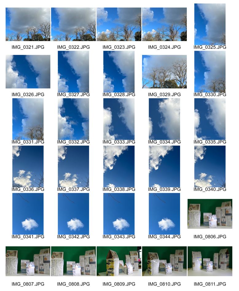
Below I have inserted a collection of images which have been taken during the process of creating my digipak – each image will have a small explanation explaining what is happening within the image.


My font cover of my digipak is pictured above. I have chosen fonts which are suitable for my genre (indie rock / rnb). The artists name, which is located at the bottom was slightly too ordinary so with that I embossed the ‘X’ to provide that extra boost of interest. This draft is missing the front cover image but it will soon be included.


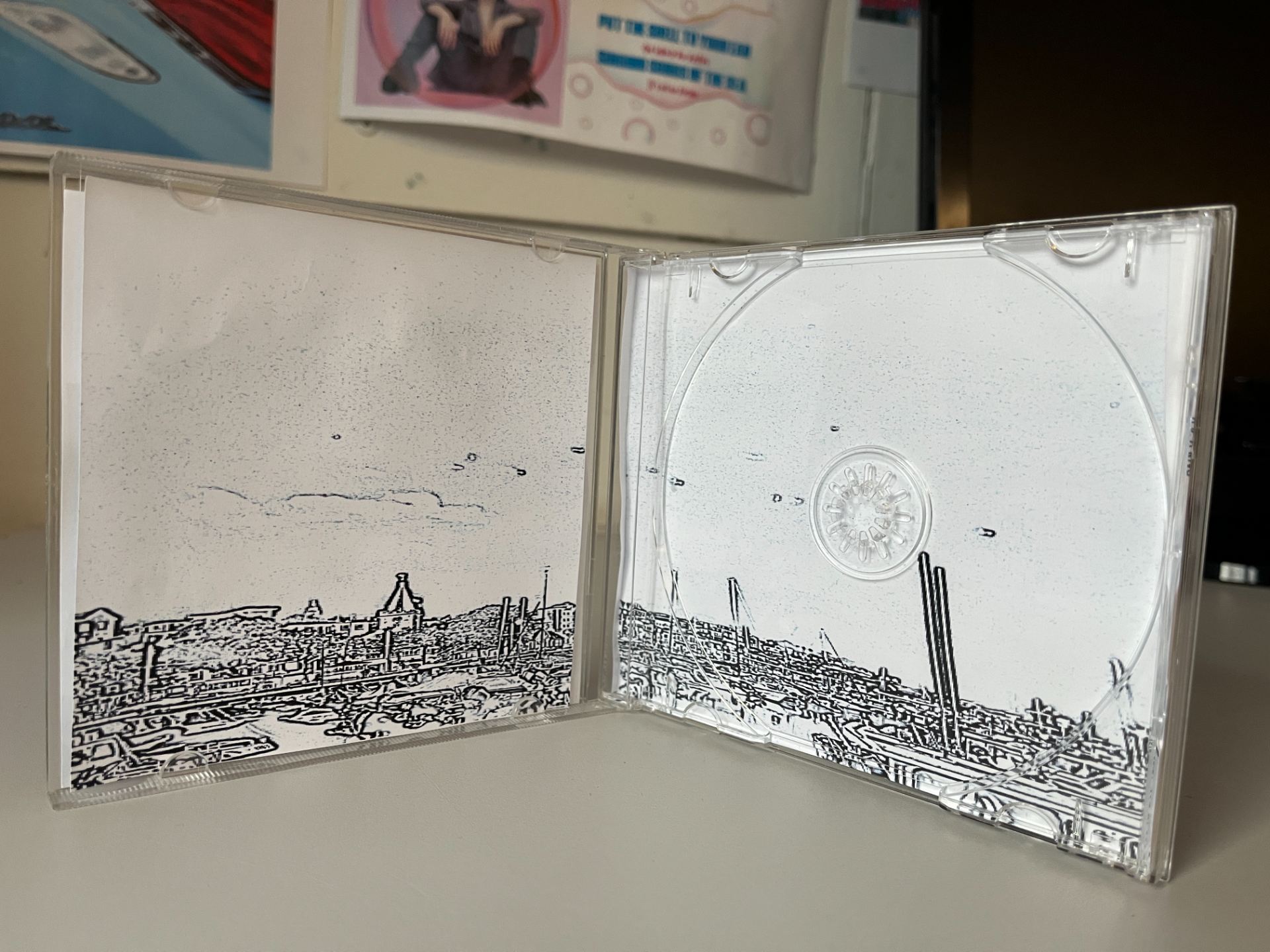
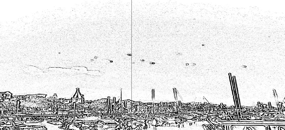
This is the two inside pages within my digipak. For this page I used an image that I took of St Peter Port, incorporating the idea of ‘Paper Towns’ I decided that illustrating my image through photoshop will have a positive effect on my digipak – the audience will be able to understanding the meaning of the title and what is supposed to be represented within the brand.


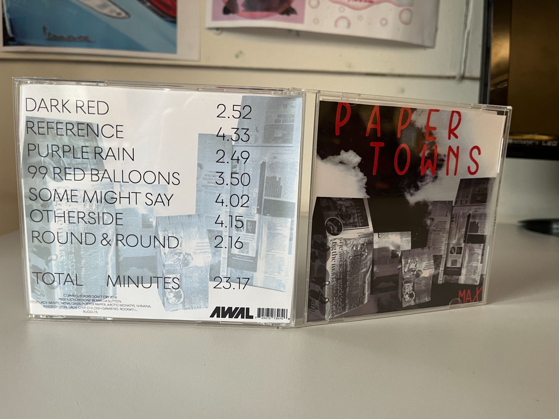
The back of my digipak, I think at this point in time, is the best. Whilst carrying out my research into what makes a good digipak and key conventions, I uncovered a digipak background which was in a similar style to a receipt and with this, I created my own take of this design. I have included all essential features of a digipak back cover, advertisements, barcode etc. The only thing missing from this design is the image to be located under the writing.

All of my pages within my digipak are designed to fit each other and to also have the impact on the audience which interests and educates them on my brand, artist and star image with the use of technical conventions and a repertoire of elements.

PHOTOSHOOT / DESIGN PRODUCTION MEETING & RISK ASSESSMENT

To execute the production phase of my digipak, it was essential for me to plan where I will be photographing my background, carry out a risk assessment, create a mini shot list, and to understand the status’ of props, equipment and transport. With this, I decided a date of when this will happen and to also identify risks that could occur whilst out shooting. I had to pass by all of this information to my teacher prior to the shoot in order to make sure everything was efficient and up to standard.

DIGIPAK MOCKUP

A digipak mockup is essential for the preparation of creating my own digipak. With this design, it allows me to represent my genre well within my album. My final design has been decided through carrying out extensive research, for example, Pinterest boards, indie artist album covers and further inspiration. This research has helped me because I will be  encoding (the process of turning thoughts into communication), and decoding (how an audience member is able to understand, and interpret the message), my digipak through incorporating a repertoire of elements (Altman’s Theory), preferred readings (Hall’s Theory), representing my narrative accurately whilst enabling it to be the same but different. Developing my ideas using conventions will significantly impact my album in a positive and successful way.

THE LOOK BOOK – THE PACKAGE

A Look Book requires research to help discover inspirations to aid the designing process when it comes to creating my own digipak and the package to include my social media page. From this inspirational mood board it provides me with knowledge on style, branding, integrated advertising,  genre, repertoire of elements (the most important elements that I will need include to make my digipak & social media page successful – e.g. cheeky, playful and rebellious images), blueprint (the roadmap to follow to create a generically conventional look/brand for the artist), and the audience. This has now allowed me to broaden my knowledge on what makes a successful and professional digipak using all the components which make it work. I will integrate all of these factors into my work when I come to construct my own.

Made with Padlet

MISSION STATEMENT & MARKETING STRATEGY

In order to complete my digipak, it was vital for me to carry out extensive research which will enable me to create something of my best abilities, incorporating all of the conventions which make a digipak successful; some of these conventions include types of promotion, a call to action, how I would like my star image to be represented, integrated advertising, my mission statement, a unique selling point and importantly thinking of my audiences when using all of the techniques. When I combine all of the repertoire of elements needed to my digipak, whilst referring back to my previous research, I hope to design a piece of work that works suitably well with my genre but also works for my target audience.

DIGIPAK CONVENTIONS ANALYSIS

In order to complete a successful digipak / album cover, it is essential to forward-think and complete tasks in preparation for the final design. From completing this task, it has broadened my knowledge into what makes a conventional digipak by analysing and exploring what makes it the best it can be. I am able to identify how the band have been represented through the digipak, for example quirky, cool, edgy integrating a classical British feel. I have used a selection of technical terms that interpret these factors in the most professional ways. I will refer back to this type of preparation when it comes to completing my own digipak / album cover as it will aid me to complete it to the highest standard.