CONTACT SHEET & EVALUATION OF SHOOT – DIGIPAK IMAGES

My original idea for my digipak unfortunately didn’t work out the way I would’ve liked it too so I had to use another idea to create the same effect. I have created a contact sheet that includes all of my images that were taken when preparing for the final digipak presentation.  I have decided to use the image 0810; it was of the best quality using lighting, shadows and the order of the houses to gather the best effect as possible.

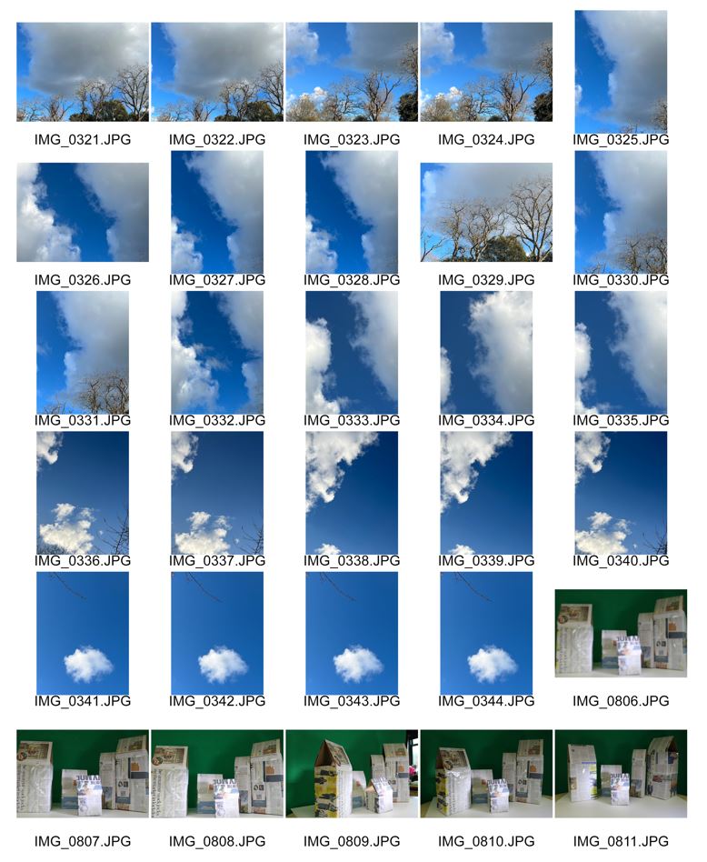
For me, this shoot wasn’t one of my best – this is due being behind in my studies due to absence. I believe that I should’ve been more organised when preparing for the shoot of my digipak front cover and back page. I knew what I wanted when I planned and researched digipak ideas and conventions. Unfortunately, I wasn’t able to carry out my first choice in planned processes but I am reasonably happy with what I have and can create with what I have in products. All of my images are in focus, and with the images of the sky as the vocal point of the image, I liked the idea of having and using the rule of thirds whilst photographing the sky and trees. The blue sky is great for bringing out and enhancing the paper towns look, I would like to colour pop some red balloons as a final touch to my digipak. I have identified that I haven’t used a wide range of angles and shots in the shoot which was intentional as it coincides with my genre of indie rock. There was no use of mise en scene however, the front page once completed will be engaging and show the strength and meaning of the design.

GRAPHIC ILLUSTRATION IDEAS – THE PROCESS OF THE DIGIPAK

To capture and identify the process of how I am designing my digipak is essential, the reason it is so important is that when anyone produces work, referring back to ways in which parts of the design were formed is inevitably, one of the most important things and with this, referring back to my digipak process will allow me to ensure that all of the required elements / conventions are included. I have to make certain that I have incorporated illustrations, graphics, font/typeface, branding, colour palette and photo manipulation that are all sophisticated and in relation to my genre and theme.

I have decided to reflect the name of my digipak within the style of my image. The use of words such as ‘Paper Towns’ has been replicated in a form of boxes in all shapes wrapped in newspaper with rooves which are there to to emphasize the ‘paper’ effect – by doing this, it will hopefully allow the audience to gain an understanding of what I am trying to achieve. My genre and artist is represented within the digipak accordingly.

Below I have inserted a collection of images which have been taken during the process of creating my digipak – each image will have a small explanation explaining what is happening within the image.


My font cover of my digipak is pictured above. I have chosen fonts which are suitable for my genre (indie rock / rnb). The artists name, which is located at the bottom was slightly too ordinary so with that I embossed the ‘X’ to provide that extra boost of interest. This draft is missing the front cover image but it will soon be included.


This is the two inside pages within my digipak. For this page I used an image that I took of St Peter Port, incorporating the idea of ‘Paper Towns’ I decided that illustrating my image through photoshop will have a positive effect on my digipak – the audience will be able to understanding the meaning of the title and what is supposed to be represented within the brand.


The back of my digipak, I think at this point in time, is the best. Whilst carrying out my research into what makes a good digipak and key conventions, I uncovered a digipak background which was in a similar style to a receipt and with this, I created my own take of this design. I have included all essential features of a digipak back cover, advertisements, barcode etc. The only thing missing from this design is the image to be located under the writing.

All of my pages within my digipak are designed to fit each other and to also have the impact on the audience which interests and educates them on my brand, artist and star image with the use of technical conventions and a repertoire of elements.