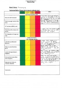
We got feedback in questionnaires from the second drafts of our digipak and advert.
Summary of feedback:
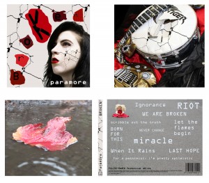
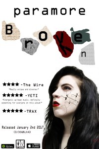
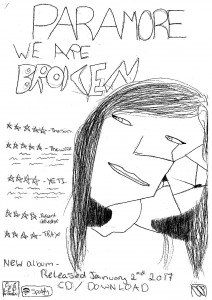
- Each of the covers convey the themes of brokenness and isolation.
- Cracks on the face create an interesting image
- Title is big and bold however the varying shades of red is less effective
- The digipak and video are mutually reflective
- Colour palette is interesting
- The font should be the same for the album name and the band name
- There is a lot of white on the digipak, the background should be more off-white