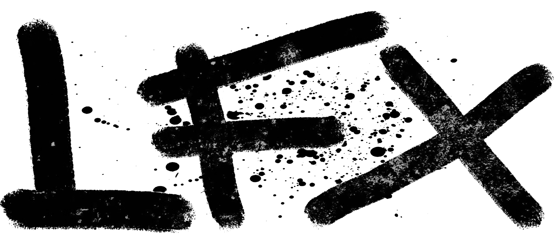
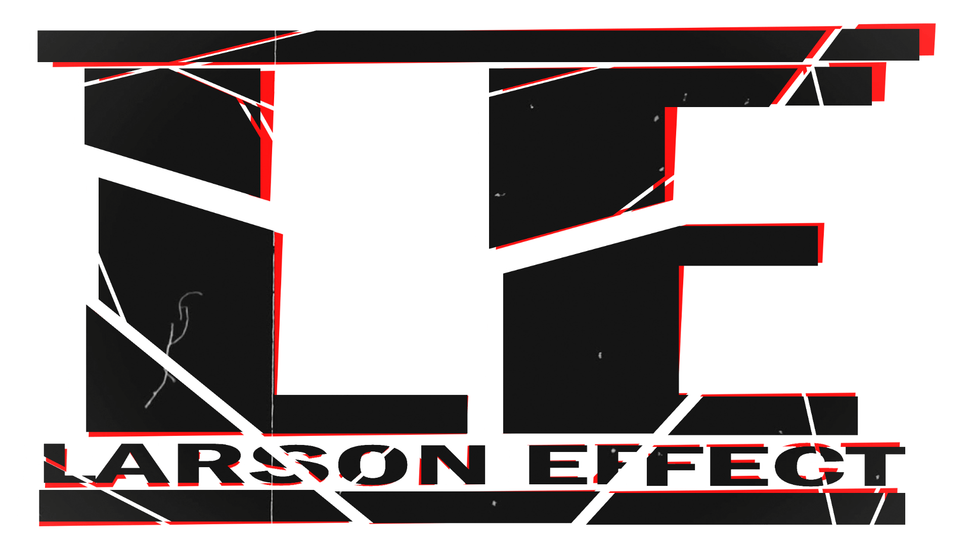
Below are five different potential masthead designs for my magazine.
In an attempt to fit the punk/alternative genre I aimed for an overall rugged, scuffed feel, using white texture overlays that fit this idea on the black text. I also wanted to convey a sense of power and strength through the mast head, consequently choosing to use a thick, strong, sans serif font, or alternatively, to appeal more to the rebellious nature of the genre, a hand-drawn typeface to give an image of graffiti on a wall.