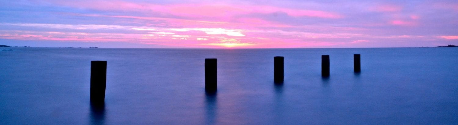
A New Improved DPS

Above is my new and improved draft.
Changes & why :
- Colour scheme – Fit better with the pictures especially since a sunset photo has been used I thought yellow would be fitting
- Photo – Better quality photo and more natural for the audience to relate to
- Fonts – To be more eye catching to portray creativity
- Design – To be more creative and attention grabbing, also different which conveys individuality for the magazine
- Title – To grab the audience in and also intrigue them to read on