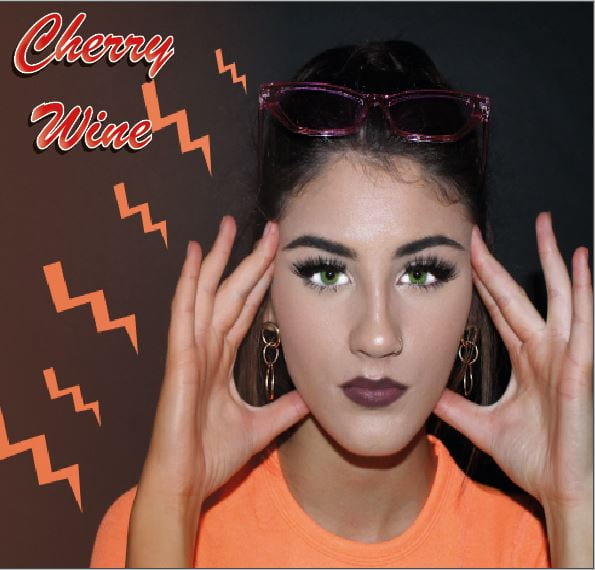
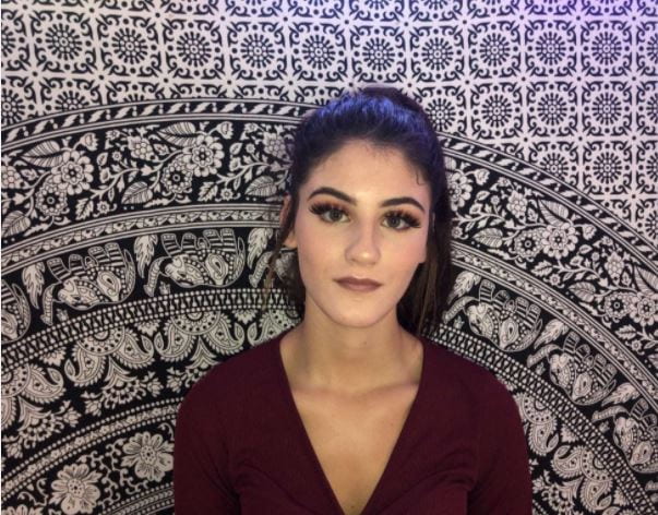
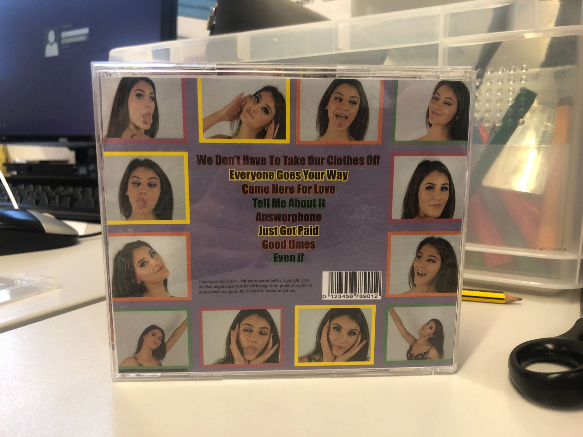
Category: Digipak

Digipak Draft 3

Below is our Draft 3 digi pack in a CD case.


Audience Feedback –

We sent out a google form to see what genre people thought our digi pack was and if they could give some adjectives to describe it. Here are a few of the adjectives given; the most common were, colourful, bright, fun feminine.

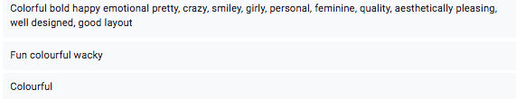
These responses have been beneficial in understanding what the audience think of our digi pack. The adjectives used are exactly what we wanted the audience to decode, and how we wanted the star to be represented. Also the genre has been understood.

What we need to improve –

  • Scale – when cutting out and printing we noticed lots was cut out and not to scale that we wanted
  • Back cover – each mini photo a outer glow

Digipack Draft 2

This is draft 2 of our digipack. Below it is a screen castify from our teacher for improvements.

Targets for digipack draft two:

  • still stretched in the face
  • add a sheen to the lips
  • do something different with the lightening stripes- they don’t work well too unrealistic
  • add the name of the artist
  • inside cover, change the words on the inside
  • choose a filter on the flowers that matches
  • back pane needs to tie in with inside and front cover
  • the font on the back is too classic
  •  lightening strikes could be colours from the flowers
  • add in spines

What went well:

  • nice green on the eyes
  • good image on the front cover

Digipack Draft 1

Above we assessed our draft 1 CD panes. We identified what is working and what we need to improve, this has made it clear for when we edit for draft 2. Also by assessing it we have been able to see our standard of work and how to improve to develop our grade. As well it has outlined key features that we are missing like copyright and displays how we can play around with writing and graphics more.

Evaluation of shoot

Because we had used lots of nature imagery in our music video and shot outside, for the majority, we decided that to contrast this we would take photos for our digipack in a studio to help focus the audience of the star and not be distracted by other imagery that we already have in the video. We took advantage of the darkness of the black studio to use bright coloured clothing and props to add a modern and vibrant atmosphere to the photos. As we thought this would benefit our genre in having bright, attention grabbing aspects. We also did a shoot over the half-term holiday using more props, such as all the clothes worn in the previous shoot spread out around the model to portray the narrative but it didn’t work a well as the image quality was bad as we used a phone with bad lighting.

what went well:

  • The orange top and cow print top stood out well in the dark
  • The pink glasses were enough to add a pop type feel but not too much to distract the attention away from the star
  • The images were good quality and there we used many different angles and poses so that we had lots to choose from
  • We used relevant and eye catching props such as clothes and glasses.

Even better if:

  • We may have benefited more from using the white studio as the colour of the star’s hair didn’t contrast enough with the darkness around her
  • The shoot we did during half term was not of good quality as we used a phone camera with flash which caused bad lighting quality.


Graphics / illustrations Drafts Ideas

While creating our digipack, we used photoshop to highlight the appearance of the model, for example by making her eyes greener and her top brighter by using tools such as the burndodge and colour tools, and we have also used features on Indesign to add in graphic detail such as orange lightning bolts and writing for the album cover name. We are exploring different fonts to use that help to portray the narrative and fit the genre as we are using bright, warm colours to portray the star as creative and expressive. We will still continue to improve the design as we develop our drafts.

Contact Sheet

Below is our contact sheets from our shoot. We went to the black studio because we wanted a plain background to make our colours stand out more as our genre has bright, bold colours. From looking at the photos we have narrowed them down and chosen one for our front cover. However we decided we are going to do another shoot as we have been inspired by our mock up ideas of what we want to do.

Photoshoot / Design Production Meeting and Risk Assessment

Above is our meeting agenda which includes dates and times, and everything we need to know to bring to the shoot.

This is the risk assessment it makes us and our teacher aware of the safety needed, since we are just going to the studio we have no potential hazards.

In our shoot we aim to :

– successfully portray the genre R&B in our digi pack, while also creating a star image which sticks to the connotations for our target audience.

Take various shots, and angels to get the best shot which can portray a message or emotion through the facial expressions.


Hand drawn mock up

Below we created a hand drawn mockup or the front and back of our digi pack. We made 4 of these each with different idea but trying to follow the same conventions. Not only did we want to focus on the star image which is common within our genre we also wanted to include some idea of a narrative, for example the idea with the bed which would link to the song ‘We don’t have to take our clothes off’. As a creator we are also hoping to encode a message to the audience which follows the performers main song; this would also link in nicely with our music video, which the audience would be able to decode and the message could speak to them on a personal level.

It is all about using the conventions but also developing them to create something unique and ensuring that your audience get a preferred reading.  Whilst creating repertoire elements we also want to keep our star different to others so she stands out as an artist. Not only do we want to stick to familiar expectations so it fits with our target audience but we want to expand and slightly challenge those expectations.

Branding Moodboard

Here we used padlet to create a moodboard of inspiration for our digi pack, we included various things such as album covers, writing, colours, photo shoots of other artists and more. It helps us gather ideas for our own digi pack, and learn more about the genre and it’s demographics.

We have looked at the connotations of the images below we have enabled us with ideas we believe our target audience will take interest in. It is clear the brand image has a massive impact on a digi pack which follows the genre we have chosen.  The repertoire of elements also plays a massive part for our digi pack as the star is the main image on the front and the audience will decode connotations about her from her stance, pose, facial expressions ect.

Made with Padlet

Digipak Conventions Analysis

This is my first annotation of a Digipak cover, I took the album ‘anti’ by Rihanna and depicted it to gather the meaning behind it, and how she chose to design it. I chose Rihanna because she is a similar artist to Ella Eyre. It showed me how to analyse images and construct a meaning which the artist wanted to convey.  

By analysing this album cover I have noticed the artist left out key conventions that as an audience I think would be beneficial to be on there; for example she left out, the title, barcode, tracks, copyright ect. When creating my digi pack I will be sure to include conventions and a spine while also keeping the idea of a message through an image.