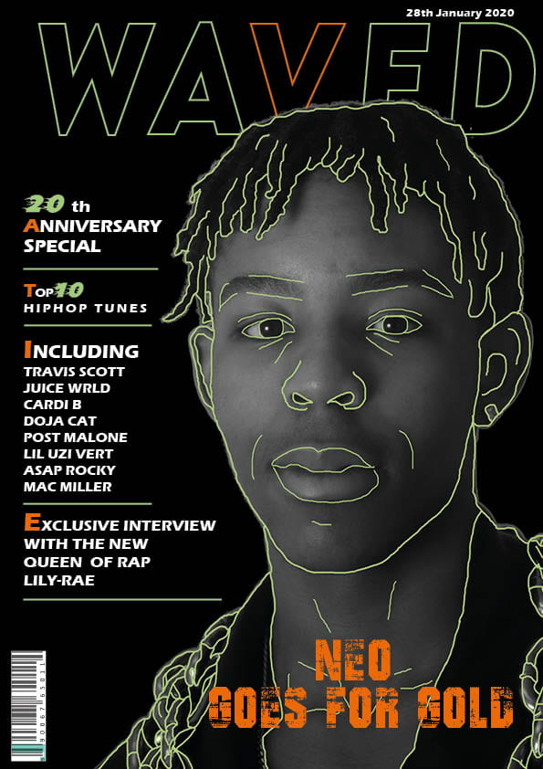
For my second draft of my front cover, I’ve changed many aspects, to enhance the features of my magazine, making it more authentic to the rap genre.
WHAT’S NEW?
- No longer squiggles inside the title of magazine, as it looks more crisp and smart.
- I’ve changed the wording of the main cover line to fit with the rest of my magazine.
- Added more orange, because the green was slightly overpowering.
- The background has been changed to black as it differs more with my star image, as grey was too similar.
- Lettering before each article is larger, so draws more attention.
- Star image has been made larger so is more the focus.
WHAT’S NEXT?
- I would like to play around with the font of my magazine title, to see if there is one more fitting
- On photoshop try and sort out the grey lines that run around my star image.
- See what other numbers look like?
- Plug for the magazine going upwards on the left hand side.