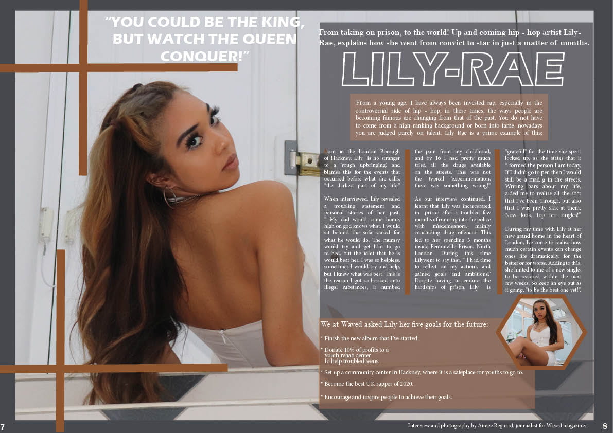
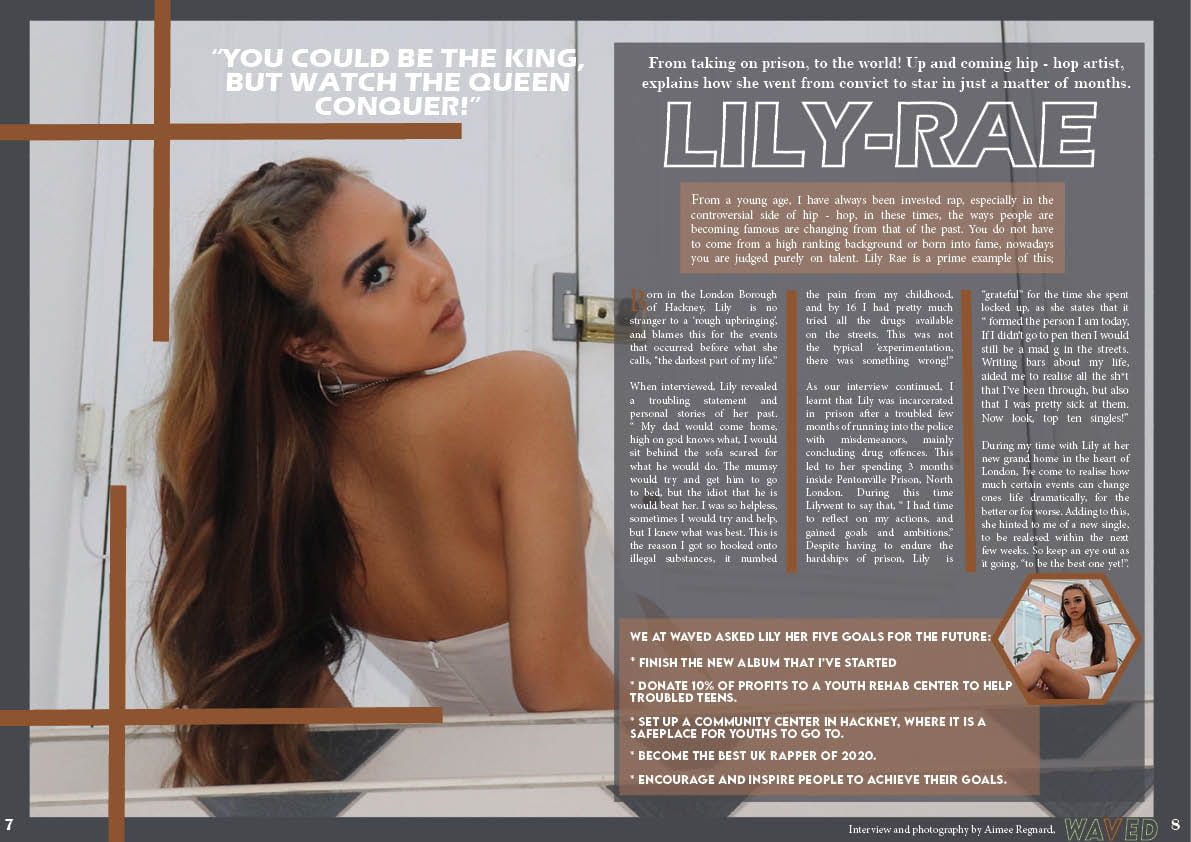
What’s new?
- Guttering space between the standfirst and the background box i.e. very near the edge at times.
- The box with the information at the bottom…. changed font.
- Waved logo magazine added and journalist taken out.
- Drop capital is bigger and bolder.
What’s Next?
- Bottom left box, writing in centre (not title)
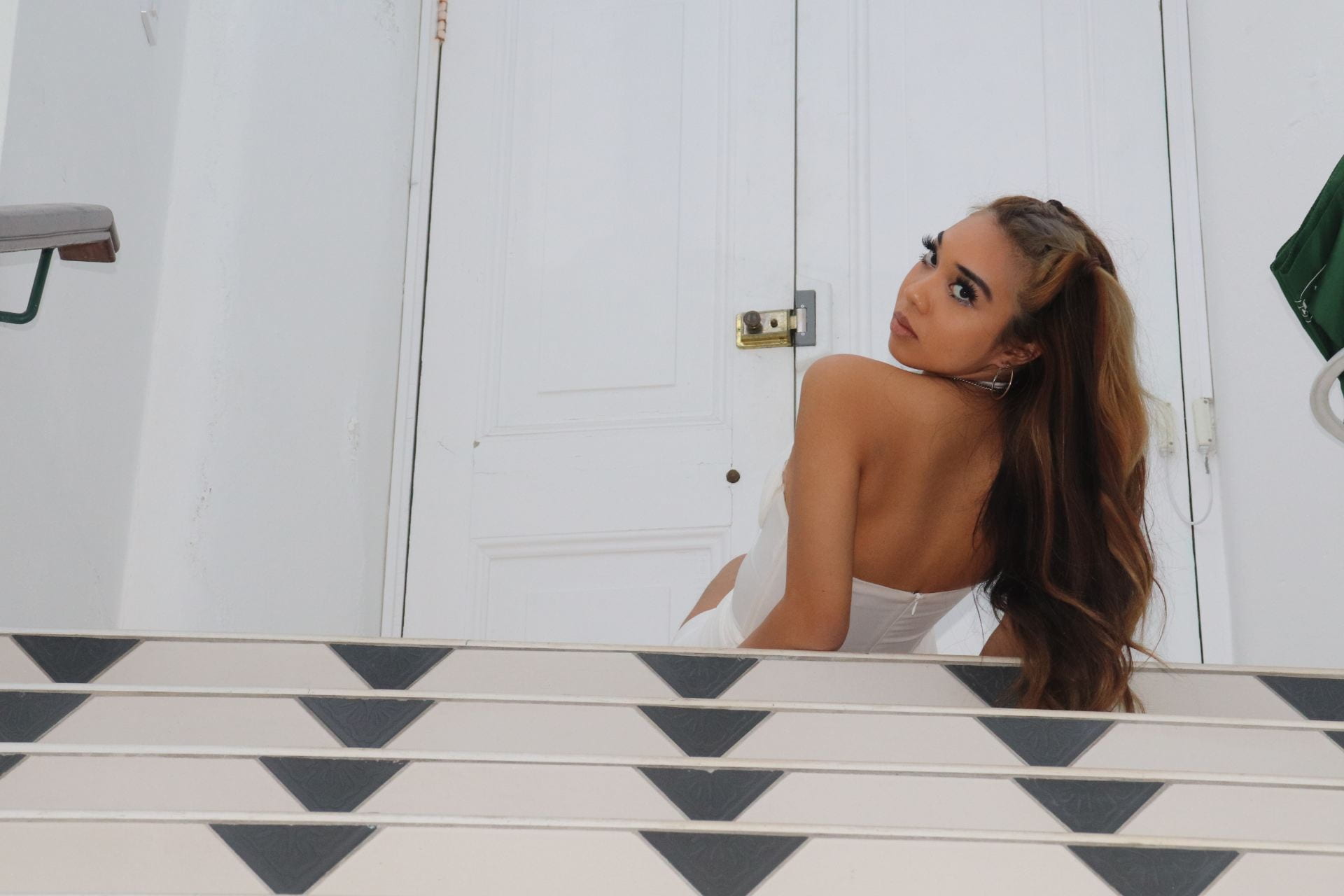
- Door handle photoshopped out.
- Make star image bigger.

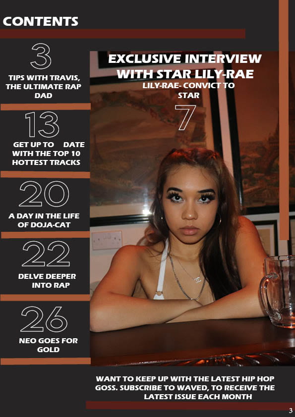
What’s new?
- Line spacing.
- Added more coverlines
- Star mentioned once in coverline instead of twice.
What’s Next?
- convict to star one line. ( Lily-Rae, convict to star)
- Straighten image. (upright)
- How to subscribe at the bottom.
- Add in green somewhere?
- Centered coverlines?
- Numbers same distance. ( over line ?)
- Extra coverline?
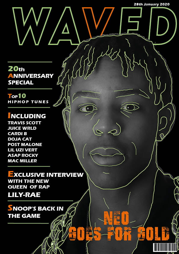
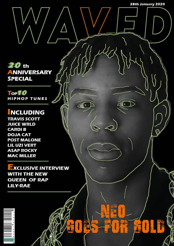
What’s new?
- Barcode moved to be more conventional.
- Title made thicker.
- Extra thin green line added above magazine issue.
- Another coverline on left hand side.
- ‘Exclusive interview’ and ‘Lily-Rae’ made larger.
What’s Next?
- Reminder of rap magazine (number one rap)
- No ‘interview’, just ‘exclusive’
- Watch length of green lines.
- ‘Snoop’ into three lines not two.
- Sizing of fonts. Every top line same size.
Here is a screen-castify done by my teacher, on what is good and relevant to the magazine, and what can be improved upon. I will use this advice to improve my magazine for the final drafts.