November
14
November
8
Star Image- Theirs and Mine
Star Image
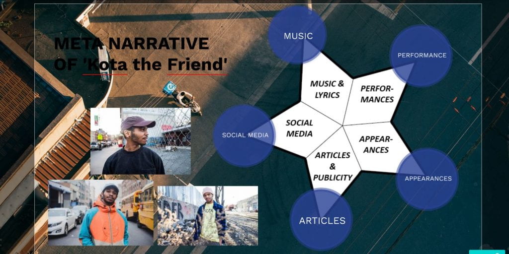
Please click the image to see the full presentation.
Above is a presentation about a chosen music artist who represents my genre to some extent because of the fact that he makes his own music and his work stems from jazz which is similar to 1950’s rock and roll. I had to choose an artist who doesn’t have a big social media presence because of the fact that social media is irrelevant to 1950’s music, so I thought that Kota the Friend would be good to research as he is not too popular.
Richard Dyer is a media theorist who looks at the paradox of the star, which is;
- Extraordinary – the amazing talent the star has
- Ordinary – How we as an audience would relate to them by common jobs such as driving and shopping.
For example Kota is an example of an artist with a dominant ordinary persona.
We also look at the meta-narrative which should be complimentary and communicate the same star image or brand ideas through:
- Music covers
- Album covers
- Concerts
- social media
- Words and images in magazines
Below is a google slide of some ideas I have put together on how to present my model. I will have one female model who will have playful expressions in the images I take paired with a relaxed stance in order to correctly portray my genres meta-narrative of being fun and yet easy-going. I researched the conventions of 1950’s Rock and Roll in order to get a better idea of how to display mise-en-scene in the images.
October
24
Communicating my Brand

Above is a photo of my Pinterest board I created to give me inspiration for my magazine cover. This is useful because when I am struggling for ideas for my magazine I can look back at the mood board which will help me to be more creative with the design of my poster. These ideas include different fonts, colour palettes, font size and outfits that relate to my genre of music so that i can incorporate them into my magazine.
October
22
My Audience Profile

Above is an audience profile I have put together to show the psyhcographics of an example member of my target audience who are people who like to listen to 1950’s Rock and Roll music.
I also had to find the demographics for my genre by researching singers and artists that belonged to my genre on https://today.yougov.com/
The singer I have decided to mention here to show demographics is Elvis Presley because he is extremely well-known and a good representation of Rock and Roll.

Elvis Presley is the 2nd most popular classic rock and roll/rock music artist and the most famous. Elvis Presley is described by fans as: A great performer, Talented, Entertaining, One of a kind and Legendary.
From these statistics I can see that Elvis Presley’s music has been more popular with women and with Baby Boomers than other generations. This information will help me to decide how to lay out my magazine as I will be able to look at other posters that are aimed at the same generation as mine to see the types of information and entertainment that they include, for example quizzes, advertisements and competitions. I will be able to keep in mind the Uses of Gratification to keep my audience interested. When creating my magazine this will help me encode my ideas, which will help my target audience to decode them and have a preferred reading of the text.
October
21
Branding Ideas + Mission Statement
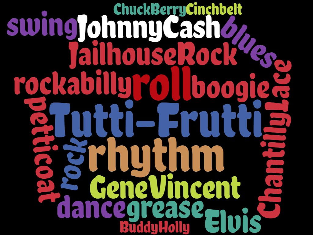
I decided to create my magazine based around 1950’s Rock and Roll because it is a genre that I like to listen to often and it is interesting to learn about aspects of the 1950’s. The name for my magazine is from a famous song “Tutti-Frutti” by Ritchie Valens recorded in 1955. The song has many elements of blues, gospel and boogie that combine together to make the perfect Rock and Roll song.
Mission statement: The aim of Tutti-Frutti is to bring fans of a timeless decade of Rock and Roll music together to read about the lives of their favourite artists and delve deeper into the world of the 1950’s. This magazine highlights the key features of Rock and Roll Music and will either bring back your 1950’s memories or make you wish you were a part of the best decade of music ever to be experienced.
Below is a Wordcloud of words commonly associated with Rock and Roll in the 50’s.
I will also include articles and interviews about music artists, adverts for music and festivals, quizzes about the 1950’s and competitions to keep my audience interested and engaged with my magazine and want to buy it again. It is important that my magazine includes social interaction as well as information and entertains my audience so that it allows people to reinforce their personal identity.
October
2
A Front Cover Analysed
In this task we had to analyse a magazine cover and work out the Psychographics and demographics of the target audience. I found out that the target audience were middle aged men interested in politics and rock with a strong sense of masculinity and this was suggested by the way that a simple font was used along with a retro colour palette, along with middle aged politicians as the cover stars.
This task will help me to create my magazine cover as I will know what features I need to incorporate in order to capture the target audiences eye. We found out how colour, cover stars and font can be used to attract certain ages and genders and this will help me focus on how to aim my magazine cover at my chosen audience.
October
1
Audience Profiling
This slide is an annotated magazine cover to show how specific features that relate to the content can can be put on the front cover so that the target audience can be reached. On this magazine cover many different colours were used in order to effectively capture the intended audiences eye. It is important to attract the target audiences eye so that the magazine will sell well.
It is implied that the magazine appeals to mainly generation X, male Rock music fans, and this can be seen in the way that a male model has been used on the front cover and the magazine could be aimed at any class of person because it is a music magazine but we thought it may be aimed more towards the upper middle classes and skilled working class.
This task will help me with making my music magazine because I will be able to know how to reach out to specific audiences with different demographics and psychographics.
September
30
Conventional design features of a magazine

In media studies this week we learnt how to deconstruct magazine covers in order to see how they appeal to an audience.
We learnt that there are many features on a magazine cover that help to bring it together, these are the technical conventions:
- Main cover stars
- Plug
- Main cover line
- Inset images
- Cover lines
- Price
- Bar code
- Captions
- Master head
- pug
On the magazine we deconstructed the front cover featured many of the typical conventions however I think that it, the master head isn’t big enough and so doesn’t stand out from other main cover lines, I also feel that the plug isn’t large enough and doesn’t stand out from the master head. I think that the fact that the image of the main cover stars is in black and white helps to add some contrast the brighter colours such as orange and red. I think that this exercise will help me to know how to design my magazine. that will draw the audience attention
September
17
Print Media that Communicates Meaning
Analysis of a poster advertisement:
This is my analysis of a poster to pick apart how the different aspects of Mise-en-scene come together to create an image that is meant to attract a target audience. This poster highlights how different parts of Mise-En-Scene are needed to convey a particular mood or theme to an audience and this can be seen from where I have deconstructed the poster to look at how effective the design features are., for example, This poster contains dark imagery which conveys a sad type of music. The singer is positioned so that his face can be seen as thoughtful and reflective and his beard suggest that he is relaxed and calm.
Analysing this poster will help me with my music magazine because:
- I will be able to understand and apply my knowledge of how various font types and sizes will have an impact on my target audience
- I will understand how colour can be used to portray a particular mood or feeling I will be able to understand how different camera angles will affect my magazine
- I will know that in order to make sure my magazine keeps the reader interested I must make sure that the writing on it isn’t too excessive.