Draft of The Double Page Spread

click on image to see pdf

(PDF won’t accept the font used for my masthead)

What I like about my double page spread:

  • The font I’ve used in the title- this is my favourite design convention because it is unique and stands out. The floral pattern fits in with my indie theme.
  • The vinyl’s- I like these because the name of my magazine is ‘Vinyl’ and vinyl’s are commonly used for indie music.
  • The colour scheme- The colours I’ve used across the spread co-ordinate quite well and compliment each other.

What I need to improve:

  • How I have spaced out the vinyl’s– they are unevenly spread out and it looks unprofessional.
  • Change the font I’ve used in the bottom two paragraphs- the font I used isn’t supported by InDesign, so you can’t see simple things such as quotation marks. It is also hard to read.
  • Check for spelling mistakes
  • Add lines between the bottom two paragraph- it will look more professional and separate them completely
  • Separate paragraphs

Second Shoot Contact Sheet

As seen above, these are the photos from my second photoshoot which I will be using in my double page spread for my magazine.

In order to create authentic Indie vibes, I chose to take these photos in a background where there were steps so I could capture shots from all angles. Overall, I am satisfied with the photos I’ve taken, however I feel as though because my camera died during the shoot, I was not able to take enough photos as I need in order to give me a larger, varied selection. Next time I do a photoshoot I will have to take more photos on my phone if my camera dies again.

My favourite photos that I captured were these and will end up using one of the two:


Language Analysis

pls click on pic to see pdf

The text that I am analysing is Maverick ‘Celebrating the wildcards who’ve inspired cult worship’, written by author Dorian Lynskey. This article has been dated back to September 2017.

Evidence of the journalistic technique 5 Whys and an H can be seen through-out the article, for example ‘When’ has been used  describe the story about a negotiating deal and ‘why’ can be seen when Lynskey is talking about James Lavelle reassessing his past and asking himself why he makes music.

The structure of this article is a biography and I can tell this because Lynskey is talking in third person about Lavelle. This page of the spread has been laid out into 4 main sections of text and one of which is written in bold writing above the three other columns. Most of this page has been covered by James Lavelle’s name, which is effective because it is big and bold meaning it will catch attention to any of his fans and the target audience. The fact one section below his name is also written in bold is informative because it gives the readers a glimpse of what will be found inside the article.

In all honestly I cannot feel much of the Journalists presence through this article, however this is probably because it is written in third person, therefore there is not much need for Lynskey to talk about himself because his job is to inform the audience about Lavelle. The impact of this being written in third person rather than first is huge because it is a non-biased perspective and only key-points about Lavelle’s life have been talked about. There is a clear introduction which can be seen written in bigger font, however there is no conclusion to finish the article.

The general tone of this article seems quite relaxed because the journalist has freely written curse words, an example can be found through the line  “a fucking amazing night”. This could also express Lynskey as being fearless and tells us he is not afraid to break any taboos. This tone relates this genre of Electronic trip-hop because that style is alternative, much like the writing style the journalist has portrayed.

To conclude, Lynksey represents Lavelle as being a free-spoken and exciting person, who is not afraid to break social norms. The journalist has also structured this article very well because it gets across the desired message and is displayed so it is easy enough to read while still looking interesting.

Focusing forward, this task will help me in order to create my own double page spread because I feel as though I have gained a better understanding to be able to hook and intrigue my target audience. When creating my own I will take into consideration the design conventions used here and possibly copy the layout.

Draft of a Contents Page- Peer Assessment


CONTENTS PAGE PEER ASSESSMENT


What type of shots have been used to create a variety of shot distances and how has the camera been used to communicate meaning?  

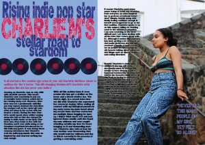
A mid shot is used in order to capture both the position of the model as well as the chosen costume to convey its relation to the indie genre. This demonstrates an understanding of positioning and lighting which results in an image that is conventional to the indie pop genre with use of a midshot also allowing the conventional body language for this genre to be shown.

What choice of Mise en scene is appropriate for the star image and genre?

The outfit worn by the star is plain yet is appropriate for the indie pop genre with the green tone of the knitted green crop top going well with the model’s skin tone. The jewellry used also compliments the genre, as well as the model’s warm facial expression.

  How far is the font used readable and reflects the genre

The bold, sans serif font is clearly legible with the exception of the words “up to” which appear to have text between them and generates an aspect of volume representative of the music found within the genre.  However it lacks variety as the same font is used both for headlines and body text which leads to a lack of variety in graphic design.

What technical conventions of a Contents page are present and used effectively?  

The lexis used within the headlines is conventional to the genre with references to well-known pop indie artists and word choices such as “thrifting” and “rumours.” All conventions of a contents page have been made use of with the bright ombre background contrasting nicely with the blue tones of the headlines and the heading of the page.


How has Indesign been used to layout the page to convey a brand?

Care has been taken not to add too much text to the page in order to prevent it from being overbearing. The different page numbers being in outlined circles makes the product easier to navigate for the audience.

 How well have the text and visuals been integrated together?

The colour palette of the images and text parallel nicely with light and bright tones that go together well without being distracting, however the page number “11” overlaps the model, perhaps preventing the reader from fully focusing on her.


Where has photoshop been used to manipulate the photos to enhance the star image or genre? 

Photoshop has been used well to make the area around the model brighter, aiding her to stand out. However the cutting out of the model in a couple areas such as the bottom left side of the lime-green crop top are a little rough, giving a slightly unprofessional feel to

 How is the language used appropriate for the genre and target audience?

The language used is appropriate for the genre and the target audience will be able to identify it with. The word “indie” is used as a premodifying adjective multiple times showing the content is relatable to the target audience (indie pop fans).

Clearly, strong, good, satisfactory, conventional, well good sense 

B grade

5 Targerts-

  • I will cut out the model properly so no areas are rough
  • Page number 11 overlaps the model, so I will fix that
  • Use different fonts
  • Choose a more exciting outfit for my model
  • Include more technical conventions

What is a Contents Page?

Having a contents page is essential to any magazine because it is an insight about the kind of content that is included inside. It is also an index to direct the reader on the page numbers of some of the content that is advertised through the coverlines on the front of the magazine. To be able to create a contents page that will adhere to my target audience I researched some contents pages and looked for any designs that stood out to me. I found a few favourites which I attached on the slide above, but an absolute personal favourite of mine is the third one along the bottom. I like this one in particular because I think the way the page numbers and headlines are displayed is very simplistic and sophisticated. However, I also absolutely love the contents page directly above it because the I think the combination of the fonts and the colour palette is unique and I like how it is designed to show the pictures down the right side of the page.

5 catchy headlines:

  • Exclusive insight into Eli B’s life
  • Essential guide into making the perfect indie jewellery
  • Shocking secrets revealed by Lana Del Rey
  • Top ten tips from fashion stylers when it comes to thrifting your indie clothes
  • Are Arctic Monkeys making a comeback by realising a song from their new album?

Focusing forward, this task has benefitted me because I now know the kind of design I am going to be using for my own contents page. Completing this task and thinking about the types of headlines that will stand out to my demographic has also reminded me of the importance of AIDA (Attraction, Interest, Desire and Action). In particular, I will need to create a contents page that will attract my target audience but also include headlines that will interest them.


Draft 1- Front Cover

pls click on image to see pdf

In order to be successful in the media world, and attract your target audience you have to be conventional. This includes providing a service for social interaction that is there to entertain, give information and help create personal identity. Another aspect that you should consider when advertising is AIDA (attention, interest, desire, action). This is demonstrated above where the main cover star is large and takes up the majority of my poster to attract attention to the audience.

Focusing forward, assessing my own work will help me in the future because I am now able to critique myself and learn from these mistakes in order to create the most successful product I can.


Contact Sheets

The following contact sheets show all of the photos I took at the photoshoot in the white room. In order to make sure my model was perfect to be the star image of my front cover I had to consider her outfit, which includes a lime green crop top, blue baggy mom jeans, silver layered necklace and big silver hoops.

This shoot helped to reinforce mise-en-scene, I did this through the use of:

  • Lighting- To create the best lighting I used two flash lights and positioned them perfectly so that they could help focus on my model. I took photos from a variety of different angles, including mid shots, longshots and close-ups.
  • Body Language- For positioning, I encouraged my model to change certain things like change the way her head was tilted or where about her hand was positioned. This ended up being effective because my favourite photos are the ones where she isn’t stood there just smiling at the camera. Body language is very important because it tells us a lot about someone’s character and their general mood, which is why a lot of her body language was natural and smiling. This conveys connotations of light-heartedness and happiness which is significant for the indie-pop genre.
  • Outfit- At first, I wasn’t 100% sure that the clothes I selected for my model would be suitable for my indie-pop genre, however when everything was put together, including the makeup and jewellery, I found it was the perfect fit.
  • Hair and Makeup- My model has black hair, which we curled in order to create the sense of passion and fun-loving, this exemplifies a feeling of warmth which helps to attract my target audience. The makeup I did on my model was a purple and silver eyeshadow look with a little bit of eyeliner, bold eyelashes and highlighter on her cheekbones. This makeup look helps to wrap everything together and I feel makes her stand out and look more powerful.
  • Colour Scheme- After doing a lot of research on the indie-pop genre, I discovered that there is not a particular colour palette for it. However, I did notice that a lot of Indie pop stars wore pastel or bright coloured clothes. The main colours I incorporated into the photoshoot were lime green and azure blue, which I feel suit my model very much and also make a statement.

When choosing the perfect image to brand my front cover I think I will either choose one of these two pictures because I feel as though these images are the most captivating and will draw in the attention of my target audience. However, the bottom image is probably my favourite because it looks natural and sophisticated, yet demonstrates the sense of youth-fullness and fun.

This task has helped me in creating my music magazine because I feel like I have got to know the camara and lighting equipment quite well. It has also reinforced the importance of using mise-en-scene to create an image with meaning towards my genre.

Masthead Design

One of the main conventions of my magazine cover, besides my main cover star, is the masthead. This is one of the most important features on the front cover of a magazine as is it is the first thing that the reader will see when they look at the magazine, if the masthead is plain and simple, i will not be attracting very many customers and certainly the right psychographic.  Mastheads are significant because they help to convey the style and express to the audience the genre of the magazine.

Using indesign and dafont I created 8 fonts which I felt matched my indie pop vibe and would be suitable to use on the front cover of my magazine. Out of all 8 I decided this font here was my favourite, because it is bold yet sophisticated. Personally, I really like the graphics and the way there is a slice through each letter helps it to stand out, yet it is not too dramatic and won’t take away too much attention from my main cover star. I feel like it will grab the attention of my demogrpahic and implies the conventions of the type of magazine I am advertising.

Focusing forward, this task will help me in order to make a successful music magazine because it has allowed me to plan how I want my front cover to look. It has made me explore other options and work with indesign to chose the exact colour, width, length and boldness I find suitable.

Production Meeting Agenda For 1st Photo Shoot

To prepare for my photoshoot I need to be very organized, and prepare everything I am going dress my model in. If I do not think about these sorts of things now, and don’t write them down, my photoshoot will not run smoothly and I will be very disappointed with the results.

When creating this agenda I made sure to include some aspects of Mise-en-scene, and considered the types of poses I will have my model do. This task will help me in the future because I am now organised and things should run smoothly.