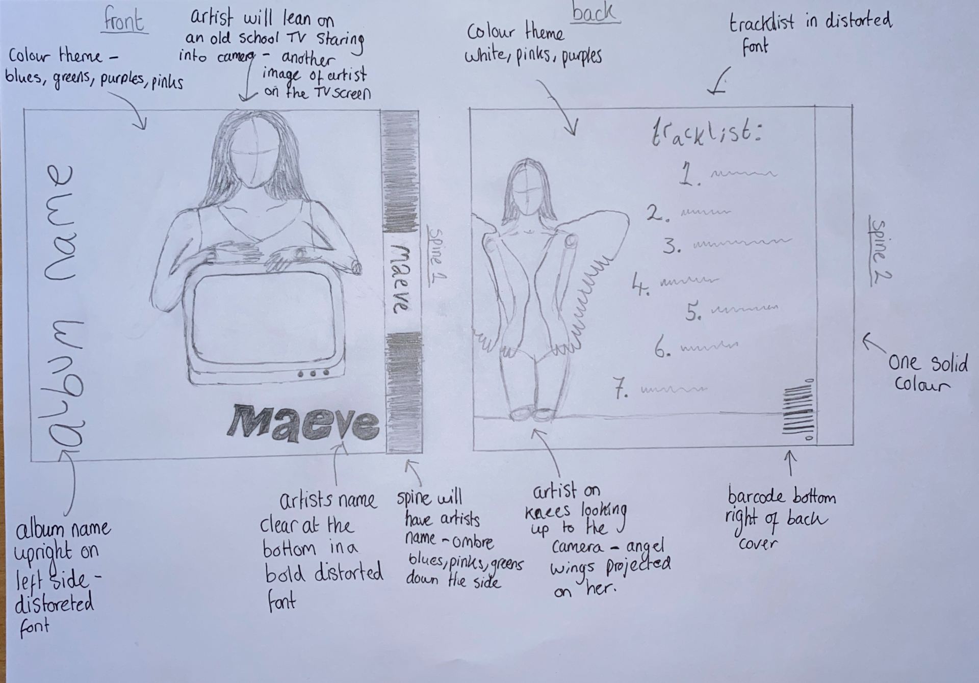
In order to know what we want our album to cover to look like so that it matches the genre and star image, using inspiration from the Padlet lookbook I drew a illustration of what we’d like the front cover back cover and both spines to look like. Below is a image of these plans by doing this creates a good blueprint of what we want to do in our photo shoot and how we want to edit it in InDesign.
For our front cover the artist will be leaning on a vintage TV with another close up image of the artist shown on the TV helping convey the theme of self-obsession. The colour theme will be dark blues, purples, pinks and greens; we an use a projector to help use all these colours. The font of the artist name and album name will be in a playful, modern distorted font. The spine will have the artists names placed on top of a sequence of ombré colours from the colour scheme. For the back cover the artist will be on her knees looking up the camera with the projection of angel wings on her, this will help convey the theme of innocence. The tracklist will be to the right of the artist using the same playful distorted font. The spine will be one solid colour and will not feature any text.


Below is some colour schemes I created on Adobe colour wheel using images from our padlet lookbook.


