Category Archives: Digipak

Digipak Draft 3

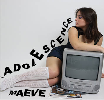
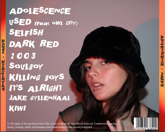
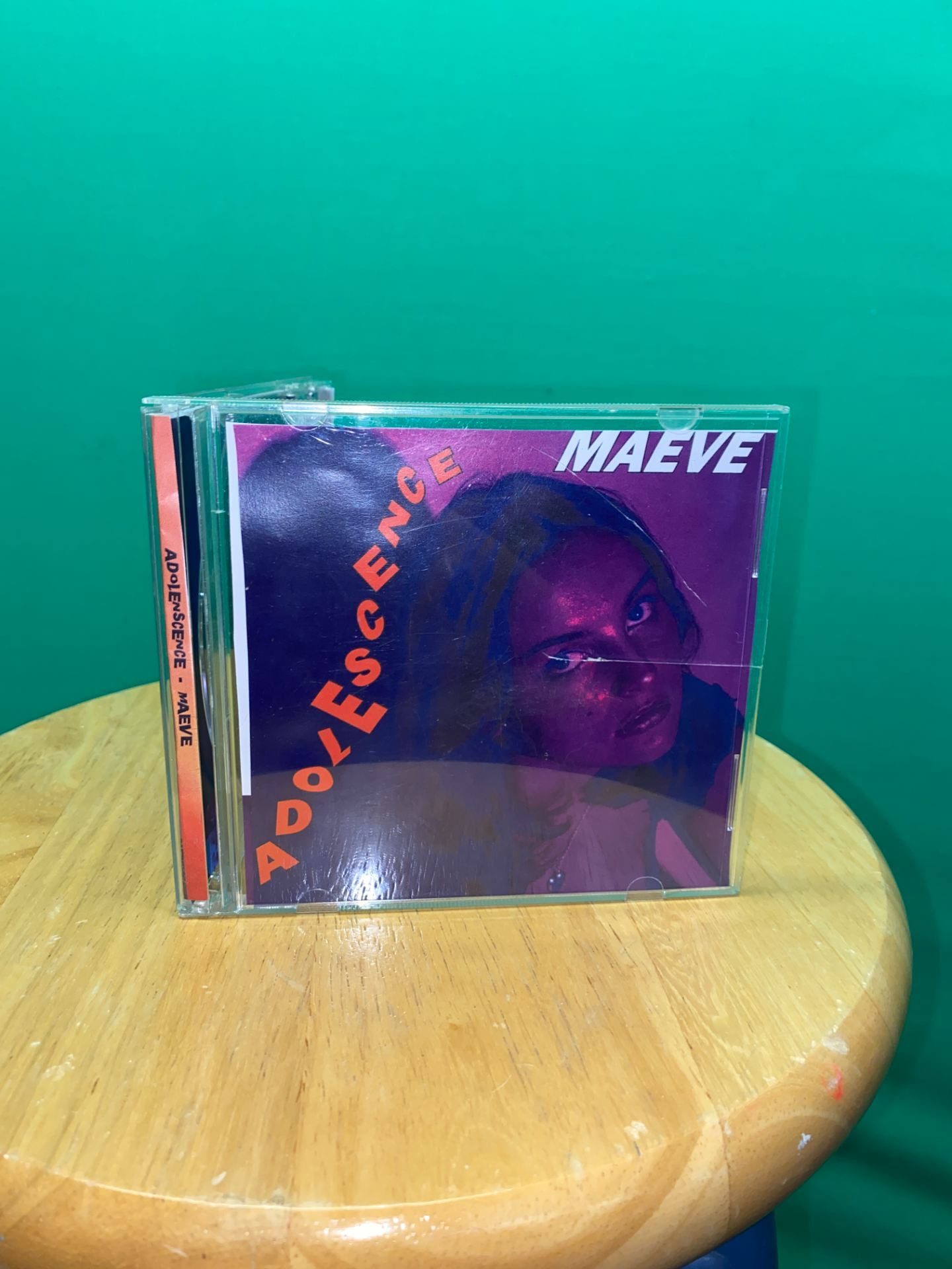
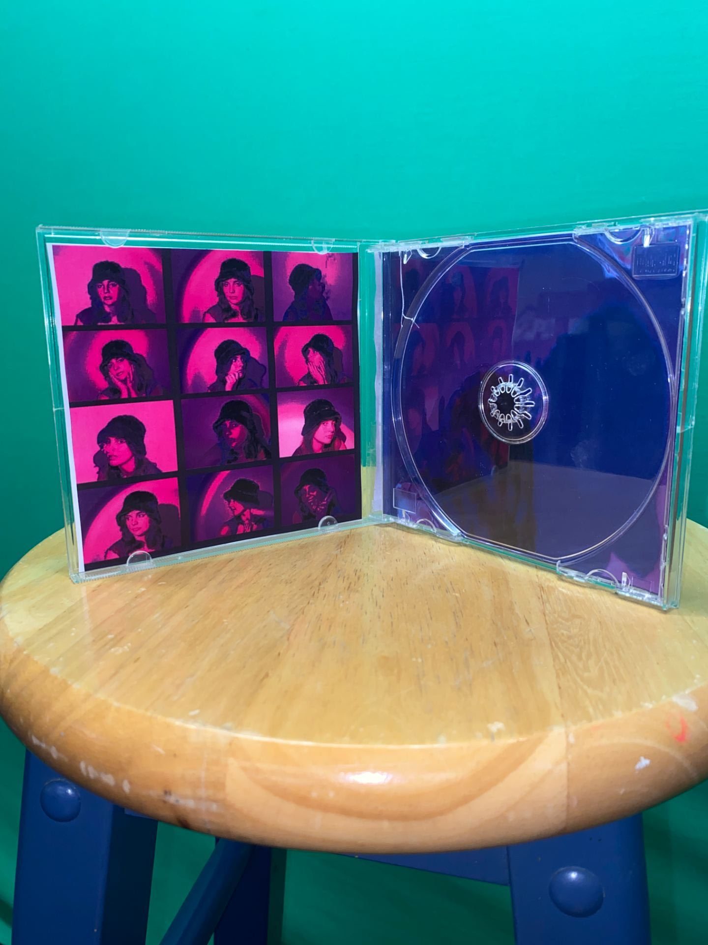
Below is our draft 3 of our Digipak and images of it in a CD case so that we could get an understanding of what a real album looks like and how we can improve. Using our teachers feedback we made changes to make the album more conventional and match the brand of our artist more. We changed the front cover image as we felt it didn’t match the genre and the themes we wanted to portray such as youth and mystery; we also found the old front over image was too dull so by adding a bright pink close up image it helps connote the theme of playfulness.

Feedback From Peers – What Genre Does it Represent?

To help us know if our Digipak matches the genre (indie pop) and to know if it helps portray the star image, metanarrative and branding we asked peers to say out of the seven genres which one they thought our Digipak represented

Pop: //////

EDM: /

Rock:

Country:

Indie: /////

R&B: //

Rap/Hip-Hop:

After receiving feedback from our peers it has benefitted us as we have learned our Digipak does show the genre however certain conventions of the Digipak may be misleading of the genre; this will allow us to edit a final draft in order to make sure out star image and branding can help portray across the correct genre of music.

Digipak Draft 2

Below is our draft 2 of our Digipak where we have incorporated feedback from draft 1 to get an improved draft. We have added an inside left pane and inside right pane to make the album more conventional and have played around with new fonts and colour schemes to help match the themes and genre of our artist.

Screencastify With Teacher Feedback:

Targets for Draft 3:

  • Find another font for the artists name (Maeve) for the front cover to add more variety
  • Make the background on front cover pop more – brighten it and potentially add colour behind
  • Make the artist more fresh by editing on photoshop (sharpen, brighten etc.)
  • Enlarge photo on the back cover to make artist stand out more
  • Edit using photoshop to make eyes more white and lips more pink
  • Find a picture to go inside the TV

Digipak Draft 1

Below is our draft 1 of our Digipak. It includes two panes, the front and back.

Self Assessment:

Targets For Next Draft:

  • Add more colours to the front page to make it less bland.
  • Photoshop images to make them pop more – sharpen image, brighten eyes etc.
  • Place an image of the artist in the TV.
  • Have a wider variety of fonts.
  • More technical conventions.

Evaluation of Shoot

Overall I would say our shoot was successful, we were organized and had everything we needed and got over 200 images which we can incorporate in the Digipak. The mise-en-scene was almost perfect for the shoot, with detailed modern butterfly make-up and multiple costumes consisting of bright colours it helped us convey our genre. One negative is we did not fully achieve what looks and photos we wanted therefore we are going to do a second shoot in order to get the images we want for example a better front cover photo and more close ups of the star for the inside pages of the Digipak. Another improvement we could do for our second shoot is change the aperture on the camera in order to get more exposed photos.

Contact Sheet

Below are the contact sheets from the shoot for our Digipak.

Below is my favourite image from the shoot. This is my favourite image as I think it captures everything we wanted the star to be represented as; playful and youthful. The mise-en-scene can be shown very clearly in the image which I believe makes the image good as it can help show the genre of the album. The lighting is also good as the blue/green light is projected onto the artist helping show every detail of the artists expression, make-up, costume, hair etc.

Photoshoot Production Meeting and Risk Assessment

In order to know what we need for our Digipak photoshoot and to make sure we get good photos we made a production meeting agenda in order to know what make-up, costumes, props and equipment we will need. By doing this it will enable us to have the best outcome we can for the shoot.

In order to go ahead with our shoot we need to assess the risks of where we will be filming at and understand how to manage the risk. Below is our risk assessment sheet where we have identified certain risks we may come across.


DP Mockup

In order to know what we want our album to cover to look like so that it matches the genre and star image, using inspiration from the Padlet lookbook I drew a illustration of what we’d like the front cover  back cover and both spines to look like. Below is a image of these plans by doing this creates a good blueprint of what we want to do in our photo shoot and how we want to edit it in InDesign.

For our front cover the artist will be leaning on a vintage TV with another close up image of the artist shown on the TV helping convey the theme of self-obsession. The colour theme will be dark blues, purples, pinks and greens; we an use a projector to help use all these colours. The font of the artist name and album name will be in a playful, modern distorted font. The spine will have the artists names placed on top of a sequence of ombré colours from the colour scheme. For the back cover the artist will be on her knees looking up the camera with the projection of angel wings on her, this will help convey the theme of innocence. The tracklist will be to the right of the artist using the same playful distorted font. The spine will be one solid colour and will not feature any text.

Below is some colour schemes I created on Adobe colour wheel using images from our padlet lookbook.

Digipak Conventions Analysis

To help when creating our own Digipak I analysed the front and back of an album cover from the artist Lana Del Rey who fits the genre of our artist. Another benefit of using this album cover is the cover conveys similar themes to our themes such as innocence and playfulness. By doing this task and analysing a popular professional artists album cover it benefits our group when making our own Digipak as we now know what makes an album cover conventional and unconventional, helps us understand the technical conventions and has overall given me ideas and a blueprint of what layout, colours etc makes a good album cover.

The Lookbook – The Branding Package

This is a look book we made full of images of tour posters, graphics, make-up etc. that we had to analyse for inspiration to help us have a clear image of our style and brand we are trying to put across when we are making our digipak. The repertoire of elements throughout all the images really project the alternative genre. This task was extremely helpful as it has helped us put down a blueprint of what themes we want to express in our digipak which are playfulness, power, and mystery; it will also benefit us as we now have a audience who we can target and make sure our digipak and social media page matches the likings of our audience.

Made with Padlet

Our Mission Statement – The Package Brand

In order to have a good brand established for our Artist we created a marketing strategy and mission statement to help promote our artist. This digipak is not meant to represent the music video but instead is to promote and represent the artist and create an integrated advertising campaign. Below is a slideshow showing the marketing strategy for our artist and digipak; it includes our mission statement, USP, call to action and our competition.

This was extremely helpful as we now know our audience and artist. The audience are around the ages 14-25 and the artists persona in a nutshell is soft and angelic with mixes of melancholy. Our star is also both ordinary and extraordinary, relating to the Dyer Star theory of the paradox of the star where the star has two contradictory representations. By having this ordinary and extrordinary representation of the star it helps the audience relate to the star but also idolize them.