Category Archives: Component 3

Contact Sheet

Below are the contact sheets from the shoot for our Digipak.

Below is my favourite image from the shoot. This is my favourite image as I think it captures everything we wanted the star to be represented as; playful and youthful. The mise-en-scene can be shown very clearly in the image which I believe makes the image good as it can help show the genre of the album. The lighting is also good as the blue/green light is projected onto the artist helping show every detail of the artists expression, make-up, costume, hair etc.

Photoshoot Production Meeting and Risk Assessment

In order to know what we need for our Digipak photoshoot and to make sure we get good photos we made a production meeting agenda in order to know what make-up, costumes, props and equipment we will need. By doing this it will enable us to have the best outcome we can for the shoot.

In order to go ahead with our shoot we need to assess the risks of where we will be filming at and understand how to manage the risk. Below is our risk assessment sheet where we have identified certain risks we may come across.


DP Mockup

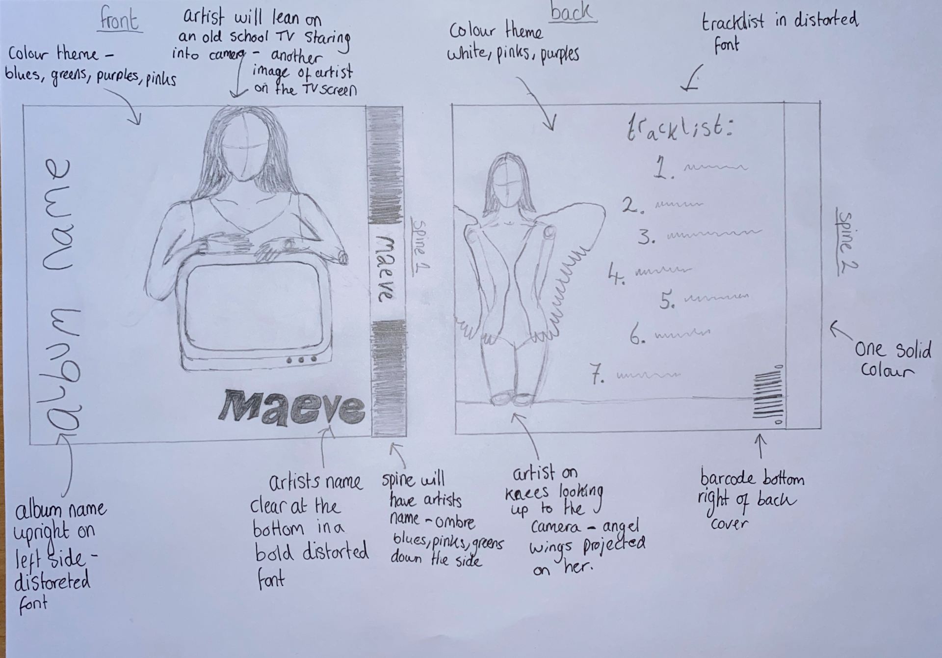
In order to know what we want our album to cover to look like so that it matches the genre and star image, using inspiration from the Padlet lookbook I drew a illustration of what we’d like the front cover  back cover and both spines to look like. Below is a image of these plans by doing this creates a good blueprint of what we want to do in our photo shoot and how we want to edit it in InDesign.

For our front cover the artist will be leaning on a vintage TV with another close up image of the artist shown on the TV helping convey the theme of self-obsession. The colour theme will be dark blues, purples, pinks and greens; we an use a projector to help use all these colours. The font of the artist name and album name will be in a playful, modern distorted font. The spine will have the artists names placed on top of a sequence of ombré colours from the colour scheme. For the back cover the artist will be on her knees looking up the camera with the projection of angel wings on her, this will help convey the theme of innocence. The tracklist will be to the right of the artist using the same playful distorted font. The spine will be one solid colour and will not feature any text.

Below is some colour schemes I created on Adobe colour wheel using images from our padlet lookbook.

Digipak Conventions Analysis

To help when creating our own Digipak I analysed the front and back of an album cover from the artist Lana Del Rey who fits the genre of our artist. Another benefit of using this album cover is the cover conveys similar themes to our themes such as innocence and playfulness. By doing this task and analysing a popular professional artists album cover it benefits our group when making our own Digipak as we now know what makes an album cover conventional and unconventional, helps us understand the technical conventions and has overall given me ideas and a blueprint of what layout, colours etc makes a good album cover.

The Lookbook – The Branding Package

This is a look book we made full of images of tour posters, graphics, make-up etc. that we had to analyse for inspiration to help us have a clear image of our style and brand we are trying to put across when we are making our digipak. The repertoire of elements throughout all the images really project the alternative genre. This task was extremely helpful as it has helped us put down a blueprint of what themes we want to express in our digipak which are playfulness, power, and mystery; it will also benefit us as we now have a audience who we can target and make sure our digipak and social media page matches the likings of our audience.

Made with Padlet

Music Video Draft 4

This is our forth draft for our music video. We have made changes to the editing and video using the feedback our peers gave us for our third draft. We also sent this forth draft to our teacher in order to receive the final pieces of feedback which we can use to clean up the video and create a finished piece.

Some of the final tweaks our teacher suggested to us was to position and scale some of the performance shots, cut some of the flashing shots so that she is off center, last shot needs to be slower (slow motion), dialogue shots could be zoomed in. These were suggested to us as due to us doing more shoots and adding more footage it started to take over and not fully show the dark side of the artist; by doing these improvements it will help give the audience a bigger connection to the plot in order for them to understand the dark, manipulative side of the artist. The improvement of positioning and scaling some of the performance shots will benefit us as it will help vary the shots and create a bigger dynamic in the performance.

Our Mission Statement – The Package Brand

In order to have a good brand established for our Artist we created a marketing strategy and mission statement to help promote our artist. This digipak is not meant to represent the music video but instead is to promote and represent the artist and create an integrated advertising campaign. Below is a slideshow showing the marketing strategy for our artist and digipak; it includes our mission statement, USP, call to action and our competition.

This was extremely helpful as we now know our audience and artist. The audience are around the ages 14-25 and the artists persona in a nutshell is soft and angelic with mixes of melancholy. Our star is also both ordinary and extraordinary, relating to the Dyer Star theory of the paradox of the star where the star has two contradictory representations. By having this ordinary and extrordinary representation of the star it helps the audience relate to the star but also idolize them.

Music Video Draft 3

This is our third draft for our music video. We have used footage from  all of our shoots especially our newest shoot (shoot 3). For the location we went to Tabs house to use her bedroom. We aimed to get enough good footage to create a third draft that we could start to try to do more effects and better editing in order to be able to just clean up certain parts for out final draft.

After doing our draft 3 we emailed our music video to other media students in order to get feedback about what was good about our music video and what improvements we can make.

Positive Feedback From Peers:

  • Good range of shots
  • Good use of mise-en scene – costume, hair and make up, props
  • The makeup and costume really fit the vibe and location
  • Good range of shots making use of closeups, longshots and midshots
  • The use of coloured lighting really adds to the atmosphere and helps the shots to pop
  • Mise-en-scene is good
  • Pace of edit is good

Improvements Suggested From Peers:

  • Black bit at the start – not meant to be there
  • There are a few cuts between shots which are slightly not on the beat
  • In the shot where she’s stood against the wall with the flashing lights, there are a few bits where the singing is out of sync
  • Some of the shots and zooms are a bit wobbly
  • Try and edit the clips at the beginning so the lip syncing is in time with the song
  • The LED shoots try and adjust the brightness as it is currently quite dark
  • More angles, lots are straight, maybe some side/low/high angle

Specsavers Feedback

To help us with our music video we had a visit from people who work in the media department at Specsavers where they watched our music videos and gave us feedback. They also taught us how to edit certain parts which we requested help with.

Feedback:

  • We need to edit to the beat more as some clips are completely off beat or fall in and out of beat.
  • Use colour tools to brighten the darker shots – running scene in the dark is too dark – makes it hard for audience to understand what is going on.
  • Potentially film a few more narrative shots to help transition from light to dark side – they gave us an idea of the star reading from the book in the light side and then fading into the star reading from the dark side to make and understandable transition.
  • Make some clips shorter as they dragged on too long and got boring and featured some bad moments.

Youtube Tutorials:

Shoot 3 Reflection

For our third shoot which we chose to do to get some extra footage we filmed both performance and narrative. For the location we went to Tabs house to use her bedroom as it fit the theme and subject matter we wanted to film and get across.

What Went Well:

  • Our group was organised which allowed us to get the shoot done without any complications.
  • We planned our shots and what we were going to film in order to get the footage we wanted.
  • The location we chose matched the aesthetic we were trying to achieve.

Targets for Improvement:

Due to this being our last shoot there is no targets for the next shoot. We will now focus on the editing of our video and watch YouTube tutorials and also get help from the Specsavers team in order for us to get the best possible edit we can achieve.