Category: Production (page 1 of 2)

Narrative Shoot Evaluation and targets

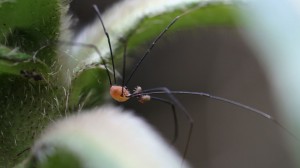
We arrived at the German Underground Hospital half an hour prior to the time we arranged, due to buses and making sure both the lead singer and all members of our production group were there. During this time we had we waited outside the entrance and took a few test shots as well as looking round for other potential shots. Whilst I was looking round I saw a long legged spider moving around in a plant and took this opportunity to use my macro 105mm sigma lens to film the spider.

IMG_9316Spider

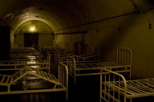
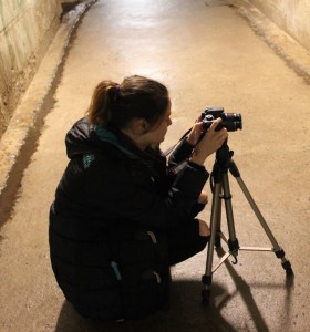
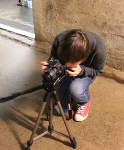
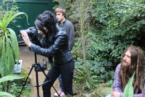
The time we arrived before also gave us a chance to retrieve and gather the different props we had brought to the shoot including getting and setting up the two DSLR cameras, two tripods,  three torches and the shoulder steadicam. Once the owner of the German Underground Hospital arrived he unlocked the doors and brought us through to the reception room. Once in reception he talked us through different safety precautions and what areas we were and weren’t able to go in. We were not able to go through the rooms containing the old beds and there were certain rooms that were locked and even the owner was not able to get through to without taking things apart. This did not affect our options too much and we were still very happy with the location choice and the permission from the owners.

2010-underground-hospital-beds

Once we were all on the inside of the old hospital we realised how cold it was and we were all very grateful we’d brought jackets and coats with us. The tunnels all looked very similar and there were so many of them leading different ways that we all naturally took a camera and split up looking for different interesting shots, coming across a puddle with water dripping into it I started filming both the water dripping from the top and the water as it splashed into the puddle. We then brought out the narrative shot list and began on the shots we had previously decided to take and started using our lead singer from shots of him just walking down the tunnels to him mouthing the words. We had previously downloaded the song to our phone so that we could play it, making the lead singer feel a bit more comfortable as well as helping him out with the pace of the original download.

In the two hours we had we managed to shoot most of the shots we had planned to get on our shot list as well as a few extras such as an old interesting looking ladder and a wall with what looked like mold dripping down which we felt worked with our genre. Every potentially interesting shot we could get we made sure to attempt to shoot, because we knew this would be our only chance at this location and having more shots was better than having too few.

IMG_0124IMG_0125

Overall the narrative shoot went really well and we achieved a range of shots that we can use in our music video. Things that we would do differently if we had the chance and to remember for another production day include:

  • more takes of each shot to increase the chance of being able to achieve a better final shot
  • Finding out more about what we are or aren’t allowed to do and which rooms we were allowed in
  • Bringing more sources of lighting for areas that did not have lighting. (although we brought a few torches some areas were still very dark)
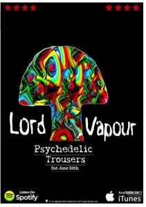
Advert Final

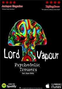
After receiving feedback from someone who fits into the target audience of our proucts, a male aged between 18-40. I received advice to include quotes with the star ratings from relevant magazines that would attract the target audiences attention. Because of this I have completed the finished advert and included these quotes.

advertjpeg


I think this advert is a lot better than my original digital draft, displaying where the album is available to listen to and download, as well as including the release date.

I think the addition of having the star ratings and the quotes from alternative magazines really targets the target audience and shows the quality of the product as well as the genre. I think the advert looks really professional and is very conventional of the genre.

I am very happy with  the outcome of the advert as the final product, I think it links with the other products and presents the genre and the band really well.

Advert Draft 2 and feedback

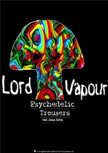
After getting feedback from another student I was advised to add more to my advert, for example where the album is available to buy as well as a star rating, this could attract the target audience with good reviews and also make the album itself easier to purchase, which is the aim of the advert. Here is my draft 2 of my advert with these comments in mind I have made changes and I think this advert is significantly better.

advert draft 2

I have now asked another peer for feedback on my draft 2 and I have voice recorded their feedback. Because the person who gave feedback is a male aged 19 they fit into the target audience and makes their feedback even more helpful and relevant.

Overall they felt like the advert was almost finished and where I have shown the availability of the album was good and helped connect with the younger generation of the target audience. One piece of advice I received from the feedback was to finish the advert by including quotes with the star ratings from magazines that the target audience would recognise, therefore making them more interested.

Advert Draft 1 and Feedback

Here is the first draft of my Advert, I have used the same image as my digi-pak as well as the same font. I have added the release date and the production company in the small print at the bottom. I have added a wider black background to increase the space I can add information to.

advert1

Please click on image to see Advert on a larger scale.

I asked another student to look at the advert and give me some feedback so I can work to make the advert better and more conventional.

The feedback shows that Sophie felt  the font and image was good and represented the genre well, but the advert could use ratings from magazines such as The Rolling Stone or any other magazine for alternative bands, this would fill the poster up a little bit more and make it look more professional as well as being conventional to a lot of other adverts done by psychedelic rock bands.

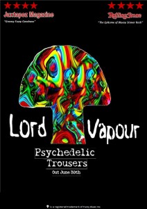
I have taken the feedback into account and have edited the advert further to make a draft 2. This includes ratings from magazines, stars and quotes to make it look more professional and legitimate.

advertdraft2

I think this version of the advert looks a lot better, but I will get more feedback in the hope to improve it more.

Digipak Evaluation

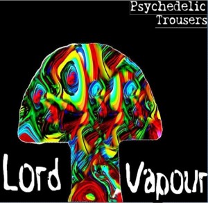
Overall I think my digipak has come along really well. Because I have not done a shoot for my digipak and it was created entirely digitally I have done an evaluation of my editing and the progress. It has taken a long time although I did not need a photo shoot to create my digipak, the work done digitally took a long time. Ipiccy was a really helpful online editor, as a kind of cheat to Photoshop with the same kind of effects but taking less time and with a simpler layout. I used a range of effects to create my digipak and edit the original photo to the images I used for my digipak.

bubble for coverfront cover final 1

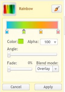
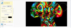
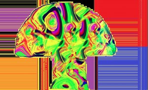
The editing process was long and sometimes I felt there must be a quicker way but I carried on. Using the ‘erase background’ tool to create the basic shape of a mushroom from the colours and then  zoom to smooth the lines. I then decided to use a black background, this is mainly because I felt this made the colours stand out really well. I used the rainbow effect to add more colour, the liquify tool to create the pattern, the erase background tool to slowly cut out a mushroom shape and the vibrancy effect to increase the intensity of the colours.

saturationrainbowvibrance

erasing 2

After perfecting the mushroom shape to a standard I thought would work well for the genre I found a website containing downloadable free psychedelic fonts and used this to generate the band name and title for the front cover of the digipak. This is really important because the image is so bright and eye-catching the band name and title of the album could easily be missed, I thought making the font white created the most contrast between the black background and the coloured image and therefore I used a white psychedelic font for both the band name and album title. The fonts are slightly different but also similar enough to see the link in genre.

front cover final 1

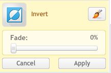
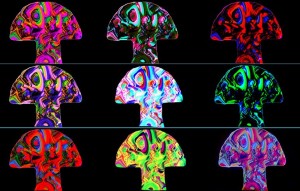
I used Ipiccy also to create the Inlay front and part of the Inlay behind. The Inlay front involved using the same image that I’d used to for my front cover, inverting the design each time and changing the colours I then saved each design. I then used Publisher and brought each image into the publisher template and making each small enough to have three on each row and have a complete image of nine different coloured but still bright and vibrant mushrooms. I then created two thin lines horiztonally between the mushrooms with a light blue colour, showing the separate images.


invertinside cover piccolour balance

The Inlay behind part of my digipak also uses the same mushroom image again with different colours and editing. I used different colours and inversions on the image and changed the colour completely to the front cover. I then opened the image up in Microsoft Publisher and created a range of different coloured shapes and lines, I think this created a trippy effect and worked really well for the cover, whilst still keeping a correlation between all of the covers of the digipak.

IMG_8721editstrange colours

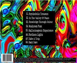
The back cover of the digipak was quite easy, using the original design without the mushroom cut out I inserted a black rectangle in the middle of the image, this allowed me to create a song list on the back of the cover which is conventional of the back of albums. I used the same font as I had for the band name on the front cover of the digipak in a smaller size. I used number 01.-08. with the zero’s before being conventional of psychedelic bands. and the number of songs also being the minimal amount of songs that would be used on the back of a digipak. I created a logo online with a free logo-maker. Using a mushroom clipart picture and editing it until it looked most professional I used this as the production companies logo. I looked at other digipaks from the genre such as Jimi Henrix’s vinyl back cover and used this for the small print at the bottom of the back cover which is conventional of all digipaks. As well as adding a barcode which is helpful for buyers and also makes it look more professional. Here is the back cover of my digipak.

back cover black thing bottom

Overall I really like my digipak and I think the editing went really well. If I had more time I could possibly change a few things but I think the digipak is really conventional for the genre and looks professional and well done.

Digipak contact sheet

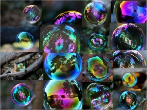
Here is the different bubble photography I already have. I have put the images into a contact sheet.

11150328_1460541754237879_1980446454389137587_n

I chose this image because I felt the colours were most vibrant and it fills most of the frame of the image.

bubble for cover

I think using editing I could create a really interesting and completely different final image for the covers of my digipak from this image. The bright and vibrant colours can be accentuated and I can turn it into a completely different visual image completely.


Draft 2 – Feedback

We asked some other media students if they could watch our music video and give us some feedback. We video’d them as they watched our video and gave us feedback and here it is:

The feedback is really important to us and means we can see the video from a different perspective, after watching the same clips and hearing the same audio it can put us in a set mind frame whereas a different audience can really help give us new ideas and tell us how they see it. We received some really positive feedback in regards to our use of colours, how the colours are bright and therefore fitting into the psychedelic genre. We also received really positive comments about the increase of contrast and they said it works really well and adds interest, they liked the overlays done through editing and thought it made our video look more professional.

Some of the areas that they told us we could improve on were

  • They pointed out a blank space which we needed to fill with footage
  • Some shots of the guitarist had been used more than once
  • Some shots were slightly long and let down the upbeat pace of the song
  • The overlay of the skull did not improve the shot because of the movement of the shot on top
  • Although they liked they use of the snake shots, these shots were not brightly coloured or contrasted like the other shots and therefore didn’t work so we can improve this by editing these shots more similarly by increasing the contrast and adding more colour
  • Some of the overlays could have more of a fade to allow for a smoother transition.

These comments are really helpful and we can use the areas we need to improve on when we reopen the video to edit and keep these comments in mind.

Lord Vapour – Psychedelic Trousers – Draft 2

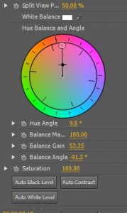
After receiving Youtube comments for feedback on our Draft One and being given advice to chose between black and white or colour for our editing. Also receiving comments that the colour was more interesting as well as fit our psychedelic genre better we decided to stick with colour for our music video. After looking back over our research of similar bands and their music videos I came across Queens Of The Stoneage who often used high contrasted editing in their music videos and this worked really well creating bright psychedelic colours as well as interesting effects to the shot. We have edited the music video for Draft 2 increasing the contrast on the shots as well as editing each shot with bright colours and increasing the colour balance on each individual shot.

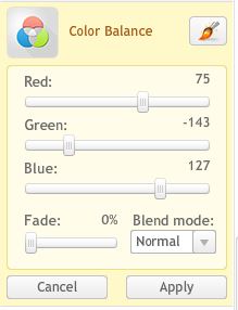
Using Adobe Premiere Pro we used Video Effects and then ‘Color Balance’ ‘Brightness and Contrast’ and ‘Fast Color Corrector’ to get the high contrast bright coloured effects. We also sped up some of the shots so that they fit in with the pace of the music more as well as keep the energy of the video up because this was a comment that had been made on our feedback of Draft 1.

brightness contrast  fast colour correctorspeed

Here is our Draft 2 and I feel there is a huge improvement after the feedback we received on Draft 1 and the editing we have done as a result.

Draft 1 (Narrative and Performance)

We have used shots from our narrative and performance shoots and created our Draft 1. We made a more obvious difference between the black and white editing and the coloured editing, not because we plan on keeping the video this way but because we felt like it could create a more obvious contrast between the both and could help us decide which one was better for the video. Looking to the feedback we received from the performance rough cut one of the things it was suggested we improved on was the synchronization of the singers mouth movements and the song lyrics so we have tried to do this in our Draft 1.

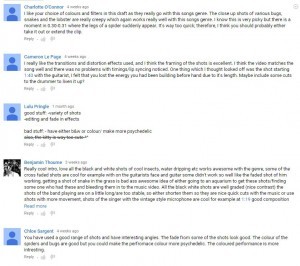
After posting our Draft 1 on Youtube we then received comments from our peers and previous media students. Here are some of the comments we received:

feedback

Please click here to see the full document

Some of the comments we received were very positive and for these comments we will try and keep these areas of the music video the same because of the way the audience has positively reacted with them. Comments on things we could improve on included an area where someone felt like the energy was not as good as the rest of the video because of a particularly long shot. We will look into shortening this shot and adding more shots and quick paced editing to improve the energy. A comment that was made more than once again was that we needed to chose between black and white effects or bright psychedelic effects, someone also added that they felt the bright colours fit more into the psychedelic genre and therefore we have decided to stick to bright colours in our editing for Draft 2 because it works well with our genre and the bright lights and colours from some of our performance shots will look better in colour. Finally a comment made was to use more shots of the drummer because there were not as many shots, we will try and do this more in our Draft

Receiving these comments from the Draft 1 we put on Youtube was really helpful and will really help us to improve our music video in editing as well as give as a fresh perspective from the target audience.

Rough Cut Performance Feedback

After creating a rough cut of our performance we asked two students in our media class to give us some feedback on what they liked and thought we could improve on from our rough cut performance footage and editing. We video’d the other media students giving us feedback so we could replay it and take their opinions when editing it later.

Some of the things that the other students said they liked were

  • The range of angles, including the low angles of the drummer and the canted angles creating a surreal and different experience
  • The shallow depth of field focusing on the important subject in the frame
  • They liked the ghosting effects used creating an obvious movementSome other comments the other students made
  • They liked both the effects of the bright colour and black and white but felt like the effects didn’t work together in the video and we needed to chose an effect to use overall
  • There were a few moments that the lip synchronization to the music did not work very well

These comments are all very important and can show us what we have done right and shouldn’t change as well as the things we need to work to improve.

Older posts
Skip to toolbar