
Category Archives: Music Magazine
Final Draft and Flipsnack of Magazine
FlipSnack
Final Drafts
Chosen Adverts
This is a advert that I thought would contribute well with my magazine as I think that it could apply to my target audience.
I am aware that this wont be marked but i think that it will compliment the Flipsnack well and and more legitimacy to my final product.


The reason why I think that these adverts fit well with my magazine and target audience is that the music which my magazine is promoting has a emphasis on being “real”, which means that the artists will write and sing about their real life struggles with mental health and other issue that has given them difficult stages through their life. Most people who listen to these artists often also go through these struggles and they have a sense of relatability and connection the the artists. This is why I thought this advert would fit with he demographic as the words seem encouraging and fit in well with the genre of music that my magazine is promoting.
Complete Magazine

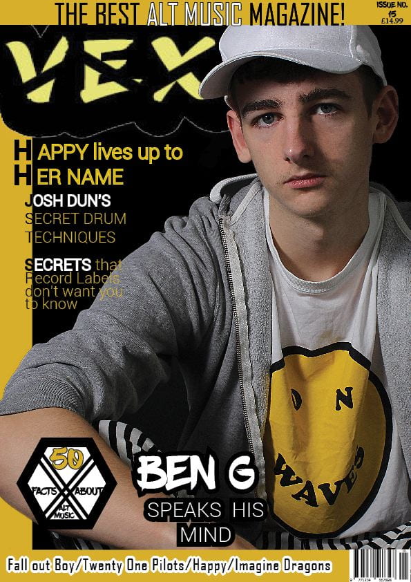
What’s New (Front Cover)
- changed the plug fonts to make sure we didn’t have too much of the masthead font.
- added graphics around the sides and bottom
- made the masthead bigger
- added more coverlines
- wrapped the coverlines around the arms

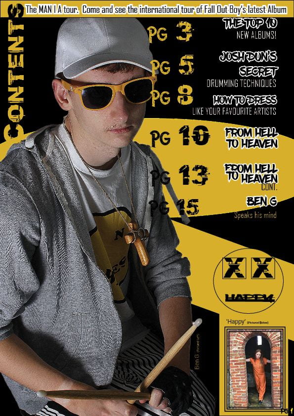
What’s New (Contents page)
- added more coverlines
- captioned the inset and the main cover star
- changed the fonts for the coverlines
- aligned the numbers
- fixed the unnecessary page number
- fixed the line spacing.

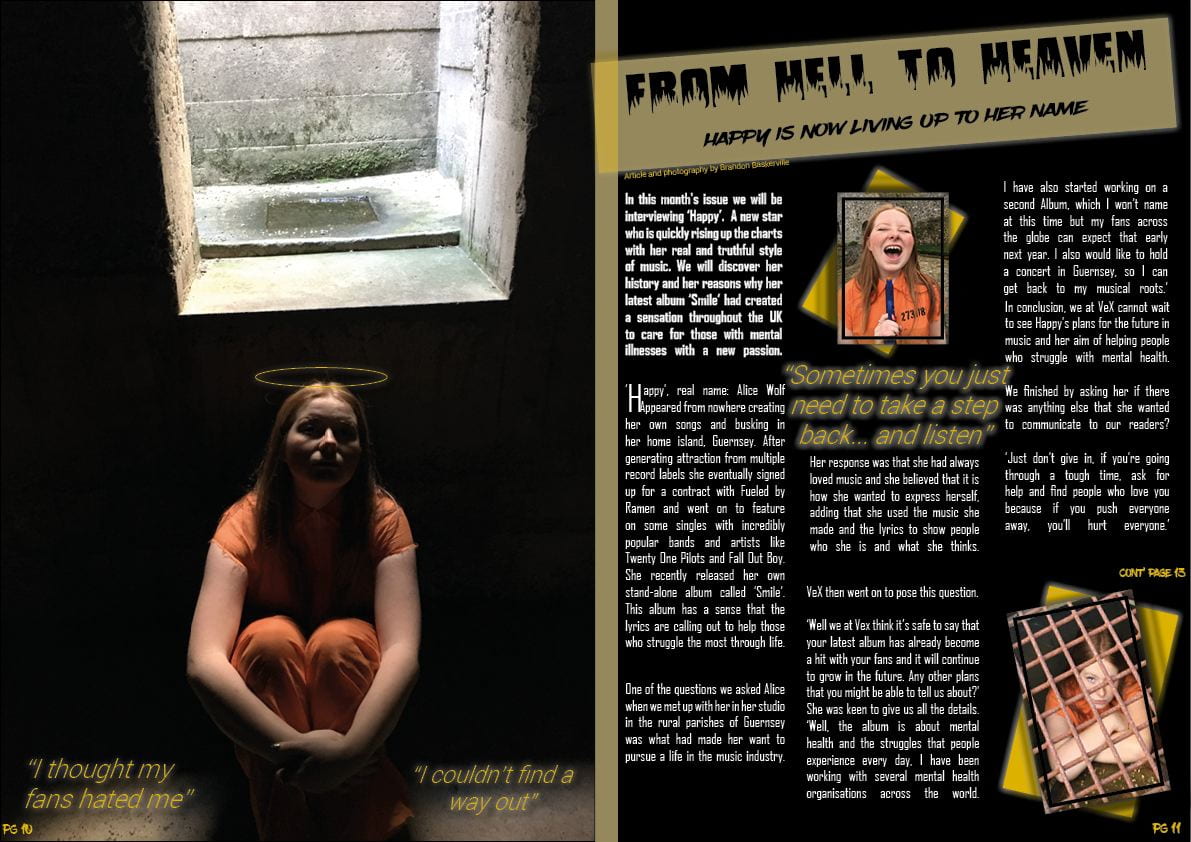
What’s New (double page spread)
- put the quotes in italics
- centered the sub-heading
- added depth to the bounding box
- moved ‘cont. on pg 13’ up
- justified the columns correctly
- made sure the paragraphs were evident
- aligned the top two paragraphs are the same height.
Summarized Feedback.
Front Cover
- More coverlines
- move barcode
- make ‘Ben G’ bigger
- add banner
Contents Page
- odd spacing
- keep headline theme
- move page number
- info on inset
Double Page Spread
- Keep consistency with orange
- change the article fonts
- strange alignment
- bigger headline
Contents Page Draft 3
This is the third draft of my contents page.
Since draft two I have changed the colour of the yellow to match the yellow of the front cover. I also changed the image and sharpened it to make it clearer. I reorganized the coverlines to have more continuity and I captioned the inset and main picture.
Contents page Draft 2
This is Draft 2 of my Contents Page. I will use this post for feedback to make my future drafts better.
This is what’s new since the first draft.
- Reorganized the page numbers and titles
- added some more graphics
- changed the ‘contents’ title
- de-blemished the picture and took away the fuzz effect and sharpened it
- added an inset.

These are my targets for my next draft.
- more coverlines but smaller font…
- caption the inset
- who is the image of? caption him.
- change the font in some of the coverlines i.e. a different font for the information and use this font for the main heading
- needs some alignment as a big higgeldy piggeldy
- page number on the right hand bottom corner
- line spacing issues?
Double Page Spread Draft 2
This is the second draft of my Double Page Spread. I will use this post to gather feedback to help me with my final, third draft.
What’s New
- Cleaned up the tile area from fonts
- Added a drop capital
- changed the fonts and size of the quotes
- created continuity between the two insets
- reorganized the paragraphs.

My Targets
- captions/quotes in italics
- center the sub heading
- add some depth to the bounding box
- move “cont. on page 13” up a bit
- justify to right and left the copy in the columns
- make sure the paragraphs are evident
- align the right and left columns to start at the same height
Front Page Draft 2
This is the second draft of my music magazine front page. I will use this post to gather feedback to improve the future drafts.
The changes I have made since Draft 1 are:
- I have de-blemished the photo and sharpened it to give it a cleaner look.
- I have added more plugs and re-arranged them to create more space.

My Targets
- What’s new and what’s next?
- too much of the masthead font
- nothing at the bottom
- make masthead bigger
- great photo but more cover lines
- wrap cover lines around arms
Contents page-Draft One

Targets
more coverlines
not sure about the filter on his photo….
;ove the graphics
check typos…favourite spelling
page number for the actual page
the placing of the coverlines is strange…over his face? and no alignment?
Double Page Spread-Draft One
This is the first draft of my double page spread for my music magazine. I will use this to get feedback and create targets to help me improve future drafts.

My Targets
- masthead across the fold
- quote placement
- Image continuity
- strange column alignment
- drop capital
- byline/photo byline
- page numbers
- too many fonts in the masthead.