It is important when labelling this poster to identify the main features as it allows me to expand my knowledge and gain the names of the key terms that I need to remember and add into my magazine cover.
I will need to make sure I incorporate all of this thing onto my magazine front cover when I come to create my masterpiece. This masterpiece will shortly be getting started on an amazing project which will also be posted later on my blog.
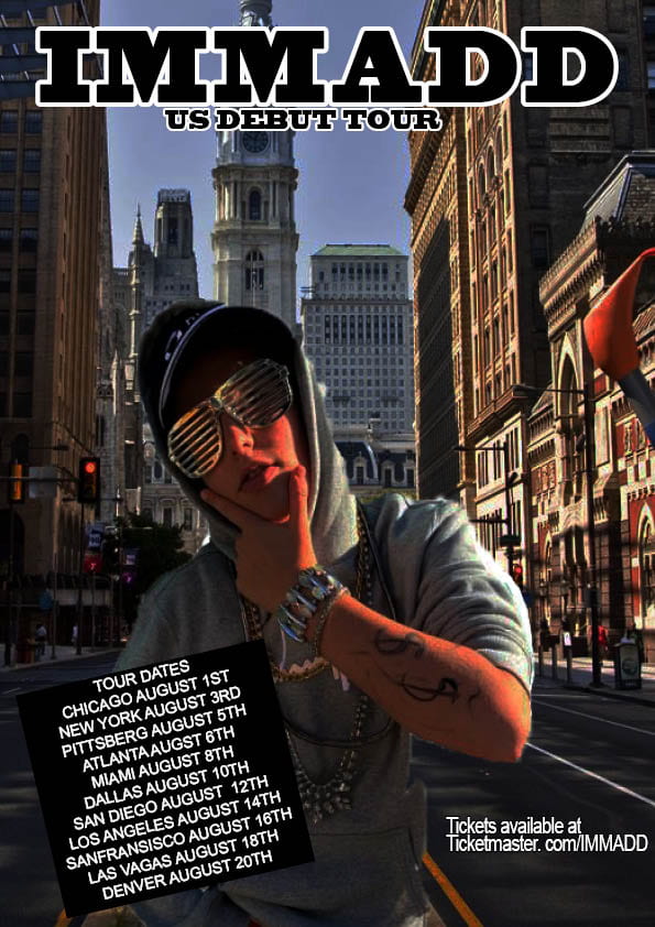
Today i have been researching into some retro style rap. This gave me a good incite into want types of colors, layouts and fonts they use. In all of the posters or album covers they seem to all try and show wealth through different conventional ways, these ways can be showing;
Money,
Expensive jewelry.
Expensive clothes,
Big groups or gangs .
They use very dark colors, most being a black background with a white sans serif font, although there have been a few posters which have been using serif fonts to add a cool retro looking vibe to their posters. some posters have used a more basic pastel color for font to allow their old school style top be portrayed into the poster.
Please click on the image to see a clearer PDF.
To conclude the rap posters use dark colors mostly for the background and for what they wear for the photo shoot to pick their final picture for the poster. Most of the fonts seem to be white and in sans serif, but this can vary. Most of the rappers like to try and add a retro type vibe as it shows a feel for their music.
Apertures affect the depth of field (what the camera is focused on), for example, if you were taking a long shot and wanted everything to be in focus with would use F22 but if you wanted to have a strong depth of field you would use F2.8. On the other hand shutter speed can be used to stop action or create a sense of movement in a photo, for example, if you were taking a picture of a sport car you would set it to a very high shutter speed if you wanted it to be sharp and in focus, although if you wanted to create a sense of movement you would have to set it to a slow shutter speed to it blurs slightly.If we had set all these correctly the photo would be exposed well and would look good. All the images below used angle and framing to create a narrative for the audience. This will impact when I come to take photos for my magazine as I will know how to create a narrative just from a photograph, without words being used.
There is a struggle for me being dyslexic to read this title without the R and A hole in the upper part of the letters, as the black on the almost white gold background of the ‘painting’.
HAving potential consumers who could have the same or worse problems with reading could mean that they change the font or the colours of the poster to allow access to the people with difficulty.
I am hoping to learn about different skills in design and to learn utilize these skills in my word and on personal projects. I used to be crazy for computers and I have previously created music magazine covers with photo shop and I have existing knowledge on the uses of some design programs. Completing coursework will help develop my time management and allow me to gain understanding of how to maximize my time on blog. I would like to study sports media at Cardiff Met University and skills and knowledge gained will really help my future ambitions. Working with groups is a skill i would like to be able to develop as I would like to listen to others ideas and utilize the idea to do the best work.
This collage of pictures may affect my magazine as my music taste in rap and expensive clothing will be portrayed when I start to create my music magazine allowing users to see how expensive and where to buy what clothes are shown in my music magazine.
My viewers will be able to find all the magazines social media outlets and see our posts online. We will also give them the latest tricks on how to write your own music. We will be offering style advice also, there will be plenty of information on where and where to go for all concert/artist information, outfits worn within the magazine and where you can get products from.
Blumler and Katz will influence my decision when creating my magazine as I will want to have an equal section of information and entertainment while also allowing people to enjoy looking at similar fashion styles.
I think the target audience will find everything they will need in my magazine as we will split all the section to allow the readers to consume more of the magazine. There will competitions even be in the magazine as well competitions on our social media as this will increase the amount of exposure that this magazine will get on social media without even having to pay to promote it yourselves
Underneath is a break down of my mood board into what they show in my personal opinion.
Blumler and Katz
Information –
Social media,
Youtube,
Netflix.
Entertainment –
Social media,
Youtube,
Netflix, Spotify,
Wales Rugby,
Southampton Football.
Personal identity –
Gucci,
Versace,
Tommy Hilfiger
Social media,
Spotify,
Wales rugby,
Southampton football.
Social interaction –
Gucci, Versace,
Tommy Hilfiger,
Social media,
Spotify.
Reflection.
In my mood board, I used a lot more entertainment then I did with my information, although I do still check the news twice a day and watch a lot of sports news. This mood board portrays my love for expensive clothing and very nice style as well as two of my favourite drill groups.
To reflect on my work, I think I will be able to possibly find a better cover photo for my magazine as this one was found and incorporated as time missed resulted in me changing poster.
I think that the text section could have had some more time spent on focusing on the with and size of each letter with what effects embedded.