In this post I will be taking 9 photos to add to make a moodboard and I will Hashtag technical commentaries and I will communicate a story. #Camera Term/#Denotation/#Connotation. I have done this to allow myself to gain information on how different camera shots portray different meanings. This has also helped me to learn how a camera angle can change the entire vibe of a story.
Category Archives: Print Preliminary Tasks
My Tour Poster!
Today i have been researching into some retro style rap. This gave me a good incite into want types of colors, layouts and fonts they use. In all of the posters or album covers they seem to all try and show wealth through different conventional ways, these ways can be showing;
- Money,
- Expensive jewelry.
- Expensive clothes,
- Big groups or gangs .
They use very dark colors, most being a black background with a white sans serif font, although there have been a few posters which have been using serif fonts to add a cool retro looking vibe to their posters. some posters have used a more basic pastel color for font to allow their old school style top be portrayed into the poster.
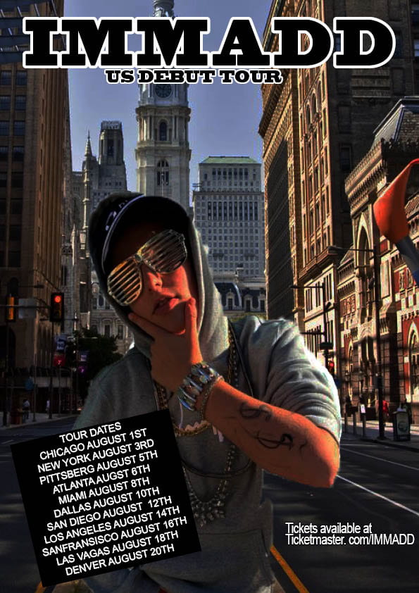
To conclude the rap posters use dark colors mostly for the background and for what they wear for the photo shoot to pick their final picture for the poster. Most of the fonts seem to be white and in sans serif, but this can vary. Most of the rappers like to try and add a retro type vibe as it shows a feel for their music.
Technical Camera Terms
Apertures affect the depth of field (what the camera is focused on), for example, if you were taking a long shot and wanted everything to be in focus with would use F22 but if you wanted to have a strong depth of field you would use F2.8. On the other hand shutter speed can be used to stop action or create a sense of movement in a photo, for example, if you were taking a picture of a sport car you would set it to a very high shutter speed if you wanted it to be sharp and in focus, although if you wanted to create a sense of movement you would have to set it to a slow shutter speed to it blurs slightly.If we had set all these correctly the photo would be exposed well and would look good. All the images below used angle and framing to create a narrative for the audience. This will impact when I come to take photos for my magazine as I will know how to create a narrative just from a photograph, without words being used.
Print Media that Communicates Meaning
There is a struggle for me being dyslexic to read this title without the R and A hole in the upper part of the letters, as the black on the almost white gold background of the ‘painting’.
HAving potential consumers who could have the same or worse problems with reading could mean that they change the font or the colours of the poster to allow access to the people with difficulty.
My magazine swede
This is the magazine swede I copied while learning some skills in InDesign to allow me to utilize those skills in my future magazine.

This is the original I copied.
To reflect on my work, I think I will be able to possibly find a better cover photo for my magazine as this one was found and incorporated as time missed resulted in me changing poster.
I think that the text section could have had some more time spent on focusing on the with and size of each letter with what effects embedded.