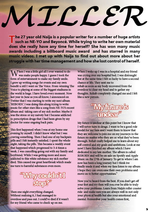
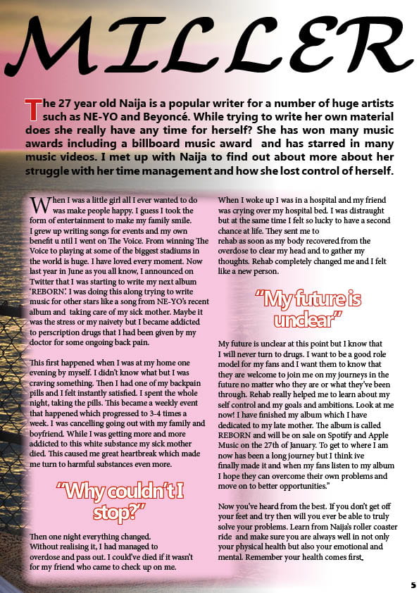
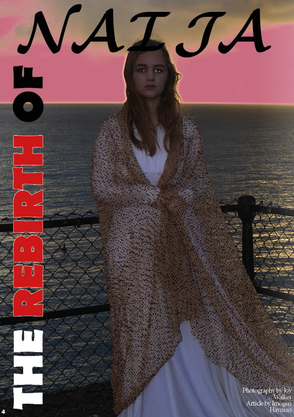
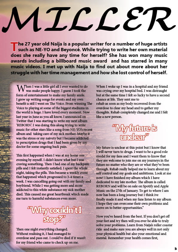
I asked another students in my class for some feedback on my DPS
This is what they said:
Student one:
What do you notice first about my DPS?
- The bright colours and image
What makes my DPS unique?
- The font is unique and the positioning of the font down the side of the left page
What do you like most about my DPS?
- The font of the stand first
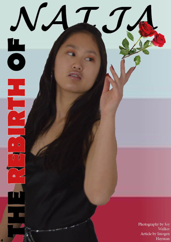
- The bold image of her throwing away the flowers
- The two drop capitals
What do you not like about my DPS?
- The font is the same the whole way through the article – it is quite difficult to read. The positioning of the by-line doesn’t fit the conventions – change the writer and the photographers names so they are different.
What do you think can be improved?
- The font – vary it
- Make the roses more believable – I don’t think that they are coming from her hand
- Make the pull-quote stand out more in a shape or something?
- A signal that the article continues on the next page?
When you see the DPS does it make you want to read the article?
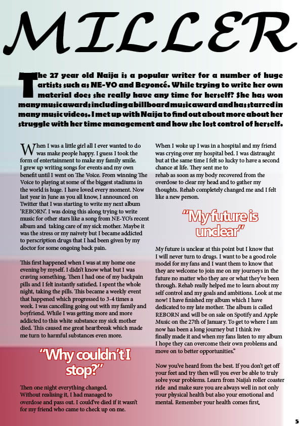
- Not particularly because there is a lot of writing with no gaps – bold writing
What else can I add to make my DPS more exciting/appealing?
- A thinner font, coloured background continue on the right page – coloured lines
Any additional information you want to add:
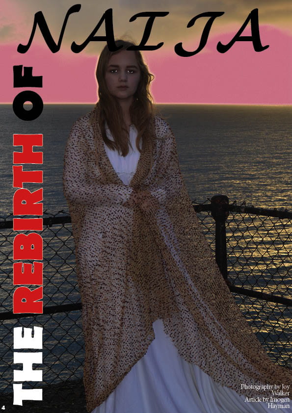
Student two:
What do you notice first about my DPS?
What makes my DPS unique?
- The style of the pages and the style of the writing
What do you like most about my DPS?
- The red and black writing across the side of the page
What do you not like about my DPS?
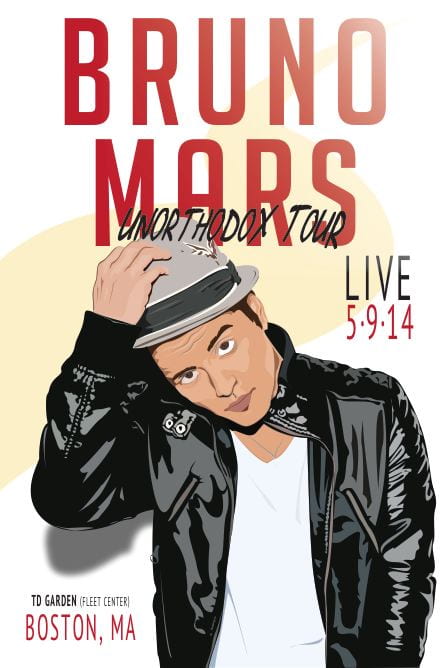
- I don’t like how the models head covers the writing
What do you think can be improved?
- The fact the model covers the title
When you see the DPS does it make you want to read the article?
What else can I add to make my DPS more exciting/appealing?
Any additional information you want to add:
Targets for development:
- change the font of my article
- get petals falling down the page
- more bold, colourful quotes
- put a shape around my quotes
- change the name of the writer of the article