January 7

Design Skills 2

Through working on my magazine I have improved a lot in my Design skills.

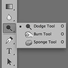
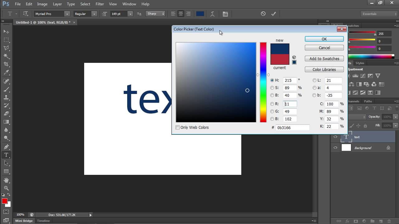
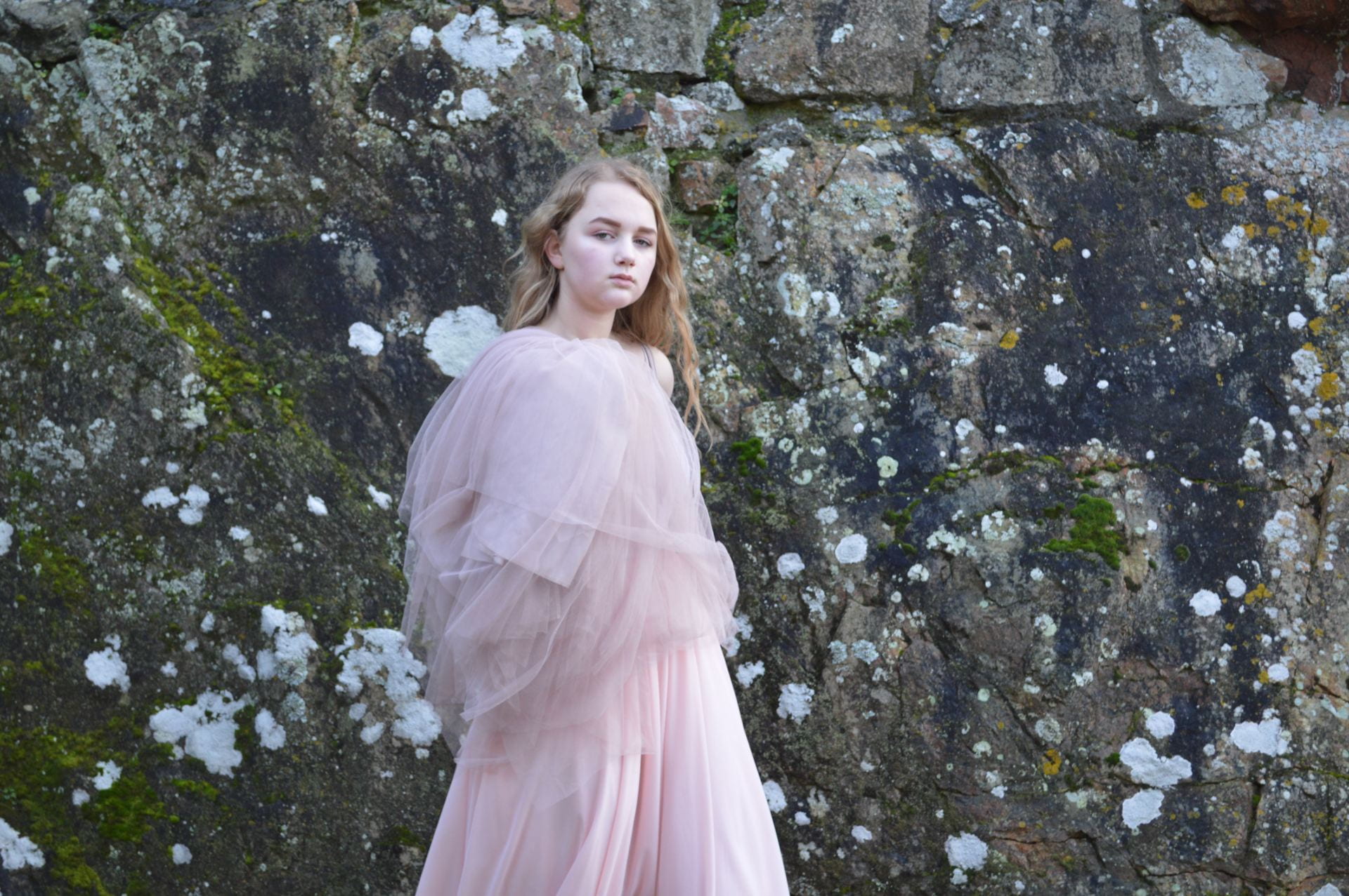
In Photoshop I have learnt to brighten the whites of someones eyes so they are not too dark. I can also play with curves of photos to change their perspectives to the audience. This helps to progress their star image and narrative since editing the photo can tell more of a story I can change the colour of my models and make them sharper. I can give my models highlights and flip the photos both vertically and horizontally which has helped portraying my genre.

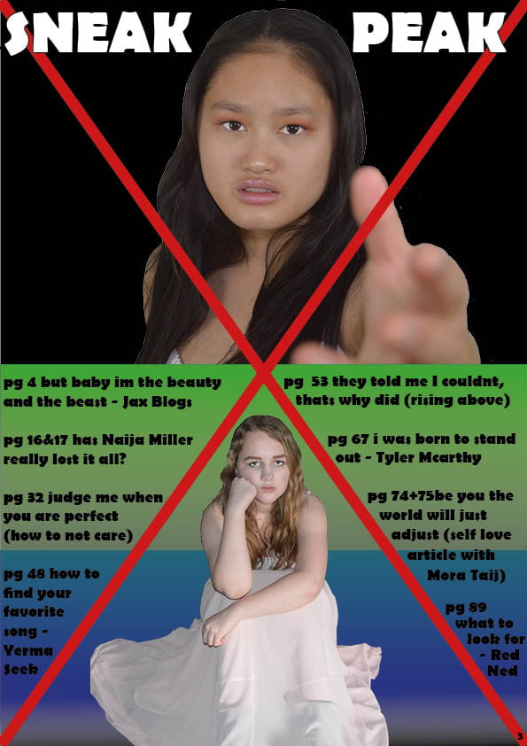
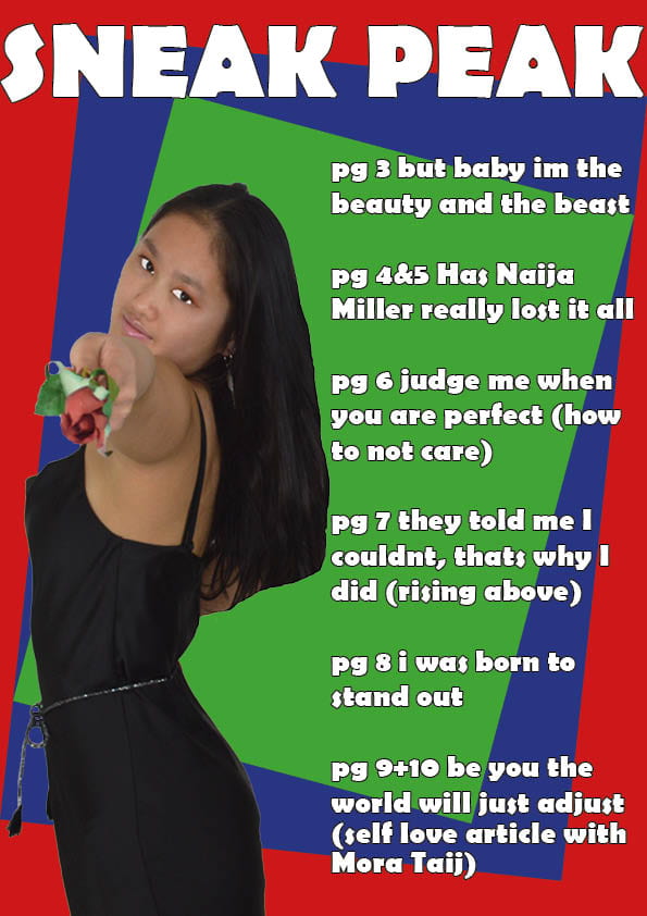
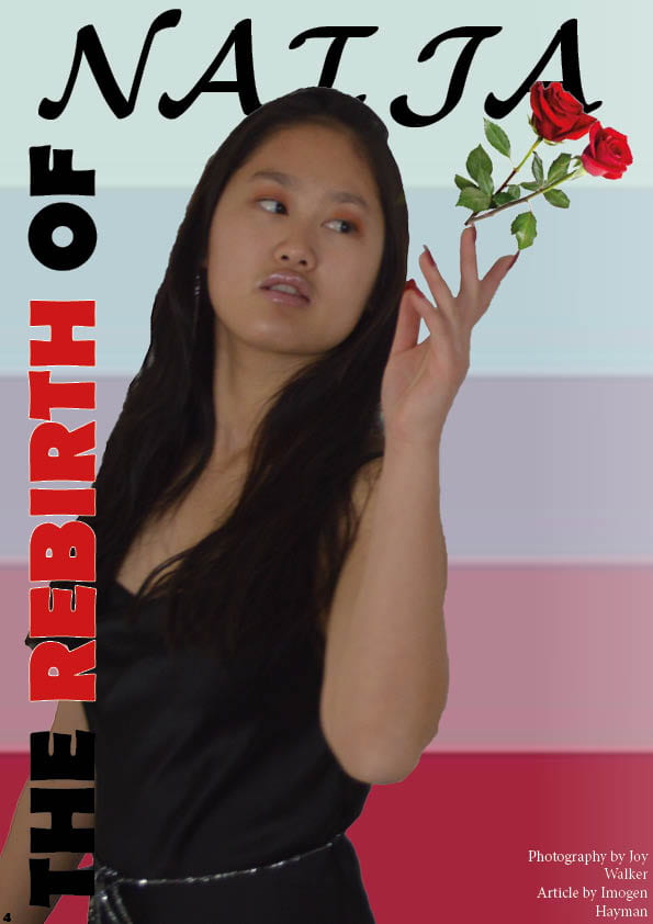
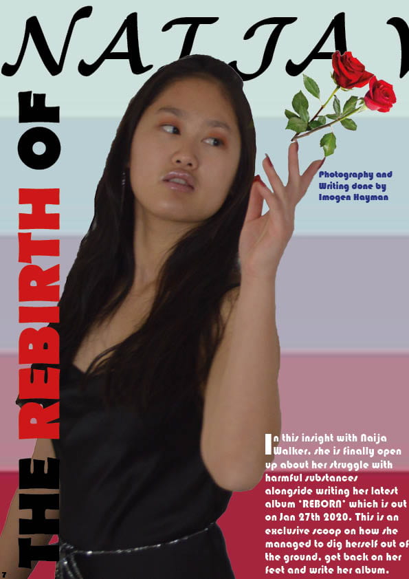
Making my DPS went really well since I changed the colour of my model to create more tension and drama to go with the article. I did this as well on my Contents page. However before I changed the colour I sharpened the image first to create a design very similar to some of the designs on my Pinterest mood board. This gave my contents page more colour and passion. The contents page looks like it is apart of the magazine now rather than looking like I’ve just put it there for no reason.


January 7

A New Improved Contents Page

This is the second draft of my Contents page:

What I have changed:

  • I have used different photos of my models to have more of a connection with the audience
  • I have added a red cross in the middle to make the page more interesting and spark emotion
  • I have put the writing to the sides of the cross for the audience to know whats going on
  • I have used blue and green text boxes and faded the colours out for interest and feeling since colours are very important to correlate to emotions in R&B
  • I have changed the font of the title

What next?

  • I want to edit my models photos to make them less simple
  • For my top model I want to go back to my pinterest board and use a RBG colour scheme on her
  • I want to move the title of my contents page around
  • I want to change the colour of my page number
  • I would like to edit my bottom model so she looks more dramatic

Targets:

  • To go back to my pinterest board and get ideas
  • To edit my top model and give her different colours
  • To experiment with different sizes of the pictures
  • To change the colour of my page number
  • To move the title of my contents page around
  • To edit my bottom model to look more dramatic

Peer assessment:

January 7

Draft of Content Page

This is the first draft of my Contents page:

What went well:

  • I like the colours I have used since they are not only suited to R&B but they are also in coordination to my Front Page
  • The image I have used has direct eye contact with the audience which is essential for an R&B magazine
  • I have not called the Contents Page a Contents Page, instead my tile for the page is ‘Sneak Peak’. This is because it is more catchy and will convince more readers to take a look inside
  • The rose the model is holding makes the model seem very passionate. In R&B magazines emotion and passion are widely shown
  • The Titles I give for each page are dealing with relevant issues and issues that convey a lot of feeling which is common in R&B magazines

What next?

  • I want to change the colour of the the title since it is very basic
  • I would also like to change the colour of the different page numbers
  • I would like the Contents to be in bullet points
  • I want to put the contents closer together and have less space in between
  • I want to make my model bigger so she has more of a connection with the audience

Targets:

  • To change the colour of the title
  • To change the colour of the page numbers
  • To put bullet points on the page
  • To make less space between each of the contents
  • To make my model bigger
December 16

A New Improved DPS

This is the new draft of my double page spread:

What changed?

  • I turned my background into a gradient and pulled it across the page to make it look more like the pages are connected to each other
  • I added more cover lines
  • I took out the stand first that wasn’t needed
  • I turned my cover lines white and put a red outline on them
  • I changed the font of my article
  • I changed the font of my credits to the photographer and writer
  • I changed the last name of my star and moved both first name and surname to fit in the middle of each page
  • I outlined REBIRTH with red

Targets:

  • I will take photos of my own roses to use
  • I will take pictures of rose petals and have them falling down the page
  • I will cut out my model again and edit her to look more dramatic
  • I will center my cover lines more
  • I will make my model bigger
December 9

Feedback & Reflection on Draft DPS

I asked another students in my class for some feedback on my DPS

This is what they said:

Student one:

What do you notice first about my DPS?

  • The bright colours and image


What makes my DPS unique?

  • The font is unique and the positioning of the font down the side of the left page


What do you like most about my DPS?

  • The font of the stand first
  • The bold image of her throwing away the flowers
  • The two drop capitals


What do you not like about my DPS?

  • The font is the same the whole way through the article – it is quite difficult to read. The positioning of the by-line doesn’t fit the conventions – change the writer and the photographers names so they are different. 


What do you think can be improved?

  • The font – vary it
  • Make the roses more believable – I don’t think that they are coming from her hand
  • Make the pull-quote stand out more in a shape or something?
  • A signal that the article continues on the next page?


When you see the DPS does it make you want to read the article?

  • Not particularly because there is a lot of writing with no gaps – bold writing 


What else can I add to make my DPS more exciting/appealing?

  • A thinner font, coloured background continue on the right page – coloured lines


Any additional information you want to add:

  • Nope well done 🙂


Student two:

What do you notice first about my DPS?

  • The colour contrasts


What makes my DPS unique?

  • The style of the pages and the style of the writing


What do you like most about my DPS?

  • The red and black writing across the side of the page


What do you not like about my DPS?

  • I don’t like how the models head covers the writing


What do you think can be improved?

  • The fact the model covers the title


When you see the DPS does it make you want to read the article?

  • yes


What else can I add to make my DPS more exciting/appealing?

  • Less black writing


Any additional information you want to add:

  • No thanks


Targets for development:

  • change the font of my article
  • get petals falling down the page
  • more bold, colourful quotes
  • put a shape around my quotes
  • change the name of the writer of the article


December 9

Draft of The Double Page Spread

This is the first draft of my double page spread:

Targets:

  • add more coverlines
  • make the picture better
  • take away some of the writing
  • add some rose petals
  • move the white writing inwards
  • make there gap bigger between the stand first and the interview
  • make the writing of my article a serif font because it is easier to read
December 9

Second Shoot Contact Sheet(s)

On the 11th of December my class went to Castle Cornet to take photos for my music magazine. In my opinion the day went well. I got a lot of striking photos and magical shots.

Here is the Contact Sheet of my shoot:


The photos I will most likely use are:

I like these photos because they show raw emotion and the props that my model is holding make a statement. I can make a number of different headlines and cover lines out of these pictures. The outfits I chose for my model is floaty and glamorous. I chose for my model to have light make up on so it was easier to see her natural emotions. In my opinion these pictures are clear and capture that connection between the artist and the audience. These photos are my favorite because they are striking and show the passion and emotion behind the eyes of the model. I prefer the photos of my model in the caves and castle for my magazine since they are all more dramatic.

December 5

A New And Improved Front Page

Here is the third draft of my music magazine cover:

Things that have changed:

  • the colour of the writing
  • the placement of the main cover star
  • the size of BD
  • added logo at the bottom
  • made my plug bigger

Targets:

  • change the logo because it doesn’t fit with the colour scheme
  • make the writing around the edges bigger
  • make my plug even bigger
  • perhaps change my background
  • make the bar-code thicker