Here is my complete set of drafts. This includes my front page, contents page and double-page spread.
I then received feedback on my magazine
From the feedback I was given I can tell that what was successful which is:
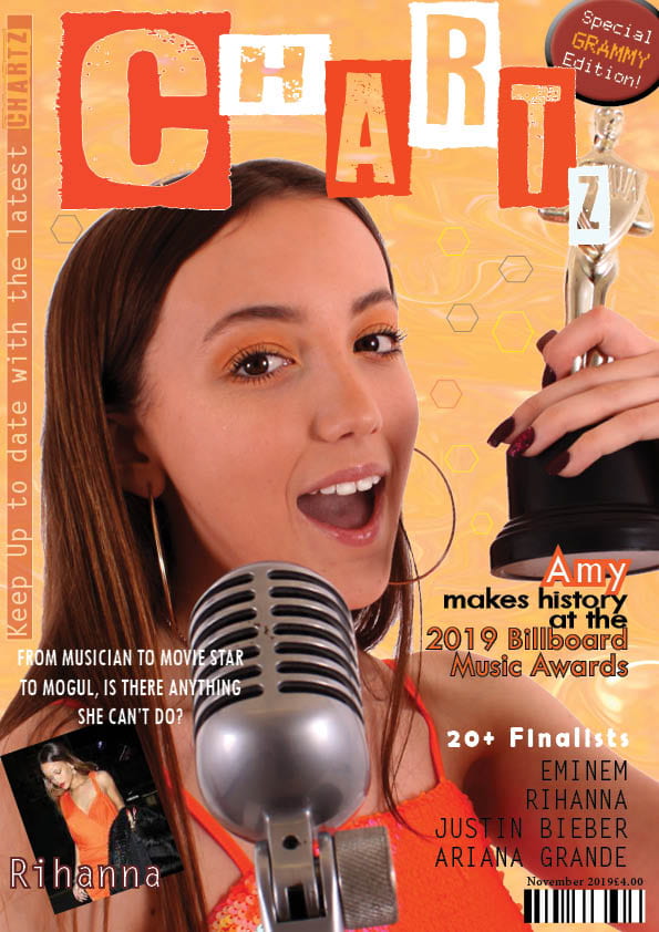
- Likes the banners and the interaction from Chartz on the side
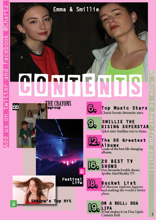
- Likes the masthead font being carried over to the contents page
- Likes the number and inserts on contents page
- Likes how the numbers from the inserts go with the images.
The parts that can be improved are:
- changing the photos of Rihanna to Smillie so that it is my photo
- Bringing more colour (green and pink) to the front cover
- Making the inserts images bigger with more of a pop genre( add shadow)
- Adding a page number to the Emma and Smillie image
- Don’t use full stops on the mini headlines and use a more classic font from the cover to the sans serif under.
- Moving the boxes and numbers overlapping the headlines
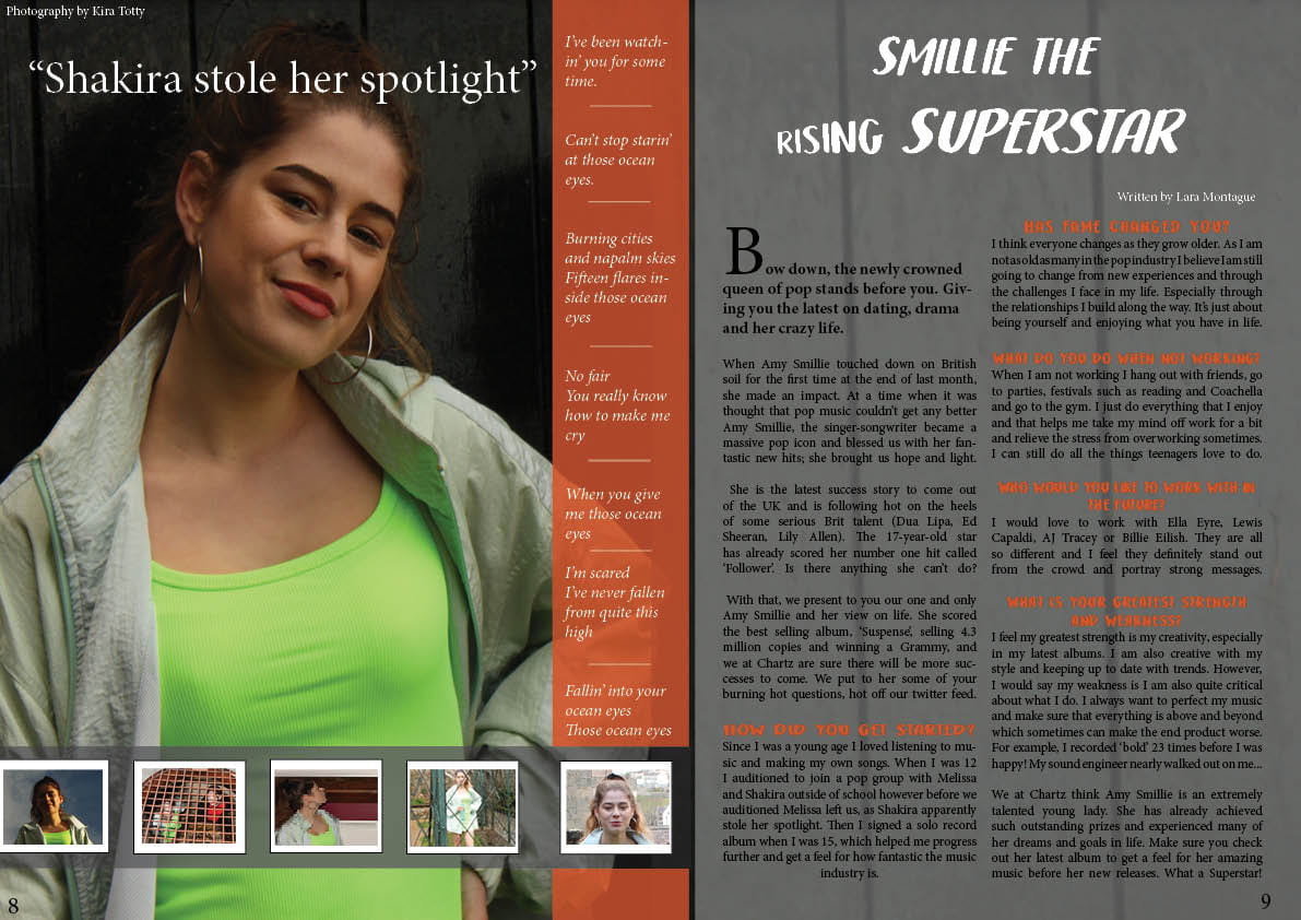
- Move the quote up on the double-page spread
- Use the same font from the title to the quote
- Centre the bottom left article question and look at spacing
- Add “Smillie out on location shoot”
- Centre banner quotes
- The double-page is looking more indie than pop genre, change the grey background
Leave a Reply