December 10

Second Shoot Contact Sheets

Below is a contact sheet of all the photos which I took for my double page spread in town on Tuesday 8th December.

We tried a few different locations for a background, I had the outside of the old HMV building in mind since it was a very open space and it had loads of areas to use for creativity. We then went to a set of stairs because I had seen some double page spreads with the model(s) on a set of stairs and I thought it suited my genre. We then tried having a few shots overlooking a balcony to add more of a story to the photo.

I think the use of Mis-en-scene could’ve been better, there should’ve been more props to show what the genre is.

I have chosen this photo because I was very happy with the camera angles and the poses that were used, I think it will suite my magazine and it represents my models the way I need them to be represented.

I have also chosen this photo as it shows the relationship between my two models and it fits into my backstory really well.

December 7

Draft Feature Article

In order to create a conventional article for my double page spread, I must first plan what I am going to write about, the backstory of my models and how they represent the genre.

The Hook

A hook’ is a treatment for an article. It usually is part of the pitch that a writer or journalist will make to their editor before they are given permission to spend time writing the article.

I will now need to create a hook of my own.

Using my plan and my hook, I have now written my final article. I used the story I had made in my plan, but I used different language which I thought would be more appropriate.

Final Article (After teacher feedback)

December 1

Language Analysis

For my article analysis, I have chosen to look at a Q&A, and how they have used conventional features of an article. Straight away I noticed that they have used different fonts, sizes and colours to highlight the text that will hook their target audience in most. They have used Gratification Theory to increase their rates of social interaction, social identity, and their use of text for information and entertainment.

This article which I am analysing is called ‘Cash for Questions’, released on July 11th 2018 and written by Paul Stokes, it is a Q&A for a famous indie rock band known as ‘alt j’. Reading this article, I found evidence of the journalistic techniques of the who, what, where, why, when and how.  The book of kells – Trinity College Dublin’s The Long Room is one of the world’s most impressive libraries, it seems a fitting location for alt-J, here to play in the grounds as a part of a summer series of gigs. 

The layout of the article shows how it is a Q&A, it uses the rule of 3’s, the first column being about how the band first met, and all of their achievements as a band, the second column being about popular opinion’s on how the band is represented, including all of the member’s responses to these claims, the third column being the actual Q&A. The questions from the fans are mainly about their music careers, one being about how they spend their money from awards they have won.

I am aware of the presence of a journalist as there is a clear introduction of the band on who they are, how they met and what they’ve won. The journalist also describes what the band have been up to lately, and it adds some context to the photos of them in the actual magazine, by context I mean why they are in a library, how it represents them and it gives some history about the location, majority of the article are words quoted from the band itself.

Overall, at first appearance they seem quite nerdy for a rock band, however after reading the way that they respond to people them calling them nerdy, they sound very casual and laid back.

November 27

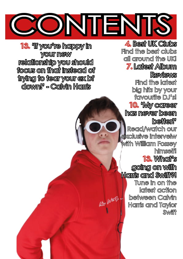
Draft of Contents Page

This is my first draft of my contents page for my magazine.

I tried to make the cover lines sound interesting and catchy by using quotes and rhetorical questions to draw in the audience.

Now it’s time to see what someone else thinks of it….

5 targets for my next draft

  1. Space out the text better to create less empty space.
  2. Add in more pictures to attract the audience.
  3. Use a colored background rather than plain white to give it more meaning.
  4. Use more of a variety of conventional features.
  5. Use more artists in my contents.
November 27

What is a contents page?

So what is a contents page?

I had a look on pinterest for some examples of contents pages from different music magazines. Now I will draw a few designs for inspiration.

5 catchy headlines: 

  1. Will Fossey – ‘My career has never been better’

With this caption, the idea is to show that it is an interview with the main star, talking about topics which relate to how he is doing as an artist and as a person.

2. Discover the best clubs near you!

Addressing the audience directly will draw them in more.

3. Taylor Swift and Calvin Harris clash on Twitter?

Briefly mentioning drama between two massive celebrities will draw interest.

4. Latest album reviews

Keeping the audience up to date with their favourite music.

5. Read/Watch a MixMic exclusive interview!

Emphasising that you can’t access it through any other product/brand.


November 20

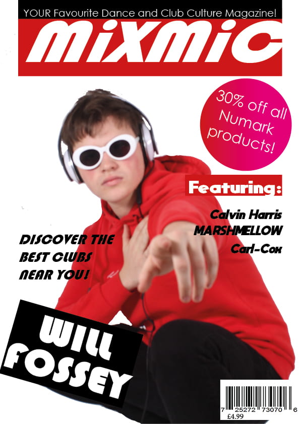
Draft of Front Page and Self Assessment

Now I will create my first draft of my front cover, I will use inspiration from other magazines, including my own ideas of conventional features.

For a first draft I am happy with how this turned out, I think my use of conventional features turned out quite well for a first draft.

Bellow is my assessment of  my first draft.

5 Targets for my final draft:

  1. Make the model slightly darker with less contrast, or use a dark background to make the model stand out more.
  2. Add more cover lines to sell the magazine.
  3. Experiment more in terms of backgrounds, colors and fonts to see what will work best.
  4. Position the text better to make it look more professional.
  5. Use more of a variety of conventional features to make it look more like a magazine cover and less like a poster.
November 16

So what am I up against – The Competition

For this post, I researched other rival magazine brands which feature in my particular genre. It is important to know all about my competition to know how to make my magazine stand out in a genre that is all about standing out.

In order for my magazine to succeed, I will need to do some research into rival brands which are part of my chosen genre.

Now I am going to make a Piktochart of my research.

Loading...

Loading…

After doing my research I am now aware of what I am up against, and what I need to include to succeed against these rival brands. I also know a few more conventional features which I should include in my magazine which will attract my target audience.

If I include information about celebrity’s social media activity then it may interest my audience, meaning they will choose my magazine as their preferred reading. The information on these artists are going to be my Unique Selling Point, as not many of my competition include their social media activity.


November 12

Contact Sheet

These are all the photos that me and my model (Will Fossey) took in our first photo shoot.

Bellow are 3 images which will potentially make my front cover.

I like this image because he is pointing directly towards the audience which may attract more attention to my magazine.

I like the pose he is doing in this photo, I also like how the glasses completely cover his eyes, suggesting he wants to hide his face.

I like this seriousness of this photo, his pose makes him look very serious and discrete. His posture looks very broad and sturdy.


I am happy with how this photo shoot turned out. I think that the way my star image is represented as an ordinary person based on the way he dresses, but he is extraordinary due to the props, body language and facial expressions.

By using brightly coloured text, and modern fonts like the one’s in my previous post, it will add a flashy and club culture atmosphere to my magazine, this will mean that my audience will decode my magazine, and it will fit in with other products of the same genre.

I used the camera to focus on my model’s posture and his facial expressions to tell a story on what emotions he is portraying, what his lifestyle may be like and potential personality traits.

With these photos in mind, I will now decide what conventional features I should include, and how big they should be, what color they should be and where they should be on my front cover.

I used Mes-En-Scene to portray a character with a flashy dress sense, enjoys mixing music and always wanting to stand out.