January
28

January
27
Question 3: How did your production skills develop throughout this project?
January
26
Question 2: How does your product engage with audiences and how would it be distributed as a real media text?
January
25
CCR1 – HOW DOES YOUR PRODUCT USE OR DEVELOP CONVENTIONS AND HOW DOES IT REPRESENT SOCIAL GROUPS OR ISSUES?

January
14
Chosen Advertisement
Advert 1
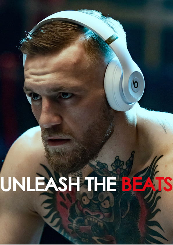
I chose beats as the brand I’m advertising because it is one of the most popular brands of music products. The title ‘unleash the beats’ is a play on words with the model Conor Mcgregor, he is a Mixed Martial Arts fighter who is known for his trash talk and his ruthlessness. A line he often uses to describe his attitude to the sport is ‘unleash the beast’, hence why I changed ‘beast’ to the brand name ‘beats’.
I feel like Conor Mcgregor is a suitable representative for my genre, since he gives off the modern and energetic vibe which is my audience psychographic.
Advert 2

For my second advert I chose to use Spotify, as it is a very popular app, and it’s main appeal are members of my audience. This particular advert uses a similar colour scheme to my magazine, making it fit in better.
The background in this advert is an ongoing house party which is the sort of thing which my audience is interested in.
My audience demographic is young, mixed gender and youthful, and based off of my research Spotify seems to be the platform which everyone is into.
January
8
Complete Magazine Draft 3

Screen Castify
Now that I have submitted my draft 3 magazine, I must now get some feedback from my teacher, bellow is a short video which outlines the pros and cons of my third draft.
What’s new?
Front cover
- Added special effects to front cover photo
- Made a banner for front cover
- Moved the features out of the way of the model
- Changed the colour of the Model’s name
- Changed the colour of the plug text box to a red and cyan mix
Contents page
- Added similar special effects to and contents page photo
- Rearranged cover lines
- Added a red and cyan mixed background
DPS
- Changed colours of text in DPS
- Cropped out photo of other model since the article wasn’t about her
- Added in another photo with the article
What’s next? (based off screen castify)
Front cover
- ensure that top plug is not cut off.
- Issue number
- Make it ‘funky’ and ‘full of stuff’
- Add something to the cover star’s name
- More coverlines
- Make main star bigger
- Consider smaller boxes for the features
- Move DPS article title away from cover star
Contents Page
- More coverlines
- Make titles of cover lines in bold and capital, and make the descriptions in lowercase.
- Stick to a pattern with page numbers
- Ensure that cover lines are all the same size
- Page number
- Different image to avoid repetition
DPS
- Feels like it’s from a different magazine
- Consider different font for article
- Crop the shoulder from the photo
- Aline the starting text columns
- Play with the photos like done with front cover.
January
8
2nd draft of DPS

What’s new?
- I added in page numbers.
- I changed the quote in the left page to the quote featured in my article
- I changed the title of the article to make it look more unique.
- I used paragraphs to make it look more like a biography.
What’s next?
- Add in a filter or special effects to both photos
- Use a different text colour for the left hand side
- page numbers need to be higher…and right hand side corner for right hand page
- give the inset a caption and anchor in some border or depth? and perhaps crop a little
- think about main cover photo as it features 2 people and the article is about one
- not sure about the line spacing or font on the main coverline
December
21
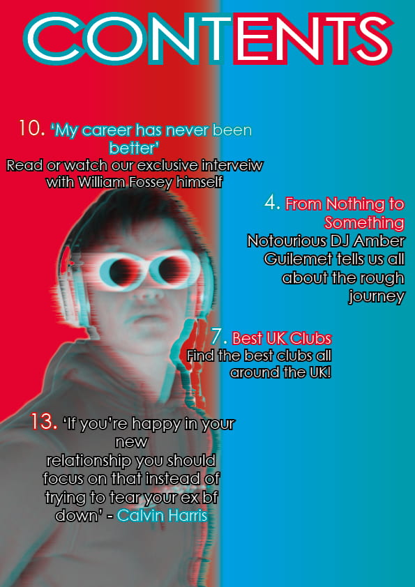
Second Draft of Contents Page
Bellow is my first draft of my contents page, I added it to make the smaller changes more noticeable.
This is my second draft of my contents page.

What’s new?
I followed the feedback I gave myself in my first draft and used a gradient background to add some meaning to the page, I also spaced out the text so it looked less bunched up, I added in my article for my double page spread, including an image of who my article is about. I moved my model closer to the left to make room for the text and for the other photo.
What’s next?
- Blend in the colours of the background to give it a smoother transition.
- Re-organize the position of the second photo so that none of the text is covered.
- Make the contents positions more unique, rather than just a straight line downwards.
- coverlines smaller line spacing
- dehyphenate
- page number
- he is a bit bluyrry….put an effect on it?
- caption him…who is he?
- main coverlines in capital letters and perahps a differnt colour
- no punctuation in coverlines
- bigger numbers
- caption Amber?
- more coverlines?
- watch repeat of numbers
December
18
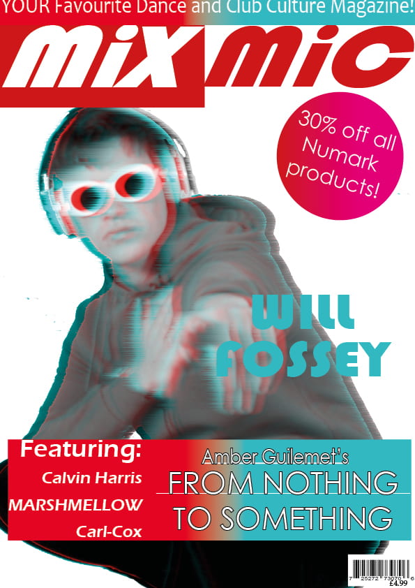
Second Draft Of Front Cover
Here is my first draft of my front cover, I’ve attached this to make it easier to notice what I have changed in my second draft.
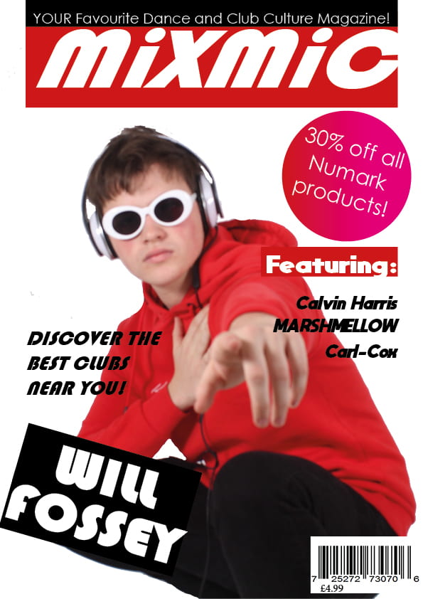
Bellow is my second draft.

What’s New?
In this draft I changed the masthead so that it has one half with a red background with white text, and the other half with red text on a white background.
I rearranged the features, adding a red text box, and added in the title of my article of my double page spread. I made my main cover star bigger so the audience knows who it’s all about.
What’s Next?
- Make the article cover line stand out more.
- Add/use special effects to give more meaning to the cover.
- Use a humorous quote from the main cover star to represent that he’s ordinary.
- Make the name of the main cover star bigger, also add to it to make him seem more energetic and stylish.
- Use a brighter shade of red to make the colour scheme more exciting.
- Use less fonts as it makes the front page look too messy.
- Overlay the pug behind the masthead.
- Add a banner at the bottom to include features of the magazine.
- Try without the coloured boxes as it covers up too much of the star.
December
11
First Draft of Double Page Spread
Now I must make a draft of my Double Page Spread so I have something to work with.

Overall I think that the colours didn’t stand out the way that I imagined they would, however with more time to experiment with colours and fonts I will find something that I would be more happy with. (Unfortunately the quality took a downgrade since it was the only way to export both pages into my blog).
Five targets for improvement
- Use some sort of shape to split the pages.
- Add in a solo shot of one of my models into the page where all the text will be.
- Use more colour to make it look less bland.
- Have a unique pattern of shapes to add more of an affect to the DPS.
- Use a large capital letter at the start of the article to make it more conventional.
Based on feedback which I received, I have made some adjustments to my first draft.

I managed to resolve the quality issue, I also decided to only have my photo on one page after looking at examples of Double Page Spreads.