October 13

My Tour Poster

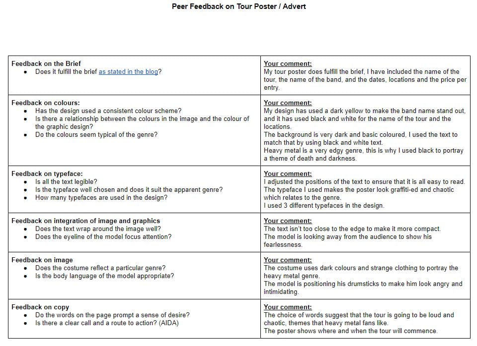
Researching Heavy Metal tour posters has allowed me to have more of an understanding on the colour palettes, fonts, and conventional features used to address the target audience.

These features which I wish to add to my poster include big bold writing with a particularly messy font to make the poster look more edgy.

I would like the picture of the band/performer to look as angry or as intimidating as possible, I am going to include a dark background to add a theme of death, since that’s what the heavy metal genre is all about.

Click to see PDF file

This is my heavy metal tour poster. Using my research I discovered that Heavy Metal posters have a very dark and basic theme to them, I used these emotions to select my background of an abandoned town at night to add an edgy theme to it.

I made this poster unique by using a variety of colour schemes, the name of the band is in bright yellow so the audience know who is performing. I also used very messy fonts to make it look as though the poster had been graffiti-ed.

I included the dates and locations so the audience knows where the tour is taking place, I named the tour ‘Northern Carnage’ and based it in the Northern area of the UK.

The action in this poster relates back to AIDA. The main cover star is alone in this dark and lonely town, he is holding drum sticks to show that he is a band member, and his dark and edgy clothing shows that he is a heavy metal artist.

I like how this poster portrays a chaotic theme using the messy fonts and the angles of the text. One criticism I have for this poster is the lighting on the cover star, I wish I could’ve made the left side of his face darker like the background.

This task  will help when designing my music magazine as I have improved my skills in Indesign and Photoshop, I have learned how to use different colours and fonts to portray a theme, and I have also identified how to use conventional features to make a tour poster more attractive.

October 9

My Magazine Front Page Swede


This is my own recreation of my allocated NME magazine cover, created using Adobe Indesign. Bellow is the original cover.

Re-creating this magazine cover has allowed me to expand my skills on using Indesign. I have also learnt how conventional features of a magazine cover are used to display a general theme of a magazine, the main cover star uses body language and facial expressions to tell a story to the audience. The colours and fonts that are used will portray emotions. The cover lines on the right hand side of the magazine give an overall impression on the demographic of this magazine, which is young and energetic character, and in some sense rough.

When using Indesign, I found it really easy to adjust the positioning of text and other photos. It was really easy to add more text boxes, and to change the size, width and height of the text.

However I did struggle with certain aspects, changing the colour of the text to the exact shade I needed was difficult, finding the correct font to use was very time consuming, and finding a high quality image to use for the cover was hard, hence why the photo I used is slightly lower in quality.

This well help when creating my magazine as I now know how to add conventional features to it, I now know how to use the basics of Indesign which I will use when making my own products.

I have attached three different tutorial videos for Indesign which I found on YouTube. I believe these videos will cover the areas where I need to improve on when using Indesign.

September 25

The Camera Talks

This task has helped me to learn the different effects of different camera angles and photo techniques. The body language used in the photo will help the audience understand what is actually happening, the body language tells the actual story of the photo. Combining the facial expressions, body language and the camera angle
We chose to use different camera angles based on the emotion that we wanted to portray. We took long shots when we wanted the location to represent a theme, and we chose close ups when it was the facial expressions and body language to tell the story.
This knowledge will help when designing my magazine as I will know which camera angle to use for which emotions I am trying to portray, and what story I will want to tell.
September 24

My Image Uses Mise-En-Scene To Communicate Meaning

Made with Padlet


I have chosen this as my final photo as I believe it portrays the story the best out of all of our photos.

The costuming we used makes the model come across as very dark and discrete about his personality. The hat and glasses cover up most of his face, adding a sense of secrecy in his appearance.

The facial expression of the model portrays the theme of anger and intimidation. He isn’t facing the camera which shows how he’s not focused on his audience, but only on the music he plays.

His body language gives an edgy impression of him, the way he’s slightly crouched adds a dramatic affect to his stance.

The props we used shows exactly what he is, a leading guitarist in a heavy rock band.

In conclusion, Mise-En-Scene is used in a lot of photos to portray a story or to add meaning. In media, the emotions of a text is what makes it attractive to certain audiences with different beliefs.

This will help with my magazine production as now I know how to use costumes, props and body language to tell a story in a photo.

September 21

My Tour Poster Analysis

The story that this poster is portraying shows that little effort was put into making this. It uses little variety of colour and text font. However this could signify that the artist himself is very basic and doesn’t need to put the extra work in.

Analysing this poster has helped me to identify that certain features will tell the consumer a lot about the designer’s personal identity. The font, colour and cover photo is what defines the piece as a whole. This task has helped me to expand my knowledge on how media is analysed, and how it can display different opinions to the audience.

I now know how I can use different colours and fonts to represent different themes and emotions. When creating my own media pieces, I will now be able to identify what colours, fonts and body language in the cover photo to use for an appropriate theme.  I will be able to use these skills learned from this task to create my magazine with the correct themes and emotions that I have in mind.