January
12


January
11
Digipak Draft 3
Here is our third draft of our Digipak in an album case.
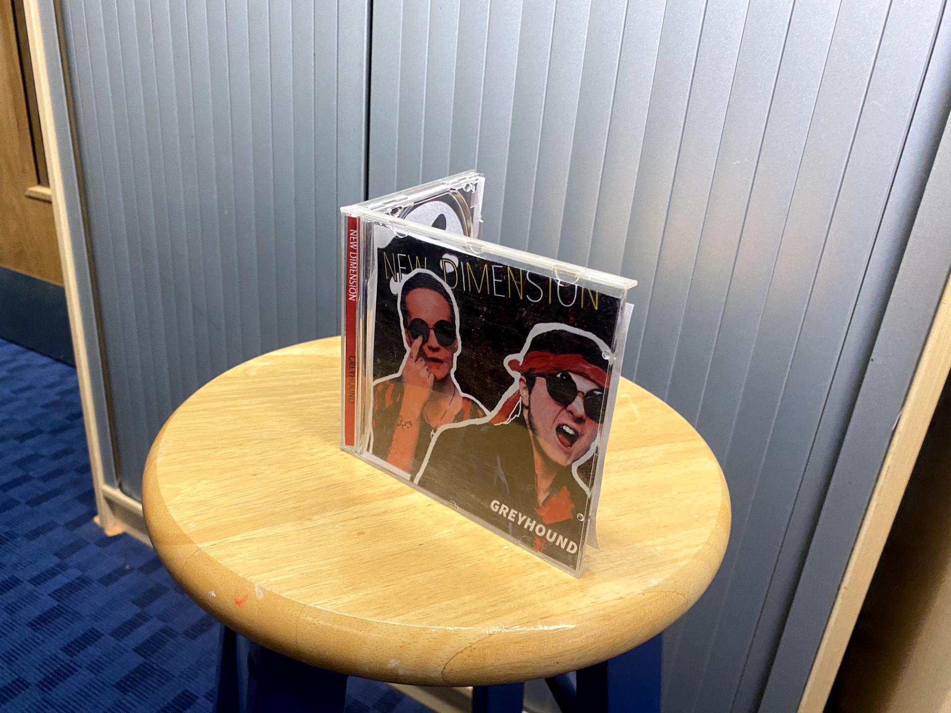


To ensure that the digipak was easily recognizable, I asked 30 people what genre they thought the album was, based off of the appearance.
Of the 30 responses, 19 people thought it was rock, 8 people thought it was heavy metal, and 3 people thought it was indie.
Rock: 19
Heavy Metal: 8
Indie: 3
Overall the conventions that we used conveyed the genre well, and the conventions we challenged worked in our favor to create a new innovative product.
Reflection
The inside panes could have some more creative conventions rather than just some lyrics and a moon where the CD would go.
One of the band members seem to be more red than the other, this may be due to the lighting but perhaps some alterations would be appropriate.
January
10
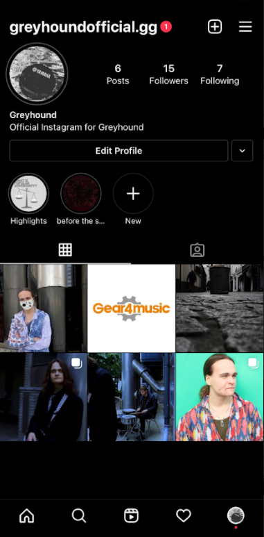
Social Media Page draft 2
Here is the second draft for our social media page.

Click image to view Instagram page.
We have added some posts which promote the release of the band’s new album, including the announcement of a UK tour.
Having a tour for our new album will give the audience a chance to socially interact with band, as well as being the main source of revenue for the band.
We also added more teasers to excite the audience.
Targets for next draft
- A few more instagram stories to add more of a personal identity to the page.
- Add a release post for the music video.
- Add in some interactive activities (e.g. Q&A, fan’s opinions on something)
December
13
Social Media Page Draft 1
Here is the first draft for our social media page.
Marking Criteria


Screen Castify Feedback
Targets for improvement
- More story highlights to represent more of a social identity.
- Include some synergy with another brand.
- Add in a radio or TV appearance
- Include a tour for the band
- Add the dark filter over the white posts to ensure a consistent colour scheme.
November
26
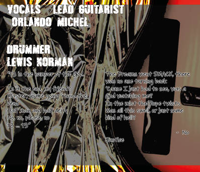
Digipack Draft 2
Here is our 2nd Draft for our Digipack.


Teacher Feedback
Screen Castify feedback
- Make Orlando bigger on the front cover.
- Move ‘Greyhound’ in the corner and make it smaller so it is easier to distinguish between name of album and name of band.
- Have picture of Orlando overlap the title of the album.
- Make song titles smaller on back pane to have ‘the man who sold the world’ on one line, and to make the copyright info easier to read.
- Make the gold on inside panes similar to the yellow used in the text on front and back panes to add some continuity.
- Titles of the singer and drummer are slightly unconventional.
- Make lyrics in the inside panes easier to read, perhaps is unneeded for future drafts.
- More fiery gold on inside.
- Include white moon on front cover.
November
25
Digipack Draft 1
Here is our first draft for the front and back panes for our Digipack.

Marking Criteria
- Our use of photoshop has manipulated the images in order to make our stars stand out, there is a clearer contrast from the background rather than the stars just blending in.
- Our brand image demonstrates a new/modern take on rock, with the conventionality of a dark/violent colour scheme, whilst also challenging conventions with the bright shirt and the sci-fi theme.
- In terms of framing, both stars are well in view and in focus, however I seem to be more contrasted than Orlando.
Targets for improvement
- Sharpen Orlando so he is just as contrasted as I am on the front cover.
- Tone it down on the smudging effect.
- Re-position text as well as considering a different colour that would suit our colour scheme.
November
25
Contact Sheet + Evaluation of Shoot


Upon reflection, this shoot went a lot better than our previous attempt. Our MES was portrayed much clearer and it made us look a lot more like a band than before. The simple gestures from Orlando represents his flare and his confidence, whilst the screaming from me represents the aggressive convention of our genre.
November
24
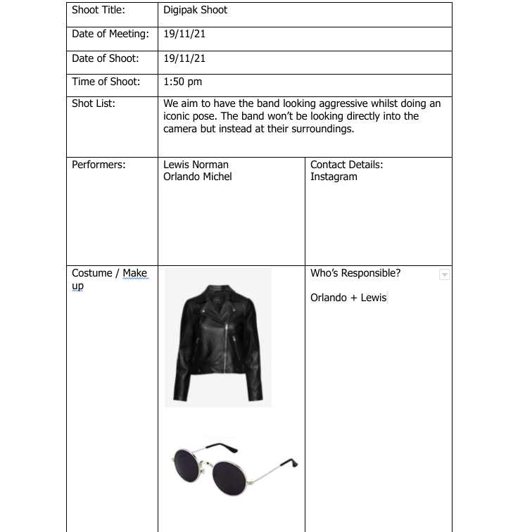
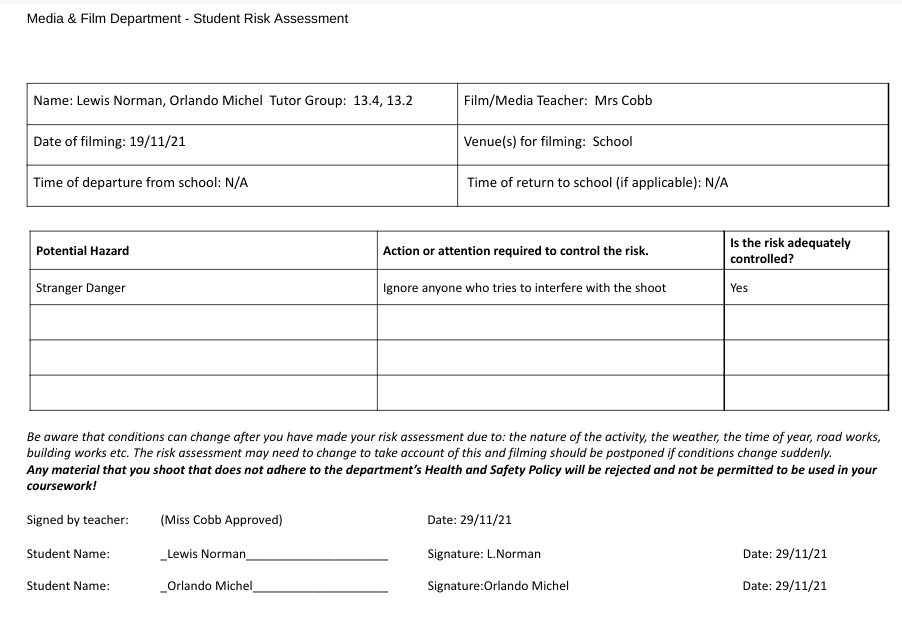
Photoshoot / Design Production Meeting and Risk Assessment

November
23
DP Mockup

Here is a rough sketch of what we hope to create for our digipak.
The space concept represents how our brand is something new, original and exciting.
We want to make our star image stand out as much as possible, since it is conventional towards our genre. We plan to dress our artists in a rough and scrappy suit since it will represent the authenticity and menacing convention of our genre.
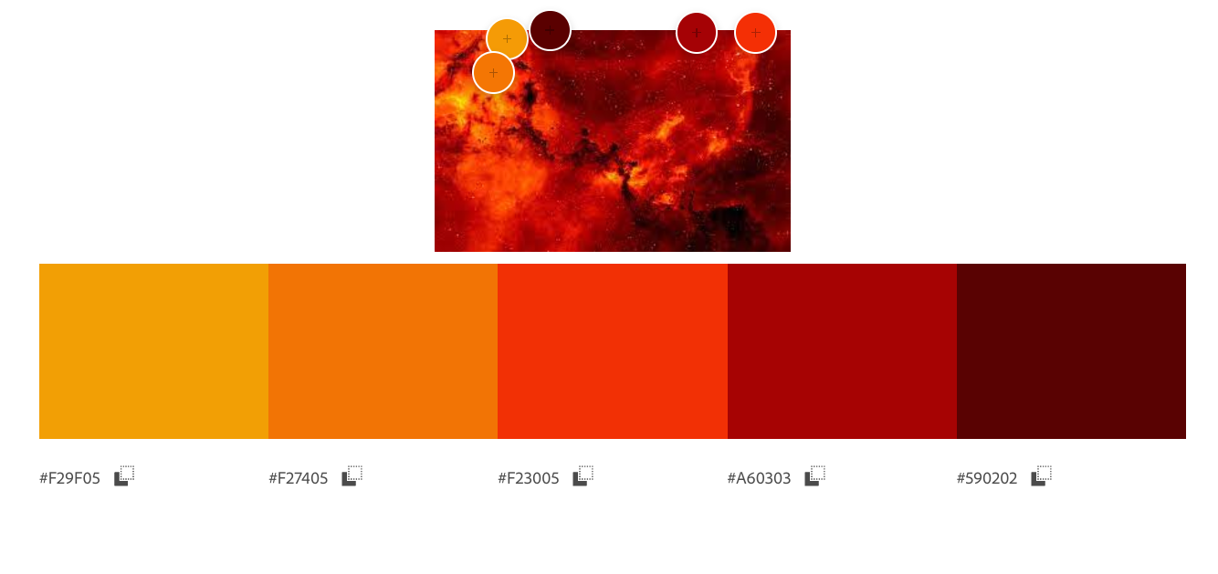
This is the colour swatch we intend to use, these colours will create a hellish feel to the digipak and will attract our target audience.
November
22
Digipak Conventions Analysis
Here is my own independent analysis of ‘American Idiot’ by the band ‘Green Day’. I chose Green Day because they are a rock band who cover a wide variety of conventions within the rock genre. They have a collection of songs that are rather political, whilst also having songs which are more dark and personal.
Reflecting back on this analysis I have learned the technical conventions that all Digipaks must have.
I also learned how Green Day were able to communicate their Star Image and how they used generic conventions to the rock genre to establish a repertoire of elements.