For my second draft of my double page spread, I began from scratch as I wasn’t happy with my previous design.
What’s new and What’s Changed?
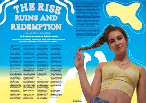
- I have now included and formatted my entire article so that it fits nicely and is appealing to the eye. I feel this has allowed me to gauge a sense on how to layout my magazine and has helped me determine the overall look.
- I have added lines around my cover star to emphasise the shape of her plait this I feel adds a unique touch and also matches the front cover of my magazine – which enables it to be more unified.
- I have also added white detailing to add to the indie-pop look which is unique and fun, I am going to smooth the details out to make them look better.
- I have also selected a new font to give a shiny, bubbly, holographic look that is coherent with my genre and brings the page together. I chose this because through my research I found that that many of the magazines used unique effects such as a glow and a shine.
What’s next?
- I will add a pull quote to the left side of the page to make the article look more appealing to read and draw the audience in. This will also comply with the required features of my magazine.
- I will add page numbers.
- I am also going to add text to the yellow bubble with the new album information and details. This will bring the magazine together and make the shape look less dominant.
- I will improve the brightness of my main cover star image so that it is of a better quality.
- I am going to make it look more cohesive and professional with some alterations to the ‘squiggle lines’.