Final Digipak Draft

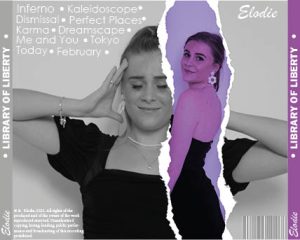
After further feedback we have completed the final draft of our digipak.

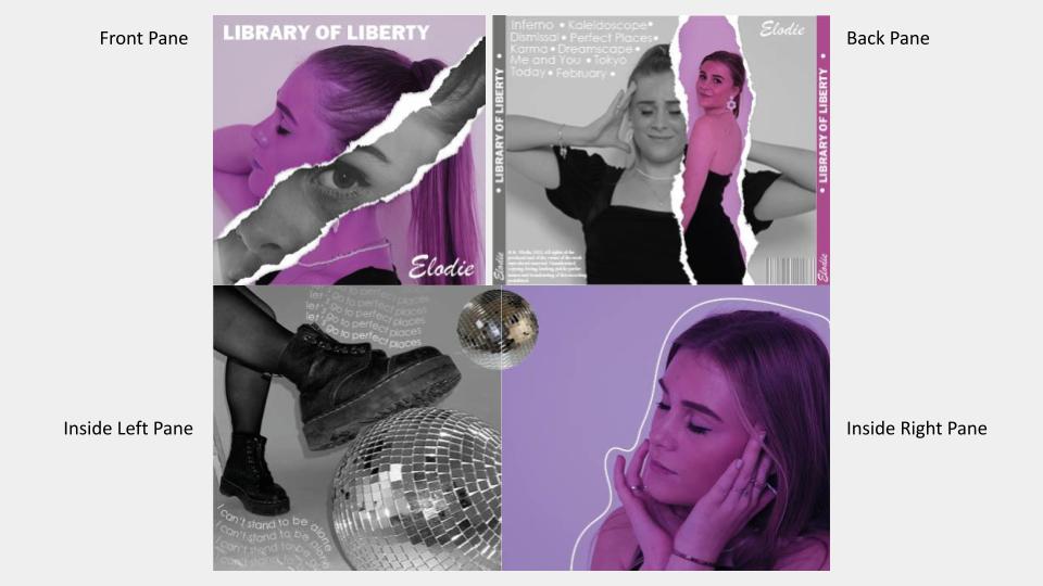
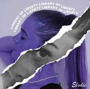
In this draft, we have altered the colour correction, making the digipak have a pink tone instead of purple. We chose to do this because the colours in the previous drafts were quite dull and didn’t entirely match.

Overall I think we have represented our star well and utilised elements from different genres to portray this. The design is well-developed and highlights the two sides of the artist, the rip works exceptionally well and has a direct impact on the audience. The juxtaposition between the elegant, graceful imagery compared to the uncomfortable, striking images create distress and alerts the audience to her life behind the scenes. This also makes her seem ordinary (Dyer) allowing the audience to relate to her and act as a role model for discussing these issues which are often seen as taboo or awkward.

We have used the majority of sans-serif fonts across the digipak, this is because they are bold and striking but also gel with the overall design well. We also chose a calligraphy-inspired font for our artists’ logo as this is conventional within our genre.

Digipak Draft 3

Following feedback from our teacher we created draft 3 of our digipak.


We have completely reimagined the two inside panels, introducing some objects into the digipak – which separates the images well. The Dr Marten boot adds a slight punk/rock twist to the digipak and highlights the rebellious nature of our star metaphorically. The third pane is graceful and elegant, reflecting her intense emotions and vulnerability.

We carried out some research to determine if our digipak represented our chosen genre well.

We aimed to initially encode the indie pop genre, however, with the development of the digipak we understand we have combined a variety of different genres – in particular pop and disco.

Overall our digipak had a preferred reading (Hall) with the genres mentioned above holding a majority of the votes. However, there was a slightly negotiated reading with the EDM genre. However, this may have been because of the contrasting bold colours. The representation of our star was received well and the majority of our target audience understood the context of the star image and design. Furthermore, this also complied with our mission statement and the ideologies we wished to generate. Overall, we can reflect positively on the design and understand that with a few tweaks we have represented our star and genre appropriately.

Focus Forward

Altogether we should be pleased with the reconfiguration of our digipak and the messages it now encodes. It was extremely useful to physically see the digipak in a CD case to understand what works and doesn’t. However, there are some changes that need to be made to make it of the best quality. For example, the colour correction on the pink/purple images needs adjusting – they are slightly off, and to ensure that the digipak is cohesive we must rectify this in photoshop. Furthermore, the lyrics on the inside panel of the digipak will need changing, as they are from the same section of the song it could seem repetitive and boring.


Digipak Draft 2

After some reflection of our first draft, we continued production of our digipak and created a draft 2.

Screencastify of Feedback from Teacher

What works well?

  • Overall it is fantastic and works well, the graphics are well developed and technical.
  • The tonal differences between the images create depth and the black and white images are striking and powerful.
  • The composition of the image with looking directly into the camera is great and conveys meaning well.
  • The back of the digipak is perfect.
  • The choice of font is perfect and correct for the genre.

What can we improve?

  • We should make the ‘elodie’ bigger.
  • The album title following our model is somewhat confusing and we should consider trying alternative options.
  • Seems peculiar placing the CD on our models face.
  • Perhaps on the inside of the digipak repeat the motif of the tear.
  • Too many images on the inside, consider creating some graphics.

Focus Forward

Overall, I am pleased with the front and back of the digipak, there are some tweaks to make but overall they work together well. I am not happy with the inside of the digipak, I feel it is too flat and 2D compared to the front and back, lacking dimension and shape. It lacks quality and is not up to par with the rest of the design. We are going to do another shoot, using a disco ball, to create some new images which we can use and modify. This will help break up the images of our model and not be too overwhelming. There are also slight colour differences between the front and back which needs altering so they match and the overall effect is carried out effectively. We now have a plan of how to carry out our final draft and ensure that we work productively.

Digipak Draft 1

Using the Adobe creative cloud we have created our first draft of our digipak. We have so far created the front and back of the digipak.

click to see full screen

Overall, we are extremely pleased with the image manipulation on the front pane. It is executed brilliantly and conveys the underlying darker side to this album and genre in general. However, the back pane is lacking and is not cohesive with the front. We need to rectify this and come up with a new layout/idea to fix this issue.

Targets for improvement

  • We need to reorganise the back pane so that it is more visually appealing. We can do this by reordering the images and altering the colour correction. We should also look for a fun way to display the track list as it is currently quite boring.
  • We should ensure that we have the correct copyright text and include the ‘p’ symbol. We also need to add record label logos.
  • The black is quite harsh and we should look at using a softer colour to match our front pane.

Focus Forward

We have learnt new techniques and tricks in photoshop which will help us when creating the rest of our digipak. Currently, we need to reorganise our back pane and ensure it is of the best quality and utilises the great images we took in our previous shoot. Our aim on the inside of our digipak is to continue with the black and white theme that is present on the front cover. It depicts the darker side of the industry and is somewhat like ‘opening a book’ similar to opening a CD case. This will comply with our mission statement and overall brand image. We also need to ensure we have the correct formal and general conventions.

Evaluation of Digipak Shoot 1

To begin our design process, we had a photoshoot with our star.

Here are some behind the scenes images from the shoot.

This is a shortlist of some of our favourite images.

What went well?

  • Overall our mise-en-scene was portrayed well, and using all-black outfits will enable us to create the colourful design we are envisaging in post-production. We had several outfit changes which all followed the same aesthetic – we did this because we wanted variation amongst our digipak and social media pages as we want to emphasise the idea that there are different periods these images were taken.
  • We achieved a wide variety of shots, including close-ups and long shots. This was important so that we had variation amongst our digipak and social media pages. 
  • We also worked well as a team, ensuring that we stuck to our tight schedule and got all the correct shots. We also played music to make our model feel more comfortable in front of the camera – which worked well.

What could be improved? 

  • We did struggle with the flash system, to begin with, we then switched to an on-camera flash which worked a lot better. This allowed us to be more playful and flexible with the shots we were getting as we did not have to worry about the cable. This, however, did take some time to figure out so we did lose crucial time in the studio. 
  • We could have executed the ‘crying’ makeup look better, we could have used more mascara and dark-coloured eyeshadow to portray the context more successfully.

We should note that we made a conscious decision for our star not to be in our music video. As Elodie is already an established artist we felt that she could use her platform to showcase other peoples’ stories and act as an ambassador to them.

Focus Forward

Overall we had an extremely successful shoot. We can now plan and structure both our digipak and social media pages to ensure that they capture our mission statement and marketing strategy. These images will allow us to have variation across our media texts and encourage our audience to interact as they are visually appealing.

Contact Sheets – Digipak Shoot 1

After a successful shoot, we ended up with around 280 photos that we will use on our digipak and across our social media page.

click to see full sheet

We chose to use a variation of different outfits and hairstyles which all worked together cohesively. We also had a makeup look that used running mascara and ruined makeup to signify the daily struggles our star faced when expressing herself – similar to the target audience.

Focus Forward

Overall, we have curated high-quality images that will be perfect to use across our digipak and social media pages. We are looking to use more playful and fun images on our social media page and more serious ones on our digipak. We plan to colour-correct these images to make them pop and be more interesting. Our brand consists of four colours: magenta, orange, blue and green. This theme will be present throughout our whole project to make it more cohesive and make use of integrated advertising. It was key that our brand had a significant look and aesthetic to comply with the general conventions.

PMA for Digipak shoot

To plan our shoot for our digipak, we made a production meeting agenda to outline all the things we needed to bring. We also gathered some inspiration pictures of different poses to ensure we obtained the correct photos

click to see full document

We also have recognised that we will need to be strict with our timings due to wanting to get a variation of different outfits. We also need to ensure that the last thing we shoot is the ‘ruined’ makeup look, otherwise we will waste crucial time redoing makeup.

Digipak Mock Up

To begin planning and visualising our digipak, we drew some ideas for the front and back covers. We took inspiration from our previously created padlet and ensured that we complied with the general and formal conventions.

Front (click for full screen)
Back No.1 (click to see full screen)
Back No.2 (click to see full screen)

We have created 3 potential designs. The front of the album consists of our star in fun, bold makeup with some pink/purple colour correction. We then are going to create a ‘rip’ in the middle with a black and white more serious image of our star. This encodes the key message of our star capturing the hardships and struggles of being different. Furthermore, this design adheres to our genre by using a similar colour scheme and image manipulation techniques. We are also following formal and general conventions by ensuring our artist’s name and album name are displayed clearly on the front. We have decided to call our album ‘Library of Liberty’ to accentuate the freedom of being your true self.

For the back, we have two ideas. Number one consists of a simple design, to fit in with our ‘rip’ in the front cover, we again created the rip effect on the back with the tracks listed below. However, we found this quite bland and boring and decided to scrap this idea. Our second idea is a lot more colourful and vibrant, it consists of four images of our star all overlapping. We would use colour correction to make these different colours but ensure they complement each other well. This ties in well with the front of the album and doesn’t overwhelm the page. We also included a track list, barcode, copyright regulations and record label logos to adhere to the formal conventions.

The track titles we chose are as followed…

  1. Inferno 
  2. Kaleidoscope
  3. Dismissal
  4. Perfect Places
  5. Karma 
  6. Dreamscape
  7. Just Me and You
  8. Tokyo
  9. Today, Tomorrow, Forever
  10. February
  11. Bloom
  12. The Shift

Focus Forward

It has been extremely useful to plan our digipak as we now have an idea of what we want to achieve. It has allowed us to visualise how different colours, fonts, graphics and text will work together to convey our star’s key messages ensuring it aligns with our mission statement. We must ensure that we stick to the formal and general conventions which we have included in our mockup. Next, we will plan our shoot to produce images for our digipak.

The Look Book

To begin creating our brand we collated images and inspiration from our chosen genre. This will enable us to understand the specific styles and elements that we will need to include in our digipak. We took inspiration from different social media pages, album covers and posters. We used a software called Padlet to do this.

Made with Padlet


Focus Forward

By creating this lookbook, we have made a place where we can gain inspiration and information about our genre. We can identify key colour schemes that use pink and blue – and visualise what our digipak could look like. We need to remember that the digipak is an advertisement for our star and their brand rather than a music video. This padlet will help us implement the core themes whilst ensuring we represent the star fully and conventionally. This creates a blueprint for all of our work which will be incredibly useful during the production process.

Digipak Conventions Analysis

To understand the formal and general conventions of a digipak, I analysed an album within our genre. It allowed me to learn and understand what is required to convey meaning within a digipak, the technical conventions used and what impact this had.

Focus Forward

It has been extremely useful to analyse a digipak from my selected genre (indie pop/alternative). I have learnt the typical formal conventions such as; record label logos, copyright information and tracklists etc. All of which make up a digipak. I have also understood general conventions and learnt what features run across all the albums. I noted that most of these use a close-up image of the star that conveys a deeper meaning. It was key to understand how our star was represented through imagery, graphics and illustrations so that I ensure within our group – we do something similar following the conventions.