For my magazine I am have two include two adverts of my choice that my target audience would find appealing. I have analysed some data from yougov.com and have decided on some adverts.
My chosen article to appear on page 3.
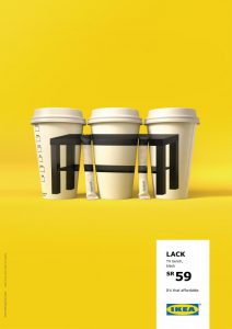
I have chosen the Naked Juice brand for my first advert. I have chosen this advert because it is bright and colourful. Not only this, the brands ethos complies with my magazine’s mission statement. This brand focuses on bringing the best out of people and allows them to focus on their health. It is readily available in your local supermarket making it accessible to all. My mission statement states ‘we hope to empower and inspire people,’ this quote matches with the Naked Juice ethos due to them wanting to promote a healthier, more active lifestyle – allowing them to be more motivated.
Not only this, I did some research to confirm that the advert would appeal to my target audience. I looked on the ‘yougov’ website and found that many Lorde fans enjoyed Naked Juice – with 39.1% enjoying the drinks. I thought that this brand would be a good fit for my magazine and there was also plenty of evidence to support my decision.
My chosen article to appear on page 6.
I have chosen for my page 6 advert an Ikea advert. I chose this advert because many of my target audience (18-19 year olds) may be moving into university accommodation or moving out of their parents house. This advert would appeal to them because it is advertising furniture in a unique way, making them more likely to purchase from Ikea. Furthermore, the brand has a minimalistic look that would appeal to my audience.
To confirm that this was the right choice, I did some research on ‘yougov’ and found that many indie pop artists liked the brand Ikea. With 73.6% of Marina and The Diamonds fans liking Ikea. I think that this is a good choice for my magazine, and would entice people to buy furniture from the brand.
I redrew the lines around the main cover star image so that they were smoother and looked more appealing to the eye. I think that this was a good decision as the other lines weren’t executed well on the previous draft.
I also slightly adjusted the colours of the gradient to create a more ambient, subtle, natural glow.
I also changed the font of the left cover line and put this in italics.
Contents Page
I slightly adjusted the angle of the film strip to make this adjacent with the side of the page.
I added another cover line to the ‘regulars’ section to fill negative space and entice people to buy the magazine as there is more content.
I also adjusted the text next to the film strip so that it was not near the centre line of the page.
Double Page Spread
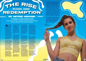
I changed the headline font to make it more impactful and bold. It also is cohesive with the rest of my magazine making it look uniform.
I added two line that have a gradient to draw the eye to my star’s name.
I also added page numbers to comply with the usual conventions of a music magazine.
Teacher Feedback
So what improvements need to be made?
Front Cover
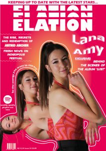
Change the format of the name ‘Lana Amy’ so that it is stronger and bolder.
Try including the colour black or another primary colour.
Contents Page
Add something onto the shoe, perhaps a cover line.
Increase the size of the cover line next to the film strip, or put it in a box so that it is separate to the rest of the spread and has a greater impact.
Double Page Spread
Change the number of columns from 4 to 3.
Colour correct the image so that it is of a better quality.
Increase the size of the stand first.
Change the glow on the stand first as it currently looks blurry.
Format the article better so that it is more interesting.
Add a pull quote or feature in the middle and wrap the text around.
For my second draft of my double page spread, I began from scratch as I wasn’t happy with my previous design.
click to see full screen
What’s new and What’s Changed?
I have now included and formatted my entire article so that it fits nicely and is appealing to the eye. I feel this has allowed me to gauge a sense on how to layout my magazine and has helped me determine the overall look.
I have added lines around my cover star to emphasise the shape of her plait this I feel adds a unique touch and also matches the front cover of my magazine – which enables it to be more unified.
I have also added white detailing to add to the indie-pop look which is unique and fun, I am going to smooth the details out to make them look better.
I have also selected a new font to give a shiny, bubbly, holographic look that is coherent with my genre and brings the page together. I chose this because through my research I found that that many of the magazines used unique effects such as a glow and a shine.
What’s next?
I will add a pull quote to the left side of the page to make the article look more appealing to read and draw the audience in. This will also comply with the required features of my magazine.
I will add page numbers.
I am also going to add text to the yellow bubble with the new album information and details. This will bring the magazine together and make the shape look less dominant.
I will improve the brightness of my main cover star image so that it is of a better quality.
I am going to make it look more cohesive and professional with some alterations to the ‘squiggle lines’.
I have changed the layout of my ‘features’ and ‘regulars’ section so that it is more appealing to the eye and stands out. I feel it pops more and allows the magazine to be brighter and a lot more colourful.
I have changed the placement of the filmstrip and changed the orientation so that it fitted in better with my magazine. I have also added some images to the film strip. I think that this adds some finishing touches and has a better effect when portrait.
I have removed the pink and orange circles and made them into ‘blobs’ that make up the background. I think this looks more professional and less blocky.
I have also slightly changed the placement of the title ‘contents’ to make it more flush with the image, this improving the minute details.
I have also changed the fonts so that they are bolder and stronger – matching my genre. I feel that this brings the magazine together as a whole and has a greater impact on the reader.
What’s next?
I will add more regular features onto my page to fill up the negative space, so that it is less empty. I will be careful not to make it too crowded.
I will add some text near my cover star image to highlight where the article features so that anybody interested in her can easily navigate to her story.
I will add page numbers so that I have the usual conventions of a music magazine.
I will also change the cover lines that are linked with the film strip so that it is more visually appealing and matches the quality of other features of my page.
I also need to realign the film strip so that it adjacent with the edge of the page as these details are important so that the magazine looks better.
I have moved the masthead to the center of the page so that it is more impactful and catches the consumers’ eye so they can easily identify the magazine.
I have also moved the barcode, price, and release date to the bottom left corner so that it doesn’t take away from the overall design. It also makes the design more conventional as this is typically where the barcode goes to make it easier to scan in stores.
I have also changed the design of my main cover stars’ name so it is more cohesive with the design and stands out. I have added a ‘wave’ to the text and have created a multicoloured drop shadow by using light pink and orange shades.
I have also changed the font of the headlines to make them bolder and stronger. I have also changed the text alignment from left to center to make it more appealing to the eye.
I have added a positive quote from Lana Amy’s interview to draw the audience in and give a sneak peek at what’s inside. It also emphasises the curve of the images and accentuates the lines around the images.
What’s Next?
I am going to smooth the lines around the main cover star’s image to make it more appealing to the eye.
I am going to come up with a more enticing main headline to draw the audience in, I will also increase the size of this text to make it stronger and more impactful.
I am also going to improve the lighting of my images using photoshop to make them of better quality.
I am going to work on the cover lines layout to make it stand out more and attract more attention.
I am going to increase the length of the wavy lines below the cover lines so it is more uniform.
This is a draft of the article which will be on my double page spread.
Astrid Archer was a newly emerging rising star back in 2017; she had everything going for her – a new album, brand deals, and collaborations with the hottest names in showbiz. However, this newly found fame didn’t last long. A scandal plummeted her, in just five weeks, to the most hated music artist ever. Now, five years later – she is back and ready to conquer the world for the second time.
Archer was a hot topic six years ago, whereby an off chance viral video of her singing ‘Tongue Tied’ by Grouplove went viral on Youtube, surging to one million views in a matter of hours. This unique adjustment brought its challenges. It was clear that her world had been turned upside down.
The aftermath was sensational, Columbia records had reached out to her to work on creating an album and releasing a debut single. ‘I was stunned, I came from a place with limited opportunities and this had just been offered to me – shocked doesn’t even express the feeling’ Astrid said. However, Columbia didn’t want the newfound fame to die out too quickly, so rushed to release a single.
‘Columbia Records gave me a song within two days that had been written by somebody at the label, but they wouldn’t disclose the name. I read the song for the first time and was a little confused, it sounded particularly similar to a Lorde song and some of the lyrics were almost identical. I just shrugged this off though – I wasn’t going to jeopardize my opportunity of being able to create music, this was a once in a lifetime opportunity. So I went along with it, little did I know this would be the biggest mistake of my life.’
June 21st, 2017. The single ‘Bracelet’ was released. ‘That was the worst day of my life. I will never forget it.’ stated Astrid. The response was dreadful, heart-wrenching, and horrible. Astrid Archer had made the biggest mistake in showbiz – copying another artist. Within hours she had been cancelled for ‘ripping off a Lorde song’.
After that moment Astrid stopped posting on social media. She went from the new girl on the block who was loved by everyone – to the most hated star in the business.
However, this is all in the past, and now… she’s back, better than ever.
5 years later and she was ready to start again. ‘I have questioned my move by doing this, but I need closure and I need a second chance’ she states. On a random May afternoon in 2021, she uploaded a picture to her Instagram account. It read ‘Long time, no see! I think it’s time I make a comeback – new single Hot Topic out next week’. This was a shock to the entire music industry, and it gained a lot of attention. Everyone was extremely confused why this had occurred. There was a lot of positive feedback but as she expected a lot of negative attention did occur and the trolls were still talking about her previous scandal and how ‘ripped off’ she was.
The single was released and it was completely different from the song ‘Bracelet’ – it allowed her to reset and start over, something which doesn’t happen often. ‘Hot Topic’ soared to the top of the charts within the first week and it was almost like she time traveled back to her early days with the newfound fame from singing covers. Astrid told us, ‘Now, I love life a hell of a lot more.’
Astrid has only trod her feet into the depths of being a celebrity, but sure is making a difference in the world. So what does the future hold for Astrid?
‘The future… Well, I live everyday like it is my last. I want to make a difference in the world and inspire young kids to never give up on their dreams – no matter what happens, because trust me I have been through it all. I look back at my younger self and the trials and tribulations I faced, even though it was awful at the time, It has shaped me into the person I am today. A little piece of advice to anyone reading would be to always make sure you are confident with what you are posting on social media – as it could resurface to hurt you in the future. But I guess what you really want to know is what is my future in the music industry? Well… management are gonna murder me for saying this… but. I am releasing a new album next year called ‘Redemption’.’
Overall, Astrid Archer has been through it all – The experience of a rising star, the regrets, and how you can redeem yourself no matter what has happened. We often question why Astrid wanted to do this interview with us, but she told us that ‘It was time for me to tell my side of the story.’
To continue developing my magazine I have created a double page spread. This will include an article that I have written myself and I have used InDesign to aid the design process.
click to see full screen
What I like about my double page spread
I like the images I have chosen to use and I think that the images on the left side of the page are simple yet effective – adding depth to the article.
I also love the headline and how I have formatted it. I think that the typeface works well and is legible, in particular I like how a shadow effect is created with the yellow and blue of the models clothing and this makes the pages cohesive.
I like how I have used a star on the stars’ name as I feel this adds a unique touch to the magazine.
What I can improve
I think that I could wrap the text around my image to make the spread more coherent and less blocky.
I can improve my pull quote and make it stand out more to draw the reader in. I can do this by adding a shadow and by formatting my text better.
I think that I will remove the box for my stand first as I feel it is too blocky and doesn’t look good on the double page spread.
I need to add my article into my magazine to check that it fits and works well.
I could add more graphics onto the page to make it tie in better with my other pages – such as adding a line around my main image.
To further develop my music magazine I did a second location shoot. We took pictures in different settings to add dimension to my magazine. See below the contact sheet.
click to see full contact sheet
I enjoyed doing this shoot and it allowed me to be creative. I was happy with the outfit and thought it reflected the genre well – but could’ve been improved if it was more colourful. I took a range of different shots of my model from extreme close up to extreme long shots so that I would have variation amongst the different images.
I have also shortlisted some images that I thought turned out well.
I do like all of these images and in particular, the mirror images – I think that these will feature in my magazine in my contents page. I could’ve improved these images by making sure they were well lit and of a better quality. I do think that I will do another studio shoot so that I have a variety of images to use in my magazine, and so I can ensure that the best quality pictures make it onto my magazine as it is important they are in focus and lit well.
Third Photo Shoot
As I wanted a more colourful look for my magazine, I decided to do another photo shoot. I used the white studio to take these pictures. To begin with we had some technical issues with the flash kit, but these were quickly resolved and some nice images were taken.
See below my favourite images from the shoot.
I have selected quite a few images as I want to include quite a few images on my double page spread. I will edit these pictures so that they are brighter and fit well on my pages.
To plan for my second shoot I have created an agenda to create a clear vision for my shoot.
Focus Forward
By creating this agenda I have been able to plan my shoot effectively, I have brainstormed some ideas for pictures I can take on location. This prior preparation is useful so that I can use my limited time effectively and get the crucial shots I require for my music magazine.
To continue the production of my music magazine, I compiled all of my contents page research and created a contents page from scratch. I then got some peer feedback to have another perspective of my magazine and further understand how I could improve this page.
click to see full screen
Peer Assessment
What type of shots have been used to create a variety of shot distances and how has the camera been used to communicate meaning?
A medium close-up has been used to portray the model as strong. This is successful because her upper body is in the frame, whilst she looks down at the audience (showing dominance). The cover star is positioned so that her foot is in frame, but out of focus. This makes it look like she’s going to step on the camera/ us. The well-lit lighting, and appropriate posing/ positioning demonstrates a clear link between conventional indie magazines. I think that this content page could use another photo to fill the top half of the page, as it is mainly just text placements currently.
What choice of mise-en-scene is appropriate for the star image and genre?
The outfit worn by the star is a pair of plain black trousers and boots, with a bright pink and orange top. This top (being different and eye-catching) does not clash with the other parts of her costume. Instead, the tops colour palette matches the magazine’s colour theme perfectly. The worm’s-eye view angle gives us a good vision of the model’s necklace. This is important since she doesn’t have any other accessories on display.
How far is the font used readable and reflects the genre?
I like the chunky, bold, and bubble-like typeface used. It’s very clear and legible. The colour is also easy to read against the light background. Since it has the shadows of different colours it also isn’t boring. I really like how the title wraps around the models’ side too. The only thing I’d say is that I’m not sure if the magazine’s genre is indie or pop?
What technical conventions of a Contents page are present and used effectively?
She has included her main title, page numbers, and she has used superlatives/ alliteration in her plug. Specifically, I like the use of language techniques in the plug, “greatest gig guide” because it really convinces the audience that they should read this magazine. The coverlines, features, and upcoming articles haven’t been added in yet, but there are place holders.
How has Indesign been used to layout the page to convey a brand?
The layout of the page leaves a generous amount of space for the cover lines and page titles in the top right-hand corner. Then the bottom left-hand corner has the main cover star’s photo. This Indesign layout is good because it means that the page is evenly spread out. Having the writing at the top of the page is also a clear way to present the page’s information- so that it’s easy to read.
How well have the text and visuals been integrated together?
The colour palette between the images, text, and decorative shapes match perfectly. The only colour that’s missing in the main cover stars top, from the title, is a lighter pink. However, I don’t think this page needs any other colours. Since the background is a pale cream colour, it’s a safe choice. It isn’t contrasting from the grey text, but it does let the colourful plug circles pop out.
Where has photoshop been used to manipulate the photos to enhance the star image or genre?
Photoshop has been used to cut out the model from the photos white background. The cut out is quite clean, the only part where I can see the white background/ outline is at the ends of her ponytail (which is the hardest part to ease). It also looks like the necklace may have been sharpened or filtered to make it glimmer and stand out even more.
How is the language used appropriate for the genre and target audience?
The language used so far is appropriate for either genres and the target audiences. They will most likely be able to guess who will feature in “the greatest gig guide 2022”. Therefore, making your coverlines fit for the target audience will increase their chance of buying/ reading the magazine further.
Conventional, strong, aesthetically pleasing, trendy, understandable, A grade (when finished)?
My Reflection and Focus Forward
This peer assessment has allowed me to understand what is good and bad about my contents page. I can observe what I need to improve and change, and when I have the next opportunity to redraft I can focus on my targets.
Add coverlines that suit my genre
Add some more grungy aspects to make it easier to identify the indie pop genre
Include some more appropriate images
Refine the hair of my model in photoshop
These targets will allow me to further improve my magazine and make it the best it could possibly be. In my next opportunity to redraft I will definitely add all of these features to complete the contents page.