After some reflection of our first draft, we continued production of our digipak and created a draft 2.


Screencastify of Feedback from Teacher
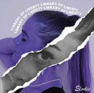
What works well?
- Overall it is fantastic and works well, the graphics are well developed and technical.
- The tonal differences between the images create depth and the black and white images are striking and powerful.
- The composition of the image with looking directly into the camera is great and conveys meaning well.
- The back of the digipak is perfect.
- The choice of font is perfect and correct for the genre.
What can we improve?
- We should make the ‘elodie’ bigger.
- The album title following our model is somewhat confusing and we should consider trying alternative options.
- Seems peculiar placing the CD on our models face.
- Perhaps on the inside of the digipak repeat the motif of the tear.
- Too many images on the inside, consider creating some graphics.
Focus Forward
Overall, I am pleased with the front and back of the digipak, there are some tweaks to make but overall they work together well. I am not happy with the inside of the digipak, I feel it is too flat and 2D compared to the front and back, lacking dimension and shape. It lacks quality and is not up to par with the rest of the design. We are going to do another shoot, using a disco ball, to create some new images which we can use and modify. This will help break up the images of our model and not be too overwhelming. There are also slight colour differences between the front and back which needs altering so they match and the overall effect is carried out effectively. We now have a plan of how to carry out our final draft and ensure that we work productively.