See below my complete draft 3 magazine.

So what’s new and what’s changed?
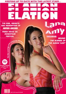
Front Cover
- I redrew the lines around the main cover star image so that they were smoother and looked more appealing to the eye. I think that this was a good decision as the other lines weren’t executed well on the previous draft.
- I also slightly adjusted the colours of the gradient to create a more ambient, subtle, natural glow.
- I also changed the font of the left cover line and put this in italics.
Contents Page
- I slightly adjusted the angle of the film strip to make this adjacent with the side of the page.
- I added another cover line to the ‘regulars’ section to fill negative space and entice people to buy the magazine as there is more content.
- I also adjusted the text next to the film strip so that it was not near the centre line of the page.
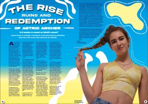
Double Page Spread
- I changed the headline font to make it more impactful and bold. It also is cohesive with the rest of my magazine making it look uniform.
- I added two line that have a gradient to draw the eye to my star’s name.
- I also added page numbers to comply with the usual conventions of a music magazine.
Teacher Feedback
So what improvements need to be made?
Front Cover
- Change the format of the name ‘Lana Amy’ so that it is stronger and bolder.
- Try including the colour black or another primary colour.
Contents Page
- Add something onto the shoe, perhaps a cover line.
- Increase the size of the cover line next to the film strip, or put it in a box so that it is separate to the rest of the spread and has a greater impact.
Double Page Spread
- Change the number of columns from 4 to 3.
- Colour correct the image so that it is of a better quality.
- Increase the size of the stand first.
- Change the glow on the stand first as it currently looks blurry.
- Format the article better so that it is more interesting.
- Add a pull quote or feature in the middle and wrap the text around.