My response to question 1.

My response to question 1.
Please see below a screencastify answering question 2.
Transcript for Screencastify Video
Introduce your magazine, name, genre…
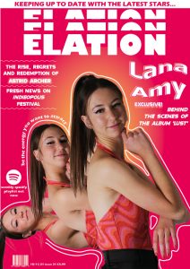
My magazine is called Elation and is an indie-pop magazine.
Describe your brand values / quote your mission statement?
Elation as a brand aims to produce new uplifting content that creates a space for individuals to grow creatively and form a community with people just like them. The Mission statement reads; Here at Elation, our aim is to create a feel good, fun and artistic magazine that provides opportunities for smaller artists and those who are looking for that ‘break’. We hope to empower and inspire people to be their true selves and be a part of a wider community. We are passionate about the content we create and aspire to do good in the world. If you’re looking for an authentic magazine that keeps you up to date with the latest indie pop music news – then elation is for you.
Who are your target audience?
Elation’s target audience consists of individuals who fall under the psychographic categorisation of young aspirers and reformers who are fun individualists aiming to endorse change. Furthermore, the demographics of the audience are 17-21 year olds females who live in cities that are still involved in the education system.
Why would that audience buy your magazine?
The uses and gratification theory by Blumler and Katz can be used to analyse the decisions I made to engage my audience in four different ways. These are categorised into entertainment, social interaction, personal identity and information.
AIDA is a marketing strategy that allows you to focus on four key parts of design to draw your audience in and provoke them to buy your product. These four things are attention, interest, desire and action.
Who would you want to work with to distribute your magazine?
I would choose the company Hearst to represent my magazine as there is a gap in the market for my music magazine in their company. Not only this, they own many magazines that my audience would also like such as Cosmopolitan and Elle so my magazine would have an even bigger audience as they already have an established following. Not only this, Hearst’s mission is to create premium, purposeful content that helps audiences and partners strive, thrive and get more out of life. This statement complies with my magazine’s ethos and ideology, this is extremely important as I would want to choose a brand to represent my magazine who valued the same morals my magazine did.
What sort of advertiser would you hope to attract?
To understand the type of advertiser I would like to attract I selected two adverts that would appeal to my target audience.
For the first article I chose the Naked Juice brand. I chose this advert because it is bright and colourful and this is appealing to my audience. Not only this, the brand’s ethos complies with my magazine’s mission statement. This brand focuses on bringing the best out of people and allows them to focus on their health. It is readily available in local supermarkets making it accessible to all. My mission statement states ‘we hope to empower and inspire people,’ this quote matches with the Naked Juice ethos due to them wanting to promote a healthier, more active lifestyle – allowing them to be more motivated. It is important to me to have advertisements in my magazine that support my magazines messages and this was why I chose Naked Juice.
For my page 6 advert I chose the brand Ikea. I chose this advert because many of my target audience (18-19 year olds) may be moving into university accommodation or moving out of their parents house. This advert would appeal to them because it is advertising furniture in a unique way, making them more likely to purchase from Ikea. Furthermore, the brand has a minimalistic look that would appeal to my audience.
What strategies do you have for distribution? How will you link your print content with online content? Have specific ideas, examples, stats and facts to back up your proposals.
For the distribution of my magazine I will be focusing on print and digital copies. This is because 44% of readers prefer paper copies and 27% prefer digital. I have decided to have an online distribution as well because when you calculate 27% of 1,083 people that’s almost 293 people. That’s 293 people we would miss out on if we did not publish online. Both print and digital forms of a magazine can work together and are liked by many, meaning that you can grow your audience and profits by publishing both versions of the same magazine with about the same cost – as digital magazines are cheap to produce. This allows you to reach a wider variety of people creating a bigger reach and audience.
To help my magazine survive in the digital age I will use social media to promote the magazine and enforce audience participation and interaction to create a sense of community so that you are getting more out of the magazine when buying it, as these days we lack social interaction with one another.
I think that it is also important to include freebie items with the magazine as this adds a new selling point making the individual want to buy the magazine more. My magazine would include items such as vouchers for the latest health brands, new makeup products such as mascara and lipgloss. This would encourage individuals to buy the magazine in the print form instead of the digital form as you will be getting more for your money.
See below my MP3 recording of my letter discussing the production skills I learnt throughout the project to a prospective year 11 student.
Transcript
My name is Maisy, I am a current year 12 student who is taking media studies. This letter will give you a taste of what you will learn on this course whilst making a music magazine and the new skills you will develop in the production process. It includes technical, creative, and transferable skills such as: how to use Adobe Photoshop and InDesign and how to communicate with others. You may think you could make a music magazine in maybe a week? However, this project took us over four months to complete.
Throughout the design process, you will learn many technical skills that will aid you in making your magazine the best it can be. We used software such as Adobe Indesign and Photoshop to layout a magazine using text boxes, text manipulation, and shapes. We manipulated images on photoshop by using tools such as select and mask, image adjustments, and smoothing tools. Technical skills are extremely important as they have an impact on the star image and how you want to represent them.
For example, I used photoshop to improve the lighting and quality of my images. I would use the image adjustment tool, my favorite being curves, to increase the brightness. However, as I learned it is a very precise process and it is very intricate. The curve represents the tone and you can move the line to increase or decrease the light, mid and dark tones in the image. Sometimes, I did adjust the image far too much to the point where it was so bright you couldn’t make out my model, don’t be afraid to make mistakes next year; it’s all part of the process. I found this skill particularly helpful as it allowed me to create good quality images, showing that my star has a professional demeanor.
In the design process, mise-en-scene is one of the most important parts of media. It is a concept that allows you to focus on the story you want to tell with an image. There are 5 key features; costume, lighting, action, makeup/hair, props, and setting. Which can be remembered with the mnemonic CLAMPS. By deciding how you want to include each element you can create a strong image that conveys a particular, clear message. This key skill has a good impact on your magazine as it allows you to represent your star perfectly to fit your target audience’s wants and needs.
My magazine was of the indie-pop genre, this genre was particularly colorful, light-hearted, and bold with a hint of grunginess. So to convey this meaning I dressed my star in a colorful bodysuit with a pair of leather trousers. I also used a pair of glasses and had my model style her hair in a high ponytail. This focus on mise-en-scene allowed me to portray a particular narrative and helped me produce a successful magazine. This creative skill also impacted AIDA, which is a strategy to draw your target audience into reading your magazine by provoking awareness, spiking an interest, creating desire, and a call to action. By ensuring my mise-en-scene was well developed I could be certain that individuals would buy my magazine as it hits all of the AIDA requirements.
Media studies is a great way to learn skills that can be used in other subject areas and the real world. One that I felt benefitted me the most was communication. Throughout the process, you learned how to communicate with others and work collaboratively through emails and social media sites. Not only this you also learn how to communicate meaning in blog posts and how to share ideas with others, providing you with the basic skills of how to work collaboratively with a wide range of individuals – all of which will be important in the working world. By learning these skills it enables you to be organised, reliable, and a good team player.
For example, I created a production meeting agenda where I could plan and organize with my models so that the perfect image could be created. I informed them what clothes they would need so I could ensure that my brief was being met allowing me to convey a perfect star image. I also made sure to communicate with my models in an easy way that was accessible for all, I decided to use Snapchat as this was a social media site we all had easy access to.
If you are a creative, hardworking individual who likes editing and design then media studies would be a good fit for you.
Please see below my infographic answering question 4.
For my magazine I am have two include two adverts of my choice that my target audience would find appealing. I have analysed some data from yougov.com and have decided on some adverts.
My chosen article to appear on page 3.

I have chosen the Naked Juice brand for my first advert. I have chosen this advert because it is bright and colourful. Not only this, the brands ethos complies with my magazine’s mission statement. This brand focuses on bringing the best out of people and allows them to focus on their health. It is readily available in your local supermarket making it accessible to all. My mission statement states ‘we hope to empower and inspire people,’ this quote matches with the Naked Juice ethos due to them wanting to promote a healthier, more active lifestyle – allowing them to be more motivated.

Not only this, I did some research to confirm that the advert would appeal to my target audience. I looked on the ‘yougov’ website and found that many Lorde fans enjoyed Naked Juice – with 39.1% enjoying the drinks. I thought that this brand would be a good fit for my magazine and there was also plenty of evidence to support my decision.
My chosen article to appear on page 6.
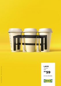
I have chosen for my page 6 advert an Ikea advert. I chose this advert because many of my target audience (18-19 year olds) may be moving into university accommodation or moving out of their parents house. This advert would appeal to them because it is advertising furniture in a unique way, making them more likely to purchase from Ikea. Furthermore, the brand has a minimalistic look that would appeal to my audience.

To confirm that this was the right choice, I did some research on ‘yougov’ and found that many indie pop artists liked the brand Ikea. With 73.6% of Marina and The Diamonds fans liking Ikea. I think that this is a good choice for my magazine, and would entice people to buy furniture from the brand.
See below my complete draft 3 magazine.

Front Cover
Contents Page
Double Page Spread
Front Cover
Contents Page
Double Page Spread
For my second draft of my double page spread, I began from scratch as I wasn’t happy with my previous design.
What’s new and What’s Changed?
What’s next?
See below my draft two of my contents page.

What’s new and what’s changed?
What’s next?
This is my second draft of my front cover.

What’s New and What’s Changed?
What’s Next?
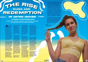
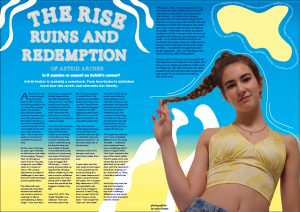
This is a draft of the article which will be on my double page spread.
Astrid Archer was a newly emerging rising star back in 2017; she had everything going for her – a new album, brand deals, and collaborations with the hottest names in showbiz. However, this newly found fame didn’t last long. A scandal plummeted her, in just five weeks, to the most hated music artist ever. Now, five years later – she is back and ready to conquer the world for the second time.
Archer was a hot topic six years ago, whereby an off chance viral video of her singing ‘Tongue Tied’ by Grouplove went viral on Youtube, surging to one million views in a matter of hours. This unique adjustment brought its challenges. It was clear that her world had been turned upside down.
The aftermath was sensational, Columbia records had reached out to her to work on creating an album and releasing a debut single. ‘I was stunned, I came from a place with limited opportunities and this had just been offered to me – shocked doesn’t even express the feeling’ Astrid said. However, Columbia didn’t want the newfound fame to die out too quickly, so rushed to release a single.
‘Columbia Records gave me a song within two days that had been written by somebody at the label, but they wouldn’t disclose the name. I read the song for the first time and was a little confused, it sounded particularly similar to a Lorde song and some of the lyrics were almost identical. I just shrugged this off though – I wasn’t going to jeopardize my opportunity of being able to create music, this was a once in a lifetime opportunity. So I went along with it, little did I know this would be the biggest mistake of my life.’
June 21st, 2017. The single ‘Bracelet’ was released. ‘That was the worst day of my life. I will never forget it.’ stated Astrid. The response was dreadful, heart-wrenching, and horrible. Astrid Archer had made the biggest mistake in showbiz – copying another artist. Within hours she had been cancelled for ‘ripping off a Lorde song’.
After that moment Astrid stopped posting on social media. She went from the new girl on the block who was loved by everyone – to the most hated star in the business.
However, this is all in the past, and now… she’s back, better than ever.
5 years later and she was ready to start again. ‘I have questioned my move by doing this, but I need closure and I need a second chance’ she states. On a random May afternoon in 2021, she uploaded a picture to her Instagram account. It read ‘Long time, no see! I think it’s time I make a comeback – new single Hot Topic out next week’. This was a shock to the entire music industry, and it gained a lot of attention. Everyone was extremely confused why this had occurred. There was a lot of positive feedback but as she expected a lot of negative attention did occur and the trolls were still talking about her previous scandal and how ‘ripped off’ she was.
The single was released and it was completely different from the song ‘Bracelet’ – it allowed her to reset and start over, something which doesn’t happen often. ‘Hot Topic’ soared to the top of the charts within the first week and it was almost like she time traveled back to her early days with the newfound fame from singing covers. Astrid told us, ‘Now, I love life a hell of a lot more.’
Astrid has only trod her feet into the depths of being a celebrity, but sure is making a difference in the world. So what does the future hold for Astrid?
‘The future… Well, I live everyday like it is my last. I want to make a difference in the world and inspire young kids to never give up on their dreams – no matter what happens, because trust me I have been through it all. I look back at my younger self and the trials and tribulations I faced, even though it was awful at the time, It has shaped me into the person I am today. A little piece of advice to anyone reading would be to always make sure you are confident with what you are posting on social media – as it could resurface to hurt you in the future. But I guess what you really want to know is what is my future in the music industry? Well… management are gonna murder me for saying this… but. I am releasing a new album next year called ‘Redemption’.’
Overall, Astrid Archer has been through it all – The experience of a rising star, the regrets, and how you can redeem yourself no matter what has happened. We often question why Astrid wanted to do this interview with us, but she told us that ‘It was time for me to tell my side of the story.’