Your Tour Poster

Standard

This is your chance to shine now. This is your chance to put all your technical skills with Indesign and your knowledge and understanding of how font, colour, images and language can help communicate a story.

BRIEF
A client has come to you with an image of themselves as a performer. Their style of music will belong to a particular genre. They want you to design a poster for an A4 page in a magazine, advertising and promoting their forthcoming tour. You must include the following:

  • Name of artist
  • Name of the Tour
  • Dates and Venues
  • Other information like: where the album can be bought/downloaded, tickets available from and prices etc.

Why not use the previous album cover presentation as a start for inspiration?

Consider AIDA – attention, interest, desire and action.

Look at this presentation of CD covers that relate to specific genres and you will see how ‘conventional’ the colour palettes are for each individual genre.  Make sure you too follow the conventions but create an innovative and eye catching poster.

Finally, include all your relevant research/planning documents such as a brainstorm, sketch, stick n lick layout.  Remember, Mrs Hibbs said you should doodle, muse and research before you open up your Indesign.

Self Assess Your Mock-Up

Standard

Self Assessing your Mock Up

For the purposes of this self assessment please judge your work against the following headings

  1. How well did you manipulate photographs (including cropping and resizing)
  2. Did you integrating image, illustration and text accurately?
  3. Did you follow the colour scheme on the original page?
  4. Did you follow your lick and stick analysis of the conventions of layout and page design?
  5. Were you consistent/accurate in your use of fonts and text size?
  6. How well did you use Photoshop & Indesign?

Your Blog:

Please insert a copy of your mock-up; a Jpeg thumbnail links to a PDF version of your front page.

  1. Beneath that you should write three sentences on what you think works well on the page and that you are happy with.
  2. Then three sentences on areas which you would like to improve on or were unhappy with.

Use the assessment criteria above for areas to discuss.

Then seek out up to 3 x tutorials on InDesign, which will help you improve on your skills and design techniques next week, when you make a tour poster.

Desktop Publishing & InDesign

Standard

Lesson 1 + 2

Serena will take us all through the basics of:

  • PHOTOSHOP – how to cut out an image and ‘improve’ it (find your poster image to practise on).
  • INDESIGN – how to create a poster template, place a photo, add text, change colours etc.
  • You will be allocated a specific edition of the iconic music magazine, NME (New Musical Express).
  • The aim is to recreate the layout and to recap on the main conventional design features of a magazine cover.

Lesson 3, 4

  • You will be allocated a specific edition of the iconic music magazine, NME (New Musical Express).
  • The aim is to recreate the layout and to recap on the main conventional design features of a magazine cover.
  • Using Indesign – recreate/copy the cover you have been allocated.
  • Each of you will create your own version but you can work with your partner in terms of sharing ideas for fonts etc.
  • You do not need to find the exact photo – any one with a similar grouping of performers or artist will do or in fact you can add in a box with a cross through it if you really can’t find one that will do.
  • The main aim is that you have some fun with Indesign – find the right fonts, play with the sizing, kerning etc and do your best to lay out the cover with a conventional layout.
  • Here are some suggestions for cover photos – see the first slide for caveats on what you will and won’t be able to do with them but it might save you time trawling the web.

Lesson 5 + 6

  • Reflect on how you did – find 3 strengths and 3 weaknesses.
  • Set yourself some targets by finding @ 3 self help YouTube tutorials for any aspects of Indesign that you struggled with and embed the videos in your self assessment post.  Make sure you watch them in full this weekend in preparation for your own album poster design next week.
  • You may amend your draft 1, but it is important that you spend time exporting as a JPEG and a PDF, uploading  to your blog.
    • Remember to introduce the content (your mock-up front page)
    • Reflect on what you have learnt
    • Link in the online tutorials that will help you improve your use of Indesign next week.


Camera – framing, angle and distance all make meaning

Standard

In groups of @ 3, you must shoot 9 photographs using some of the techniques we have been experimenting this week. You should try and use a DSLR.

For example:

  • an extreme close up of a tear stained eyes could underline a character’s sadness and vulnerability.
  • an extreme long shot of a man standing alone on a deserted beach might portray his isolation and solitude.
  • a two shot of a two people, with one in the foreground looking away from the camera and the other slightly out of focus in the background could add an enigmatic, mysterious feel to the scene as well.

Remember to consider:

  • Angle – high, low, canted x 3
  • Distance – ECU, MS, LS, ELS x 3
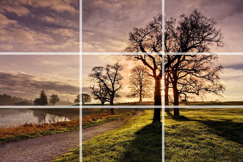
  • Composition – rule of thirds, lead space and Depth of Field x 3

Each photo should then be uploaded to goboard.com with the technical details of the photograph annotated (T), a description of the scene (E), some connectives for represent and what meaning is communicated (A) using appropriate adjectives.  TAKE A NOTE OF THE URL FOR YOUR OWN MOODBOARD ON GOBOARD.COM SO THAT YOU CAN EDIT IT LATER.

Remember to bring in facial expression, body language, proxemics and gesture to add weight to the narrative story your picture is trying to tell. What about MES to add even more weight to the meaning?  Try and get some special FX in too i.e. motion speed blur?  gomoodboard.com is also good (this is the one that I have used) but you have to upload and comment and complete all at one go as it doesn’t seem you can return to it.

Use locations around the school (but be respectful and safe) i.e. from a high angle at the top of the stairs looking down at your subjects or a low angle looking up at your subject/frames/point of views, lead space looking whistfully out of a window at the sky?

DISTANCE
Image result for close up of tear stained eye

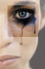
The close up of the tear stained eyes conveys a sense of sadness and vulnerability of the model.

ANGLE
Image result for high angle shot of a small child

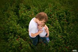
The high angle shot of the small children  helps represent their weakness by reinforcing their small stature. The composition using the rule of 3rds also draws attention to their isolation as they sit firmly in the middle of the shot surrounded by foliage and no other humans.

COMPOSITION 
Image result for depth of field

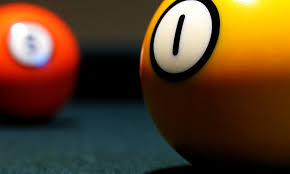
The yellow snooker ball  is clearly the important object in this frame. Using depth of field, the other snooker ball is out of focus, present and yet not as important as the yellow one that signifying that the important focus of the photograph is the yellow number 1 ball.

Please click on the moodboard below to go a moodboard site to see how the comments on the meaning and composition of the shots have been compiled. Good luck. HAVE FUN!

Essential Rules of Composition

Standard

Composition

Good shots do not just rely on using the focal length and shutter speed well or even just getting something in focus.  You must always try and work out how and where to place  the objects/subjects in your frame so as to draw attention to the main focus of your ‘story’ (picture).

Remember, this is all about story telling so make sure the signs, symbols and messages you want to convey are placed and highlighted correctly in the frame.

There are a number of rules relating to formal composition:

  • The Rule of Thirds
  • Depth of Field
  • Contrast & Texture
  • Lead Room

These are rules which can be followed or subverted to effect in film making.


How to use a DSLR

Standard

When you come to take your photos for your Music Magazine, you need to take some excellent shots. Many of you will have up to date and advanced smart-phones which will take some great shots, but using a DSLR camera when you can implement depth of field and get excellent images by playing with shutter speed and aperture size, could mean your photos are much, much better.

Neither Mr Gregson or Mrs Cobb are specialist photography teachers. However, this is your chance to play around and experiment with the DSLR cameras after a short introduction to the very basic controls and functions available.

With your partner, experiment with aperture size, (which changes the focal length) and shutter speed in various lighting conditions (inside, outside, natural light etc) and with the flash and automatic and manual settings. Only by playing, making mistakes and learning by them will you be able to use a DSLR for your photo shoot.

Here is a very good video, which talks through and illustrates the three key parts of a DSLR that you need to experiment with:

  • Shutter Speed
  • Aperture
  • ISO

Enjoy the time to play.

Contact Sheet – how to…….

Standard

Make sure ALL of your photos are in your Pictures Folders.

Open Adobe Bridge and Photoshop

Bridge

  • Select the photos from the pictures folder
  • Tools – select Photoshop – select Contact Sheet

Photoshop

  • Contact Sheet should be displayed
  • Export as Quick Export PNG

Embed the Contact Sheet Full Size in your blog.


Mise-en-scene (Designing your music star)

Standard

Here are the presentations from the lessons on Mise En Scene.


Remember for this post on costuming and dressing a model for your allocated genre of music performer you should:

  • Include a draft photo from the class in your test outfit with some of the comments and adjectives that the class suggested as to how your character was represented.
  • Embed one slide that is a moodboard with images of ideas for how a performer from your allocated genre could be represented in terms of costume, facial expressions, hair, make-up, body language, gestures, props etc. Use adjectives.
    • This should be summarised with comments on the general idea of MES for your allocated genre with relevant adjectives as to how that genre is generally represented.
  • Contact Sheets of photo taken from the actual shoot with commentary on the good, the bad and the ugly and adjectives to describe them.
  • Final and chosen photo of your artist in costume with a commentary on how they are represented/portrayed with plenty of relevant adjectives.
    • Reflect on how why that image seems to work better than the other ones from the shoot.

Textual Analysis (Album or Tour Poster)

Standard

Remember, what is it ‘saying’?  The denotations (things) all have connotations (meanings).  Use terms like these in your introduction to the post along with decoding, deconstructing, signs, symbols etc to show that you are getting to grips with how to analyse a media text.  You can use synonyms for represent too – portray, suggests, infers, implies, indicates etc.

Use Call Outs on your slide to evidence the comments.

Use this link to open the slideshow, take a copy, delete all the images you’re not going to use and then complete your analysis.

Please submit this work via Google Classroom (to be set up).