Production Meeting Agenda For 2nd Photo Shoot and Risk Assessment

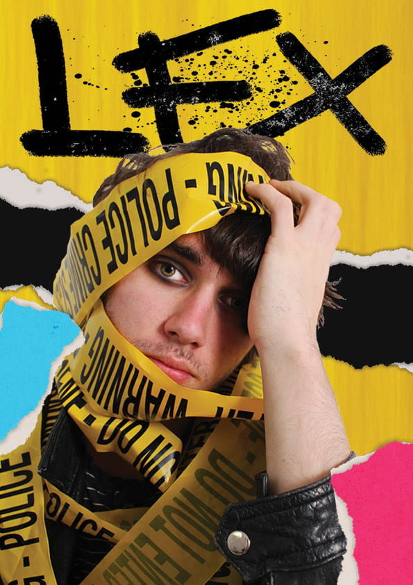
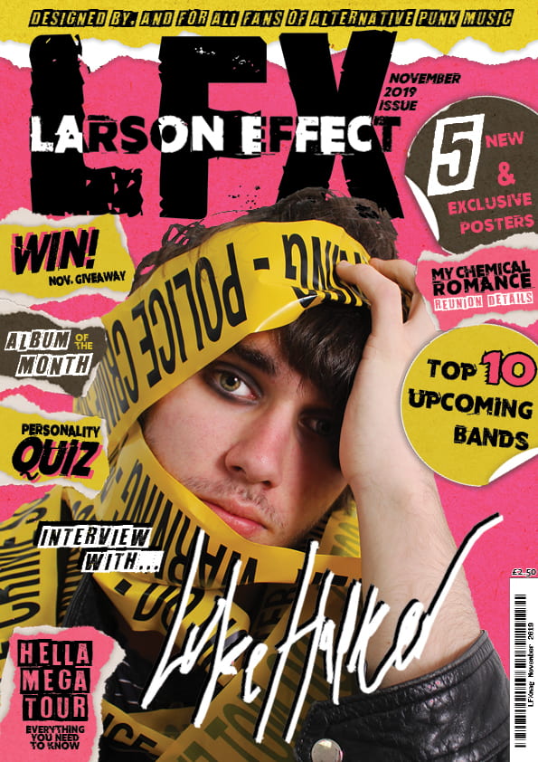
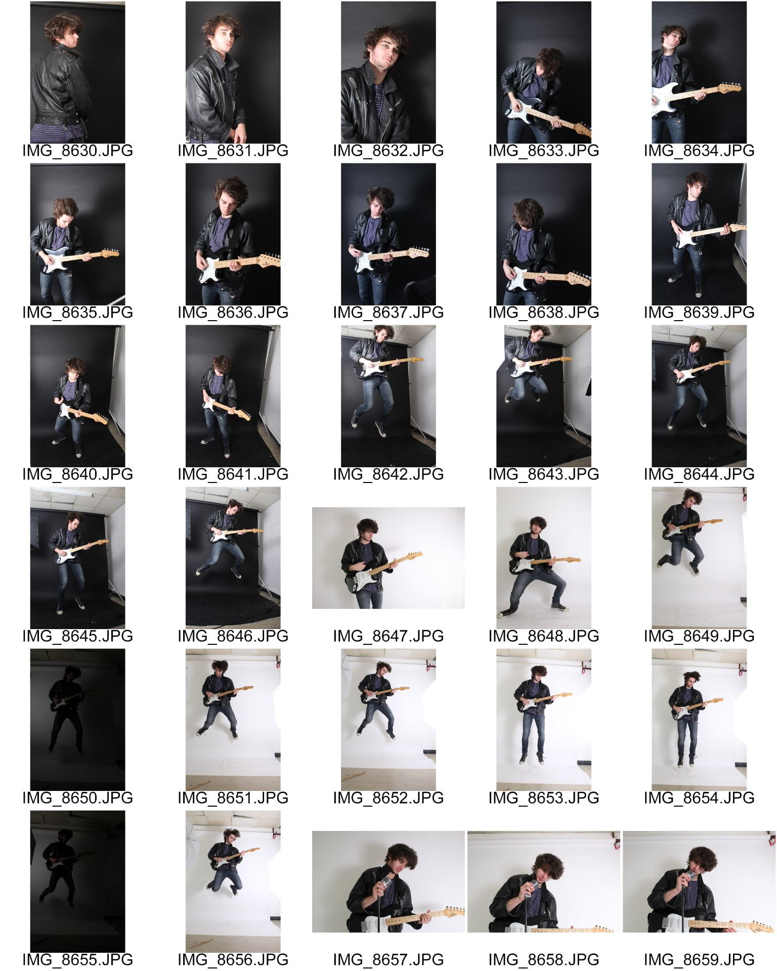
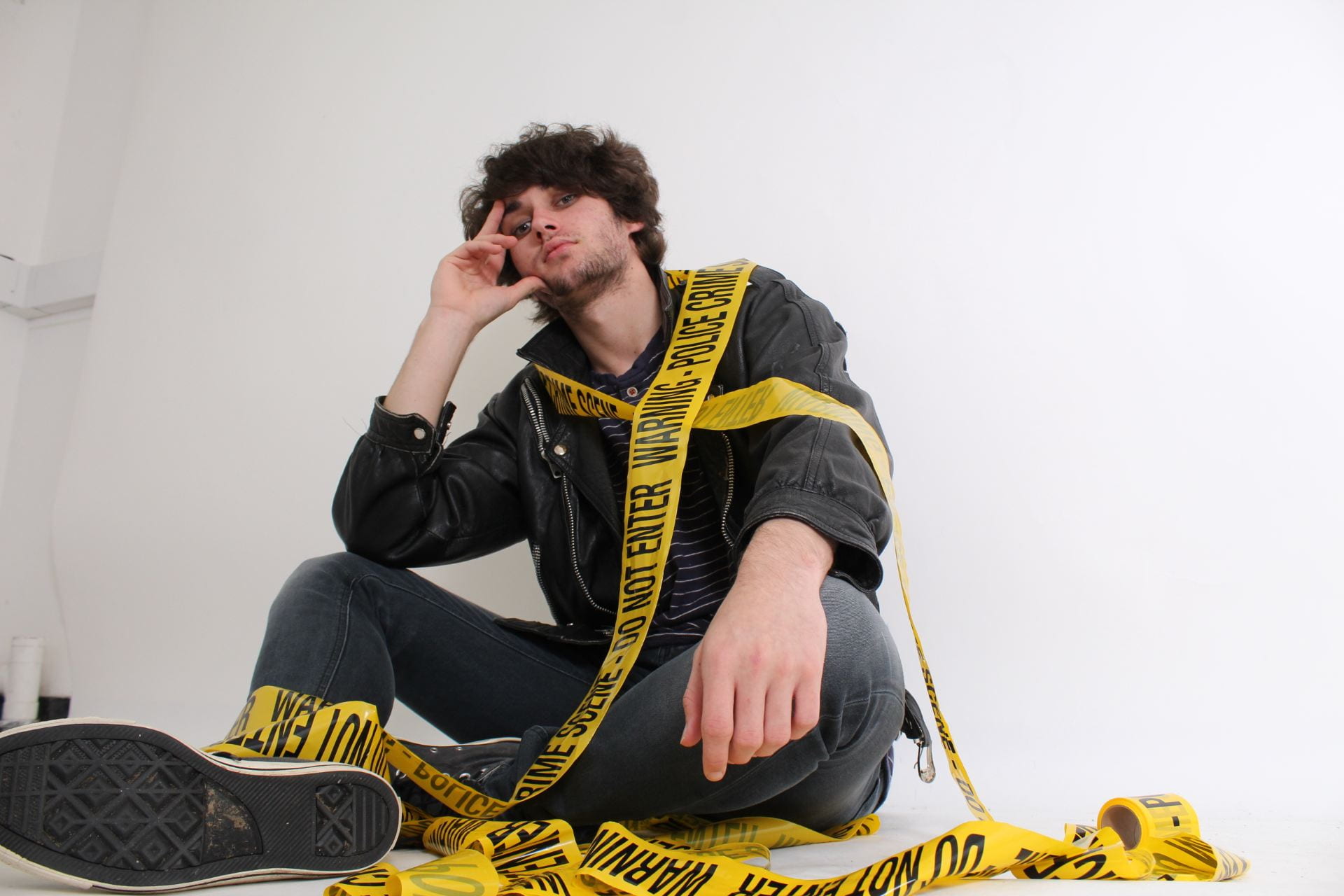
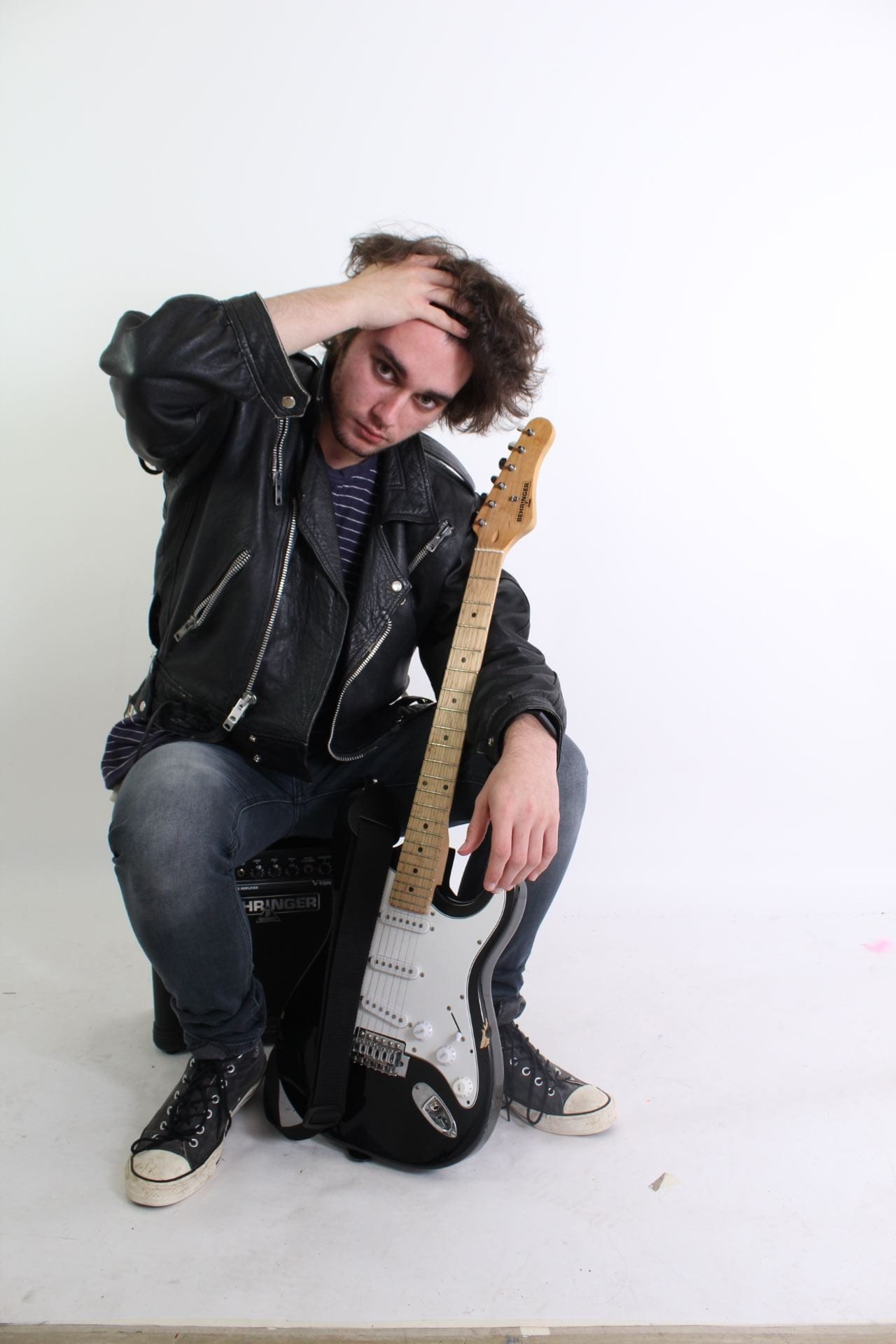
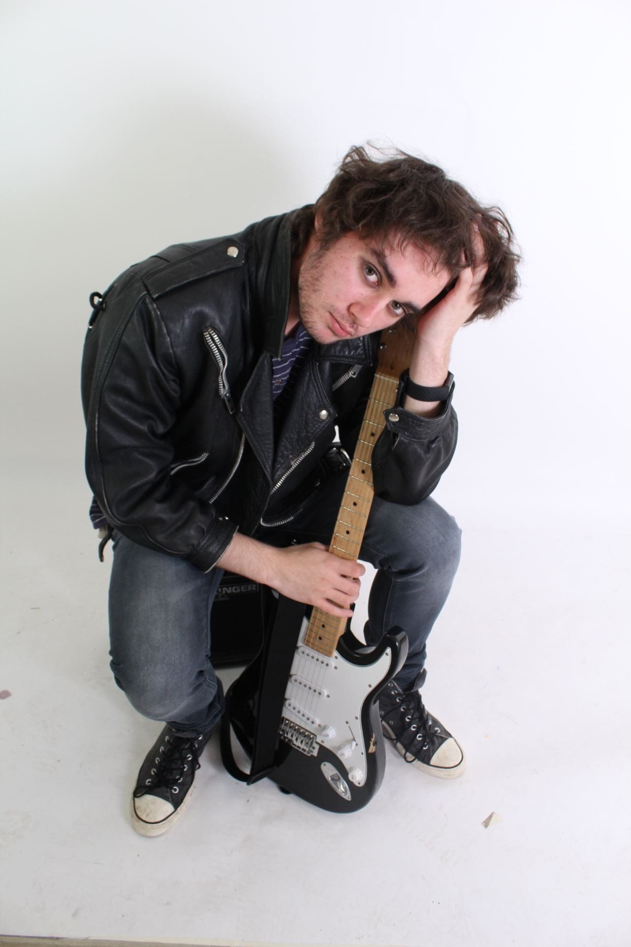
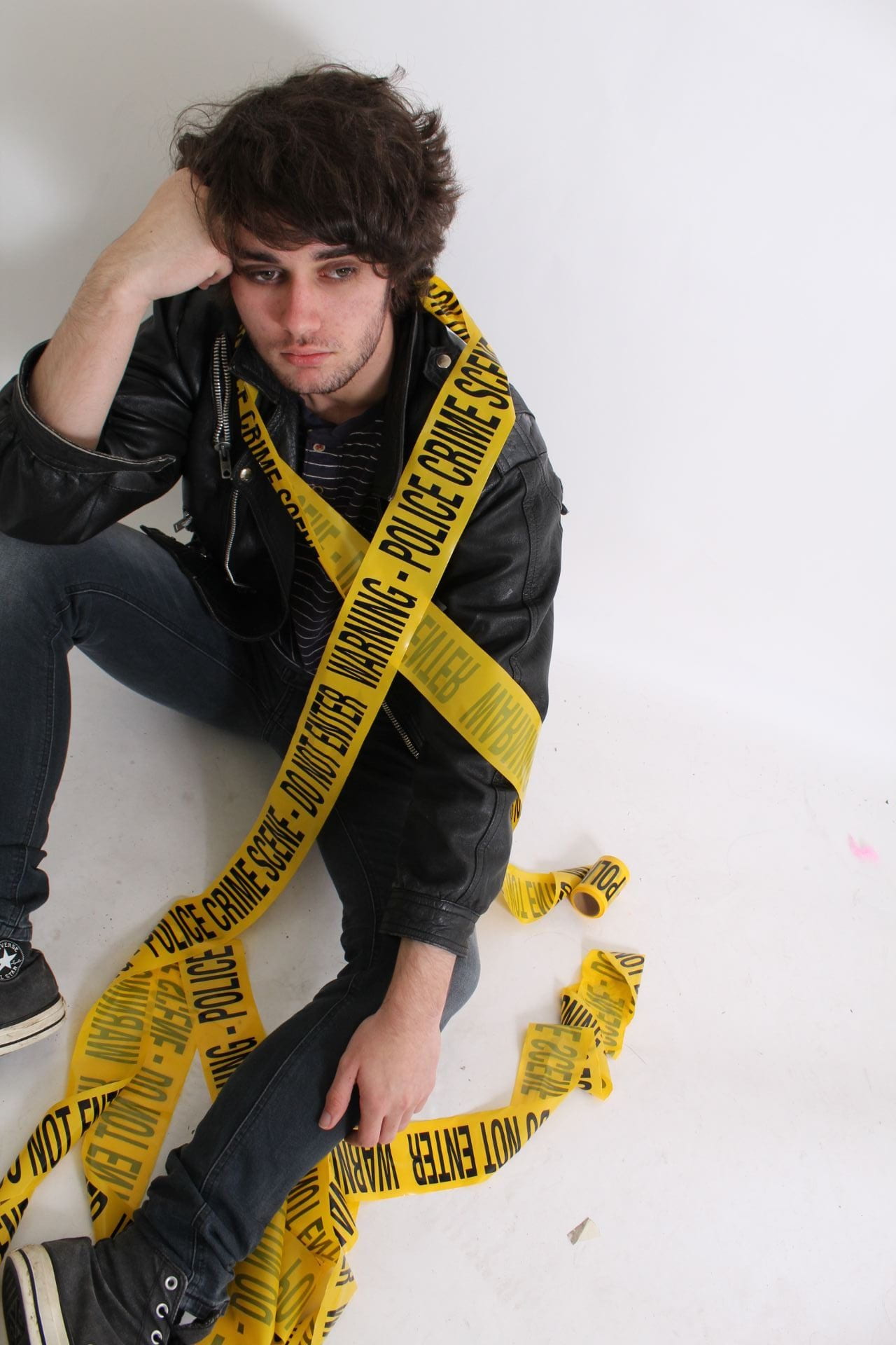
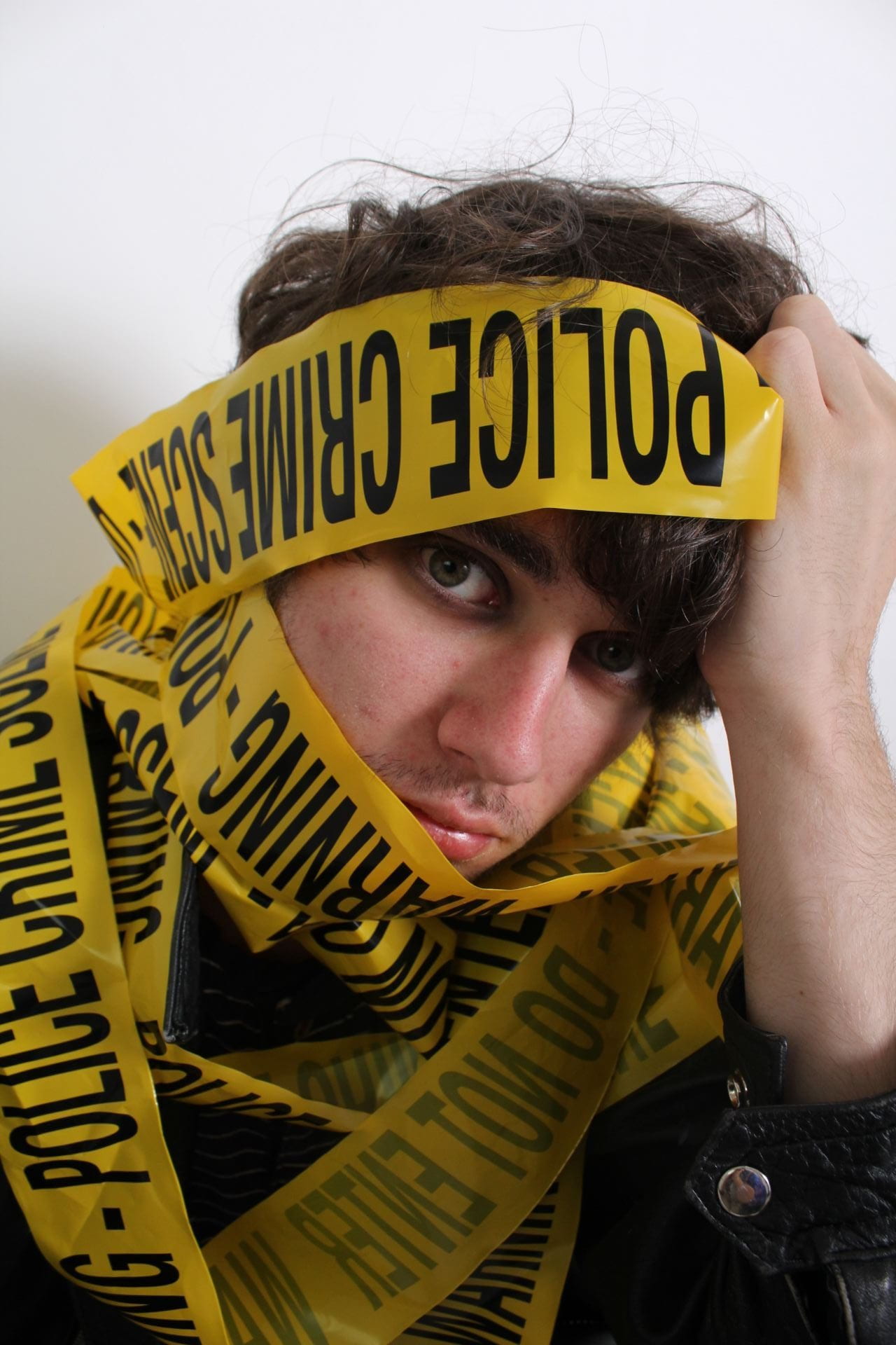
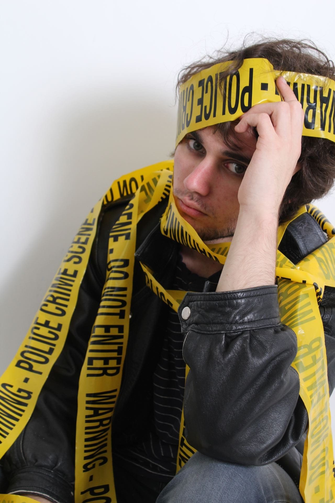
My next step is now to look at working my second photoshoot, this time outside and interacting with the environment as well as a second model. In preparation for this I completed the following production meeting agenda and created a small moodboard displaying my costume and prop choices for this shoot. I aim to maintain a similar theme and colour scheme as the previous shoot, with dark greys and blacks combined with stand-out bright yellow; I also intend to experiment with more interesting make-up, using face paint to write a rebellious message or band name of the faces of my models, really emphasizing the non-conformist nature and attitudes of the genre.

Shoot Title Town Photo shoot
Date/Time of Shoot: 11th of December 2019 11-12:30
Location of Shoot + Equipment needed Based at Digital Greenhouse – shoot around town
Bringing own camera and tripod
Model Who?
Alex Radford
Luke Halker
Costume + Make Up

(photos)

What? Who’s responsible?
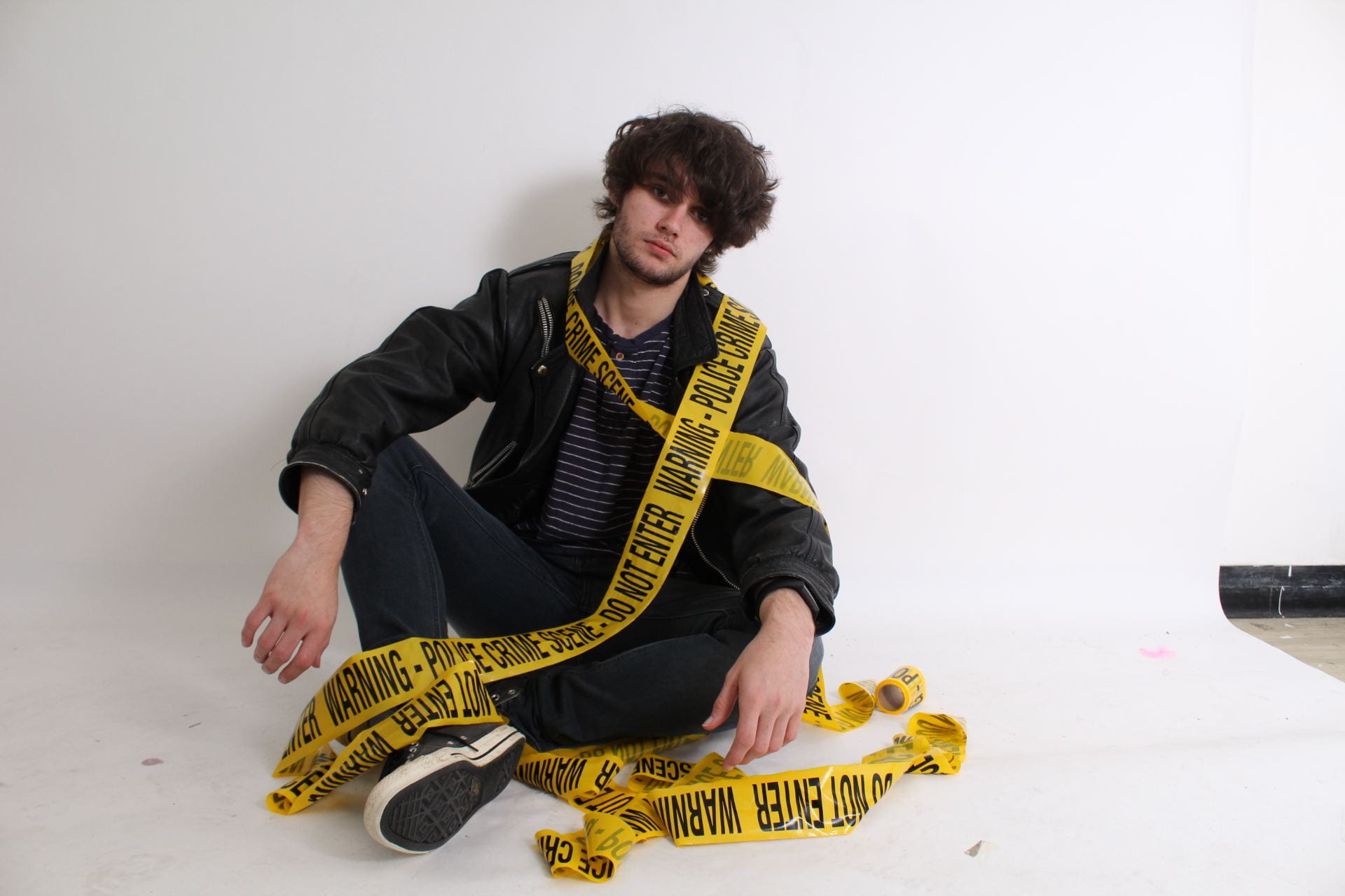
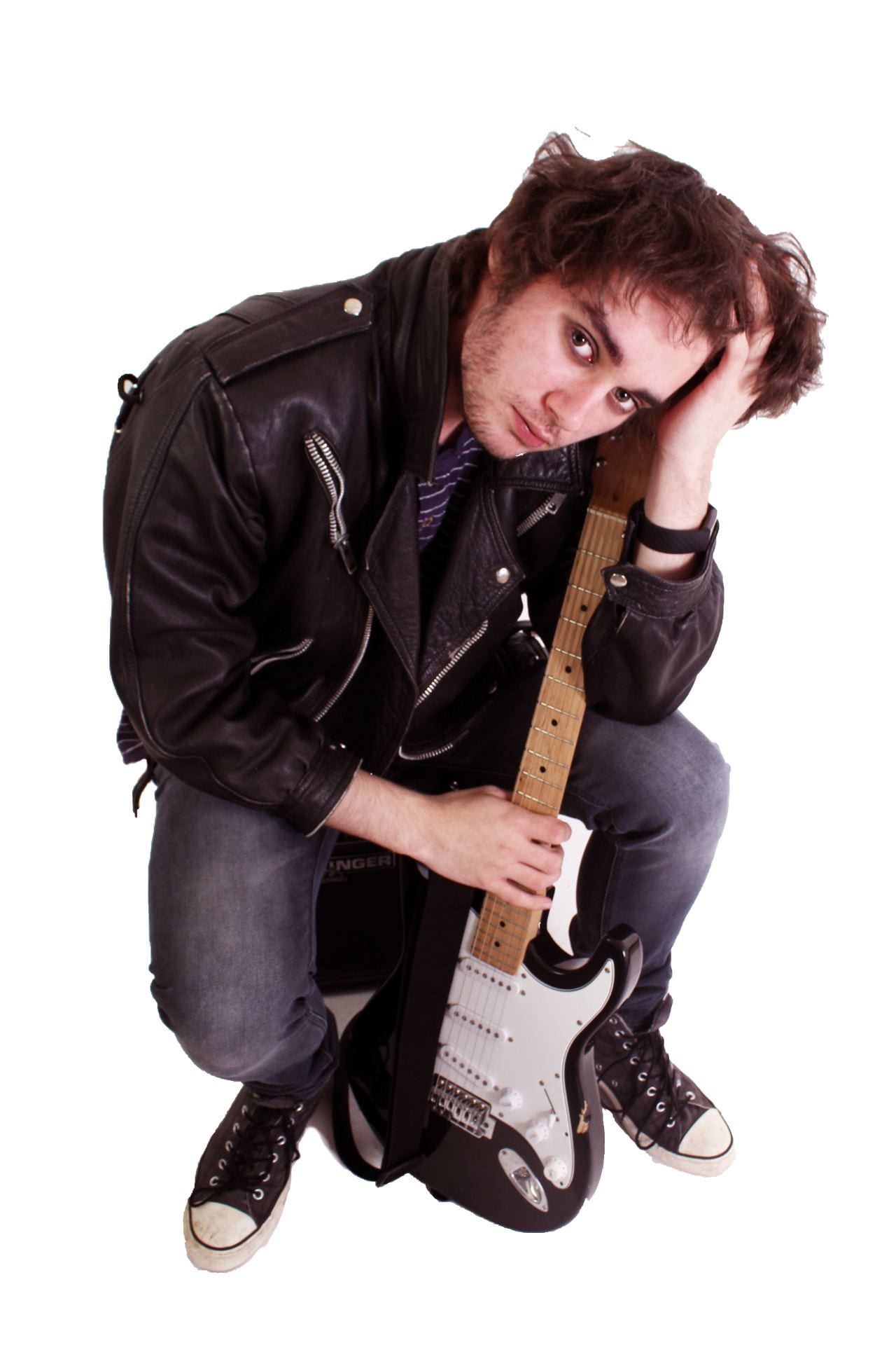
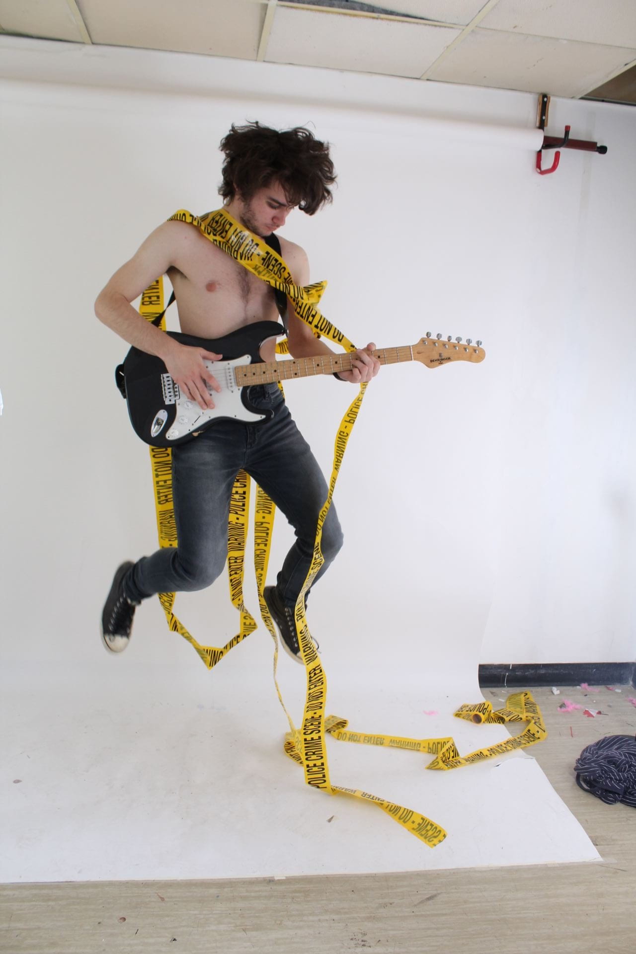
Luke –
same costume as last shoot
Alex –
yellow t shirt
dark grey worn jeans
black beanie
rough/worn/casual shoes
Luke –
Luke (jeans, shoes) and I (shirt, jacket)
Alex – 
Luke (jeans) and I (shirt, hat, shoes)
Props (photos) What? Who’s responsible?
Police Tape
Drumsticks
Traffic Cone
Me
Luke
Media Department
What is in the background, detail? Grungy, urban environments to match punk/alternative genre

A New Improved Front Page

From my previous drafts, I noted my targets and worked to improve on them; generally aiming to better balance the use of white over the page as well as filling empty spaces whilst continuing to represent the genre. Of course, it isn’t perfect, ideally I’d like to include some smaller, alternative photos of different musicians and bands to fit the articles mentioned, and with more time would potentially experiment with alternative colour schemes. Despite this, overall I am very happy with the outcome, with a consistant, eye catching colour scheme.

PDF of Final Draft

Drafts of First Page

Now I’ve begun to create and design a cover it’s important that I reflect on my work as I produce it, these two designs are my first two drafts of the cover, and whilst neither is fully complete they clearly show my ideas about layout and formatting.

The first draft draws a lot from the yellow police tape used, reflecting this in the background I created and creating a very yellow/black/white colour scheme. Whilst this is successfully eyecatching, it can flatten the image as a whole and doesn’t do much to draw attention further than the initial glance. However I do like the use of torn-paper tabs as part of the design, as this is a feature I carry forward to my second draft.

The second draft immediately makes a stronger impression, as the background is contrasting the photo rather than matching it my star stands out a lot more on the page. I also decided against the use of a light blue tab as this colour doesn’t reflect the rebellious, outrageous and punky aesthetic. For this second draft I also designed a new masthead, using a grungy, all-caps font and overlaying the full title over the initial in a clear, bold and contrasting style to reflect the genre.

I then asked for the opinions of some peers, who also preferred the second draft, reasoning “The font [of the masthead] fits better and the overlapping text in different colours adds interest and layers, and I like the pink because it stands out against the yellow tape so it’s more noticeable. I also like like his name overlayed over it so that viewers know who he is”. I also received the criticism “I don’t know about that white text, it looks slightly unbalanced against the vivid background […] plus I really like the ‘Larson Effect’ black-white effect but again, I’m not sure it works against such a busy background”.

Overall I feel that over these two drafts I have better developed my skills and have gained a better grasp on what ir eally want to acheive with my magazine. To continue from this, I plan to look at how I plan to include more information such as plugs and pugs on the cover, as well as making the masthead smaller and including the price and barcode.

View the PDF files: Draft 1 Draft 2

First Shoot Contact Sheets

With all the elements ready, I could now begin my first shoot, experimenting with both the black and white studios, I ended up with the following 188 images shown in these contact sheets. Overall I am very pleased with my shoot, despite the expected mistakes and difficulties, I ended up with a handful of very successful photos that capture my genre and aims really well.

From this, the following 11 photos are my favourite, overall finding that I liked the use of the caution tape a lot as it added a strong splash of colour against the dark, desaturated clothing.

Finally, I chose three images from this to begin editing and cleaning-up in Photoshop, as shown below, in order to get a better idea of how this shoot worked and what basic settings I wanted to use.

So… I am Ready to Photograph my Star

It has finally come to a point at which I feel prepared and ready to begin work directly towards my magazine, using the knowledge I’ve gained throughout the course so far; covering ideas of encoding and decoding for preferred reading, AIDA (attention, interest, desire and action), as well as Blumbler and Katz’s uses and gratifications theory. From this, I can confidently step forward in this project with a clearer idea of what I aim to achieve and how I aim to achieve it.

In this shoot my main aim is to clearly and dynamically represent the authentic,proud, loud and rebellious nature and attitudes of the genre by using a range of skills in terms of camera and mise-en-scene.

Following the ideas of mise-en-scene presented in CLAMPS, I aim to show each element as follows:

  • Costume – I intend to dress my model (Luke Halker) in dark, worn jeans, old, practical but comfortable shoes, a leather jacket and a stand-out, coloured striped shirt underneath.
  • *Lighting – I will be using a standard, clear flash photography
  • Acting – Whilst I will experiment with different expressions and poses as we shoot, I generally aim to create a sense of confidence and power through his body language and facial expression, facilitated by low angle shots and direct eye contact with the camera.
  • Makeup/Hair – Aiming to keep this fairly simple and down-to-earth, I intend for Luke to have messy, natural hair with a small amount of eyeliner (a common trait within the genre)
  • Props – As seen in many photo shoots of the genre, I aim to include some photos with Luke playing a guitar, to show the authenticity of music that is respected by the audience, I will also experiment with the use of caution tape to reflect the rebellious attitudes of the genre.
  • *Setting – I will use a simple black/white backdrop of this shoot, with the focus remaining on the model themselves rather than their surroundings.

(*not an area within my control/choice for this shoot)

As well as mise-en-scene, as mentioned, I aim to utilize a range of camera techniques and perspectives. For example, using a low angle to show his power, as well as experimenting with shutter speed to capture movement and energy, and using aperture to focus on different elements of his character and personality through his acting. I will also attempt a range of shots using different framing, distances and angles.

Production Meeting Agenda for 1st Shoot

Now I have looked into and researched the typicalities and trends of the genre and better understand my aims for my model I have put together a table detailing the requirements and details of my first photo shoot, to be completed using the school studios and using professional standard flash photography equipment.

Shoot Title: Punk/Alternative Magazine Shoot
Date of Shoot: Thursday 21st (3:30-4:30pm)
Location of Shoot + Equipment needed – Who is responsible? Black and White Studios, with standard photography (flash) equipment of which I’m responsible for
Model Who?
Luke Halker
Costume + Make Up What? Who’s responsible?
Eyeliner
Leather jacket
Striped or plain shirt
Worn jeans
Casual shoes
Me
Me
Me
Luke
Luke
Direction Stern, serious expression
Playing guitar
Looking into camera
Low angle shot
Open, confident body language
Props What? Who’s responsible?
Electric guitar Me

Photo examples of the costumes and props to be included:

So What am I Up Against?

As I prepared to create my own magazine it was important to reflect on other magazines of the genre, observing the typicalities and techniques used by them, as explained in the narration for this slideshow;

Video narration


Mast Head Designs

Below are five different potential masthead designs for my magazine.

In an attempt to fit the punk/alternative genre I aimed for an overall rugged, scuffed feel, using white texture overlays that fit this idea on the black text. I also wanted to convey a sense of power and strength through the mast head, consequently choosing to use a thick, strong, sans serif font, or alternatively, to appeal more to the rebellious nature of the genre, a hand-drawn typeface to give an image of graffiti on a wall.

Star Image – Theirs and Mine

The next stage of creating our magazine is considering how we want to represent our “star”, how they suit the genre and present themselves as a person to their audience. To better approach these ideas I looked at how this is done in real life, choosing an example of an artist in the genre I have chosen and looking at their various appearances and presentations in all aspects of the media – known as their meta narrative. This then takes into consideration the elements of  Richard Dyer’s Paradox of a Star, considering how celebrities are often represented as simultaneously extraordinary, talented and removed from society, whilst also ordinary, relatable and empathetic; all features which lead to their affection from fans and can be observed in how they are presented through the media.

Click to view full Prezi

From this research, I then continued to make points on and pick out common features in models of the genre, considering all elements is C.L.A.M.P.S, shown in the moodboard below with examples;

Consequently, this moodboard can act as criteria and inspiration for me to draw off of and and idea of what I aim to include and incorporate when it comes to creating my own star image / cover model.

Communicating My Brand

Below is an example of and link to my pinterest board for this magazine, which I plan to be a work in progress through the development of my magazine; collecting various images, photos, fonts, layouts and general ideas for reference and inspiration in my own magazine.

(Click to open on Pinterest)