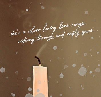
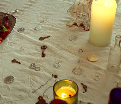
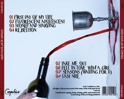
Below, is our second draft of our digipak, we have tried to include a simple structure throughout the four panes, but also keeping it conventional to the indie rock genre. In order to do this, we kept our colour pallete, font/typeface and overall aesthetic of the digipak the same. Although our images seem extraordinary to other genres, this is usual for ours, and fits in well with other band’s covers, such as Oasis and Arctic monkeys.
Before we put our images onto the digipak, we manipulated them on photoshop and played around with the filters, sharpness and graphics. This was because many of the photos we had taken were too sharp, and therefore did not represent our star image and branding in the way we wanted to.


Here is screen-castify of our teachers feedback for our digipak, we will work on the comments given in order to ensure that it is he best of our ability whilst still being conventional to the genre.
Targets:
- Front cover- wants to see more of the bottom of the table, raise candles higher
- Back cover-Include Sunday roast all the trimmings as a track
- Back cover- Enhance the Red to pop bit more- more of a blood red colour
- 3rd pane- More of chicken in the table shot- reposition
- Sharpen the trinkets on the table
- Add shine to goblet
