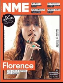
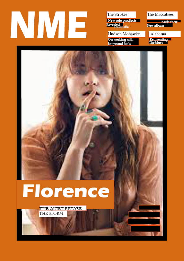
For this Task I got given a magazine cover and had to remake it as close as I can to try and make it look identical. To do this I had to use in design for the first time and at the start I was struggling as I didn’t know how it worked or how to do it but after a few minutes of fiddling and trying out different tools to see what they did I managed to figure it out and get a hand on it, this means that I can comfortably use this in the future when it comes to making one of my own.
3 Strengths
- One strength I had while recreating this magazine cover is finding the right image and inserting it with the black outline/border.
- Another strength I found I had while making this is that I managed to get kind of the right font even tho it may not be perfect.
- The last of my strengths is that I change the background to orange like it is in the real poster.
3 Weaknesses
- The first of my weakness that I found is that I didn’t manage to make the orange background the same exact shade as the one in the real magazine and this makes a big difference as you can clearly see the different shades.
- Another weakness is that I didn’t quite manage to get the image the right size so it doesn’t look right or fit perfectly in the box.
- I also could have done with more time because as you can tell I didn’t quite get to finish therefore with more I time I feel as I could perfect this and make it much better.

