Chosen adverts

When it came to choosing my adverts for my magazine I didn’t know what quite to pick, so I decided to go for an all round range as something that would appeal to all of my audience no matter their age or gender.


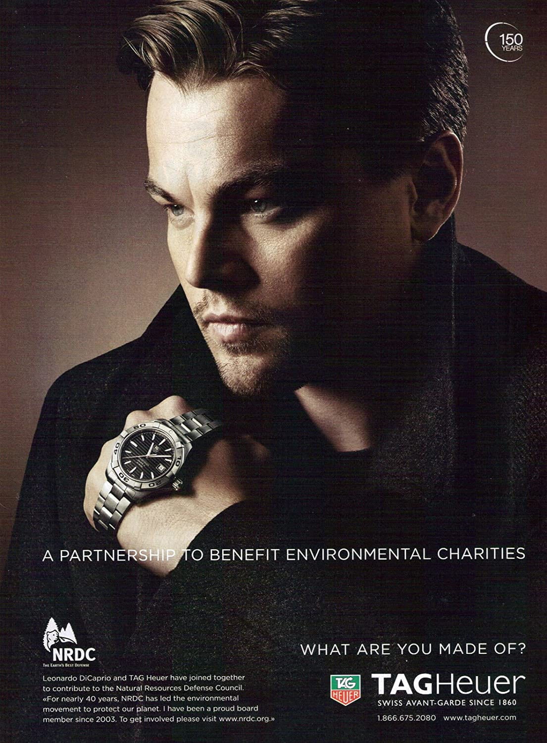
For my first advent I chose to go with more of a masculine one to break up the theme and to insure to readers that this magazine is open to everyone. Another reason I choses this magazine is that the colors used on it are different to the colors used in my magazine therefore making it and my magazine stand out more meaning the reader wont just skip past it but instead read into it.


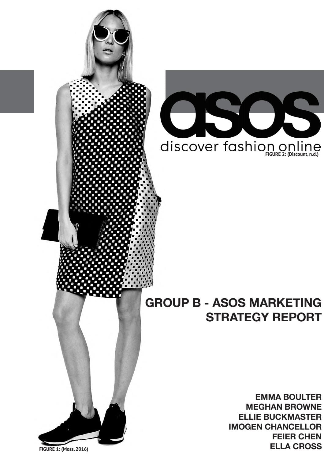
This is the second advert I chose and one reason I choses this one again is the fact that it not only stands out but makes the pages o my magazine brighter and more eye catching as the advert is black and white and my magazine is bright and colorful, meaning it will pull in peoples attention as well as pulling in a wider range or readers and audience.

Complete Magazine Draft 3

This is my third draft of my Front cover: I started this by editing my second draft while reading threw my self assessment of it and reminding myself as to what I needed to improve on.

  • I started this by first of all changing the background color by making it a darker shade of the blue as in my second draft I felt it was too light and pulled the attention away from my model.
  • Next I took a closer look at my pugs and decided it looked too flat and boring so I decided to tilt the text slightly, darken the color and add a white border.
  • I then changed the font of this as it was too thin and plain so I made it thicker and gave it a black background as well as a drop shadow, I feel this adds for depth as well as it being nicer to look at.
  • After that I realized there was a lot of empty space and I was missing a lot so to create more room for my cover lines I moved the words ‘Tillie Morris’ to the right hand side and added borders around it and also changed the font to match the pug, I also added a border and changed the font of ‘The new Face Of Disco’ and moved it over to the right, underneath my models name.
  • My next step was to add the cover lines, to do this I first of all planed out what I wanted to write then messed around with the fonts and colors to insure it fit my theme.

This is my Third draft of my contents page: To start editing this I made sure to look back at my second draft and remind myself of what needed to be changed as well as thinking of new things to improve on and make better.


  • When making the third draft of my Contents page I started of by Editing and changing the color scheme as it wasn’t very eye catching and the colors didn’t really go together that well, to do this I first experimented to then settle on blue and yellow as they are both quite eye catching and bright colors.
  • Next I edited and changed the color of the font for example I put yellow font onto the lie background and blue font onto the yellow.
  • I then changed the font of ‘Do you have your ticket’ to match the rest of the writing as well as changing the color of it to white with a black outline to make it stand out as well as making it easier to read.

This is my third draft of my Double page spread: Before making this I reminded myself of my second draft and read threw what I wanted to change about it to insure this was done in my third draft to help improve it.

  • I started by changing the font when making my draft 3 of my double page spread, I did this by going on to ‘dafont’ and look threw fonts I thought would fit my magazine and theme. I found the font ‘Edo SZ’ and thought this one would fit perfectly. After looking at it for a while I noticed that there was a lot of space at the top so I then added the word ‘my’ to take up that room.
  • Next I decided to cover up my image on the left side of my double page spread with a white box to make it more simplistic.
  • when doing this I also made the dots around my other image red, as well as adding more of them up the right side of my page to give it more color.
  • Something else I did was add in A pug, first I started with just the rectangle with the words ‘Listen live at home!’, But I thought it needed more so I added a red border as well as a circle behind with another red border on it as well as a white background to make it stand out more as well as making it easier to read.

some targets I have for making this better is to make sure the lighting is perfect, and to insure all the writing is clear and readable. I also feel I could look at more font to make sure this is the right font and that it matches the overall theme of my magazine. In conclusion I feel I have come far in making my magazine but I do feel as though it could be improved.

So What Am I Up Against The Competition

Before I can make my own music magazine, I need to think about other other magazines like mine I will be competing against. There are going to be many other magazines like mine wanting the audiences attention, these will all be aimed at the same audience as its the same type of magazine. This means I need to do everything I can to grab their attention first and make a more of an appealing magazine. I began by researching for Disco magazines and then answering questions to help me get a better idea.

These magazines are like mine as they are all Disco magazines and they all used color to attract attention and this will be the same as mine as it is a good and easy way to pull in the audiences attention and they will be able to see it easily and will therefore want to know more about it.

The good thing about looking at these magazines is that I know know what I am up against and I also have more ideas and knowledge on this topic so I now have a wide idea of what I will be doing when making my own magazine.

A disadvantage of this is that I will now be comparing my own work to other magazines and this mat not be a bad thing as it would give me more inspiration and ideas as well as more knowledge on what my audience will like and want to buy.

There is something that these magazine have in common is the big title and I think this is used to get the audience attention as it is working for me and this is one thing I will diffidently be using on mine when it comes to making it.


Draft Feature Article

I’ve decided that the article I’m writing for my double page spread is going to be a Q&A on Disco artist Holly Neill, but before I do this I need to make a plan as to what I’m going to be writing.

This is the plan I wrote.

Click on the image to see full document.

These are some of the question that will be asked in the Q&A:

Holly, how did you learn to sing in the first place?

  • My mum was a music teacher and as we traveled round, she taught at different schools is different countries as well as giving me my own lessons along the way, I found I picked up singing quite quickly as I had at least one lesson a day wherever we happened to be.

What are your plans for the future?

  • I don’t have many plans for the future, I would love to go on tour though to explore and go back to the places I once lived to preform there to the fans I may have left behind.

When do you hope to do your next live performance?

  • I hope I can do my next live performance soon as doing it over an internet live video is a pain and I would love and prefer to meet my fans in person as it means more to me and probable them. We are coping with what we have though so we are doing the best we can to make sure the fans don’t miss out, even in a global pandemic.

First draft!

  • After I had planned what I wanted to write my article about, I made a draft of all the text I wanted to include on a Google Doc.

My first draft.

Next to make sure it makes sense and that I’ve made no mistakes I read this aloud while recording it to insure no mistakes were made. I then listened back to the recording while editing my original draft to insure that it all made sense.

After listing to this I read threw it many other times and picked out the bits I liked and the bits I feel needed tweaking to make sure they made sense and that its readable.

This is my second draft.

This is my new draft for the moment but this may change in the near future if I feel it’s still needs tweaking.


2nd Draft Contents Page

To start my second draft of my Contents page I first looked back at my original draft to see what I could improve or and change.

When looking at my first draft, I decided I liked the color scheme and wanted to re use this when it came to making it again, I did slightly change the tones and shades of some of these colors tho to insure it popped out and stands out as its now brighter and more vibrant. I also changed the size and positioning of the text ‘do you have your ticket’ as before I feel it was too big and took up to much unnecessary space, now it’s moved I managed to fit in an extra image which gives the reader more to look at and therefore looks less dull and boring.

I do think I could still improve on this draft and some ways I could do this are:

  • Changing of the colors used therefore making it’s brighter and prettier to look at, this may also make the text easier to read.
  • When making a new draft I will also try to think about the font used and the placing of everything to insure that it’s perfect and done to a decent standard.
  • I also need to add a page number as well as changing the over all color scheme as I’m not so keen on the color scheme at the moment because I don’t think it is eye catching enough and I could change this by simplifying the colors used.

2nd Draft of double page spread

For the second draft of my Double page spread I started by analyzing and reminding myself of my first draft

After looking over this I chose what I wanted to change about it:

  • One of these things being the size and spacing of the text as I feel the text is too big and therefore taking up to much space, so in my second draft I have made the text a size 12 and therefore made the boxes smaller as well as put in another on above the two already existing boxes, by doing this I managed to delete the text box on the right hand side page which creates more empty space which I thought my original draft was missing.
  • Another thing I wished to change was the font, size and colors used for my heading ‘Pandemic performance’ to do this I first looked threw all the fonts and picked one I feel fit the theme as well as making it take up ore space as in my first draft the heading was to small. I then tried out different color scheme and settled on red as it coordinates with the read bricks in the image I used for the background.
  • I also changed the outline and size of the mini image I used in my double page spread and I changed this by making it small so its not taking up as much room and I took away the outline box I previously used and swapped it with dots which I feel gives it more of an overall music vibe and pulls it all together.

Something I could improve on in my next draft is:

  • The font I used for ‘Pandemic Performance’ as I still feel it could be better and maybe even bigger as I’m not completely set on this font. and it would look better if it was bigger and brighter therefore more eye catching.
  • I can also improve by adding more, for example I still need a page number and maybe even some pugs and quotes to fill the empty space as there is not a lot of it and this will help make it look more professional.
  • Overall I think this is definitely a huge improvement on my first draft but it still needs some time and care to make it perfect and how I want it.

2nd Draft Of Front Page

For My second draft of my front cover I started by looking at my first draft…

I then thought about what I liked and wanted to keep as well as parts that I didn’t like and therefore would change, for example I liked the placement of my model and the colors used as I feel they make her dress and outfit stand out. I also like the image I used and would like to carry on using this one as I think it makes the color scheme much easier to make look good and match. There were some things I didn’t like such as the background as I like the blue and white but I feel it needs some more of a gradient, as well as adding more of a border and maybe some shadows to make things pop out more as at the moment everything is quite flat. Using this information as well as the self evaluation on my first draft I then started on the second draft of my front cover.

I think this draft of my front cover came out much better than my first draft.

  • One reason for this is the font I used of the heading, I think this makes the front page batter as it is ore out there and is more interesting and therefore will pull in more of an audience as its eye catching.
  • I also changed the color of this heading to make it match the color of her dress as in my first draft it was orange but it clashed and in this draft I feel it pulls the whole thing together more.
  • Another aspect I feel I did well on is the placing of ‘Tillie Morris’, the reason I think this is an improvement compared to my original draft is that the text is no longer covering up my model and is now to one side and also off center which I feel looks better, neater and less dull.
  • I also think the changing of the placement of the gradient used in the background is used well as it now makes Tillie look more noticeable and like she’s the main part of the page as the white and blue behind her make her dress stand out as well as giving her a nice neat outline and gradient.

Some things I feel I could improve on are:

  • The cover line and I think this could be improved by changing the color as well as maybe the color of the text because at the moment it looks quite dull and the orange doesn’t quite match the other oranges and slightly clashes with the other colors.
  • Something else I feel I could have done better is The line at the bottom because for the same reason as the cover line as the color doesn’t quite match as well as the font being small and black as it makes it harder to read.
  • I also need to add an Issue number, bar code, date and maybe more cover lines because I didn’t have any in this draft.

Draft Of The Double Page Spread

After I’d gone out, done my second photoshoot, got the pictures I needed and planned the article I wanted to write, it was time to put this together to make my first draft of my double-page spread. I made sure to use different images in my Double page spread and used different angles as i felt this worked well. I  place my text in boxes and arrange them nicely around my photos. I used white boxes behind my text so it was readable and I also make them a bit transparent so you could still see the image behind.  My first draft is shown below…

what I could improve on:

  • As this was my first draft I do feel as though I could improve, one way I feel I could make this better is by using different fonts, I haven’t done much research into the font I want to use for the heading.
  • I also haven’t experimented much with the colors of the fonts and borders so I could improve that and maybe make it brighter and therefore more eye catching.

Second Shoot Contacts Sheeet

On Monday me and my class went on a trip to have photo shoot, For mine Holly was my model and we went to candy gardens and took many pictures to insure we got the ones we needed, we also tried different positions, places and ways to show of her outfit. These are the Pictures I ended up getting…

After making this contact sheet I decided to pick my 4 most favorite to see which I plan on using when it comes to making my Double page spread. These are the ones I chose…

This is one of my top 4 pictures as I like the fact that Holly is on a bench and I could use the bench as lines in my double page spread, this would also make it look cool as it would fit in perfectly, I also like the fact that her body language would be facing the text and this would pull the audiences attention the the writing as you are more likely to read it it something is highlighting it and making it look more interesting.

This is another of my favorites and maybe even my most favorite as I like the lines on the green house and I also think I could use this as lines in my double page spread as it will make the writing stand out more. I also like the colors and contrast in this image, as well and the post holly is doing as she doesn’t only look good but relaxed.

This the the third of my favorite images. I like this one as Holly is in focus and therefore stands out more as well as it being a different angle and this mixes it up more and therefore makes it look more interesting.

I like picture as it has a prop in it and I could use this when it came o my color scheme and this could pull it all together. Over all these are my Four favorite images out of all of the ones I look and even though I cant use all of these on my double page spread I could use them when it comes to remaking the front page and the Contents page.


What is a contents page?

Before making contents page of my own I first need to research some so I know exactly what a contents page is, how it should look and what it should say.

To do this I started by making a mood board of inspirational contents pages that I like the look of so I can get an idea of what I am looking for and therefore what I am aiming to make mine look.

While making this mood board it gave me a some ideas and views on what I like and what I don’t like.

  • I personally found that I like the mood colorful contents pages as I feel they are more eye catching and therefore I am more likely to want to read them, this is good for a magazine as it means more people will be buying it.
  • I also noticed some technical conventions of a contents page and these were a Title, a picture and information on what you are expecting to read and see further on in the magazine, this is mainly done in a list with the index numbers beside the information so you can know where to find these thing in the magazine if you are interested in reading further, this is good for a magazine as the customer can look at this for a quick read which will then tell them if they’re going to enjoy it.
  • A contents should be unique, interesting, attractive as well as having accurate information and this is usually done threw the images and the colors used to insure the reader is interested and that it pulls in there attention.

After that I drew what I wanted my contents page to look like.

I had a good idea and plan as to how I wanted the final product to look. I did this multiple time till I was happy with the layout. This took many trial and errors and a lot of different layouts so I could find out what I truly liked.

Next I decided to look at what my headlines could be as headlines are a vital part of a magazine as they have a huge impact on who will want to read it depending on what your headline is. Headlines must be eye-catching and catching to pull an audience in therefore more readers, to plan out what I wanted mine to be I came up with a few idea I had…

  • Do you have tickets?
  • New breakthrough artists!
  • Exclusive insights on new artists!
  • This years biggest concert!