This is my third draft of my Front cover: I started this by editing my second draft while reading threw my self assessment of it and reminding myself as to what I needed to improve on.
- I started this by first of all changing the background color by making it a darker shade of the blue as in my second draft I felt it was too light and pulled the attention away from my model.
- Next I took a closer look at my pugs and decided it looked too flat and boring so I decided to tilt the text slightly, darken the color and add a white border.
- I then changed the font of this as it was too thin and plain so I made it thicker and gave it a black background as well as a drop shadow, I feel this adds for depth as well as it being nicer to look at.
- After that I realized there was a lot of empty space and I was missing a lot so to create more room for my cover lines I moved the words ‘Tillie Morris’ to the right hand side and added borders around it and also changed the font to match the pug, I also added a border and changed the font of ‘The new Face Of Disco’ and moved it over to the right, underneath my models name.
- My next step was to add the cover lines, to do this I first of all planed out what I wanted to write then messed around with the fonts and colors to insure it fit my theme.
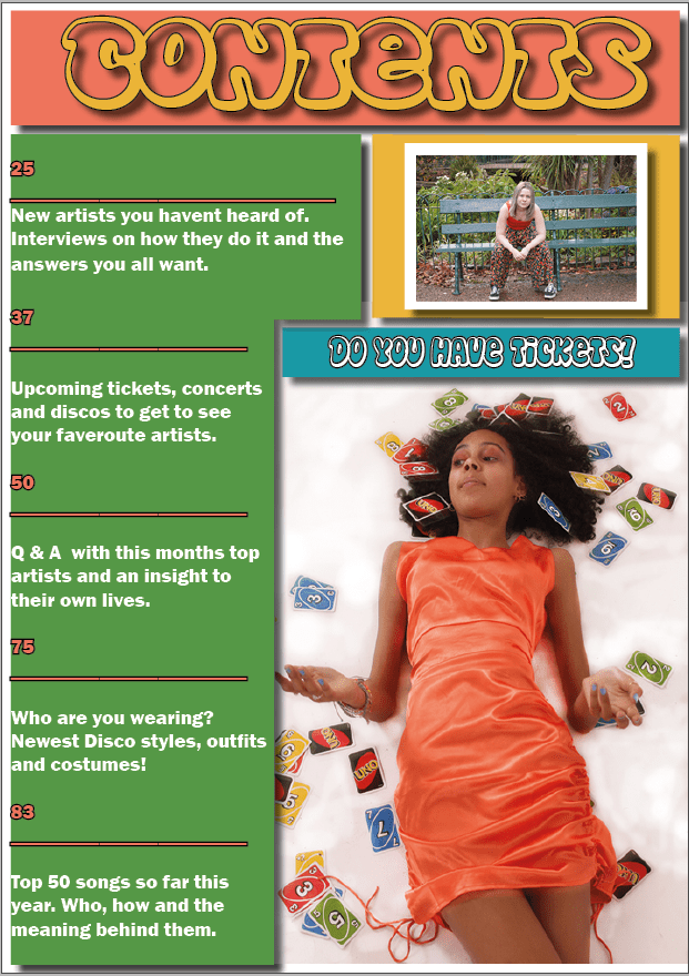
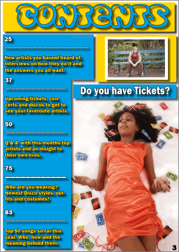
This is my Third draft of my contents page: To start editing this I made sure to look back at my second draft and remind myself of what needed to be changed as well as thinking of new things to improve on and make better.
- When making the third draft of my Contents page I started of by Editing and changing the color scheme as it wasn’t very eye catching and the colors didn’t really go together that well, to do this I first experimented to then settle on blue and yellow as they are both quite eye catching and bright colors.
- Next I edited and changed the color of the font for example I put yellow font onto the lie background and blue font onto the yellow.
- I then changed the font of ‘Do you have your ticket’ to match the rest of the writing as well as changing the color of it to white with a black outline to make it stand out as well as making it easier to read.
This is my third draft of my Double page spread: Before making this I reminded myself of my second draft and read threw what I wanted to change about it to insure this was done in my third draft to help improve it.
- I started by changing the font when making my draft 3 of my double page spread, I did this by going on to ‘dafont’ and look threw fonts I thought would fit my magazine and theme. I found the font ‘Edo SZ’ and thought this one would fit perfectly. After looking at it for a while I noticed that there was a lot of space at the top so I then added the word ‘my’ to take up that room.
- Next I decided to cover up my image on the left side of my double page spread with a white box to make it more simplistic.
- when doing this I also made the dots around my other image red, as well as adding more of them up the right side of my page to give it more color.
- Something else I did was add in A pug, first I started with just the rectangle with the words ‘Listen live at home!’, But I thought it needed more so I added a red border as well as a circle behind with another red border on it as well as a white background to make it stand out more as well as making it easier to read.
some targets I have for making this better is to make sure the lighting is perfect, and to insure all the writing is clear and readable. I also feel I could look at more font to make sure this is the right font and that it matches the overall theme of my magazine. In conclusion I feel I have come far in making my magazine but I do feel as though it could be improved.


