Front cover

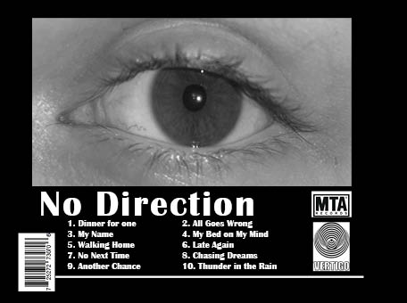
Back cover
Self Assessment
Overall I am very happy with these especially considering that they are only our first draft, as I think they work well. These have musch in common to our original idea which lets us know that we have succeeded in sticking with our plan. To get this outcome we used Adobe Colour Wheel to choose specific colours for the front cover and the warm, autumn colours we also chose to create a sense of branding for our Digipak. This is because they will also be used on the two inside pages. We chose to convert the image of our star image to black and white as we are trying to portray him as being ‘lost with no direction’. This creates a link between the album name and the title of his new song being released. We used the front for the star’s name ‘Hendry’ which appears quite formal and almost creates a rustic feel, against the colours of the album, meanwhile the font on the back cover is less formal.
Targets for improvement
- We need to work on the arrangement of our text and graphics, this is because some of these objects are out of line, causing our Digipak to appear messy. It is important we have a balanced ratio of space to text/graphics.
- Our two inside pages need to be created and we need to ensure that they are up to the same standard as the front and back covers, as well as conforming with our brand.
- Lastly, I think it would be beneficial to add another feature to the front cover. Although I like to look of it, it could be seen as being quite plain and we would benefit from having something to excite our audience into buying his album.