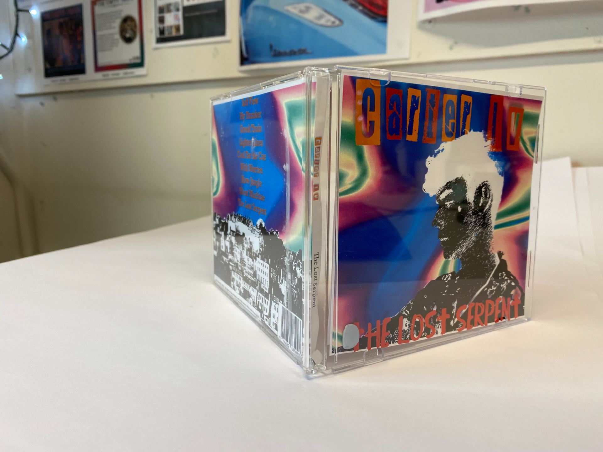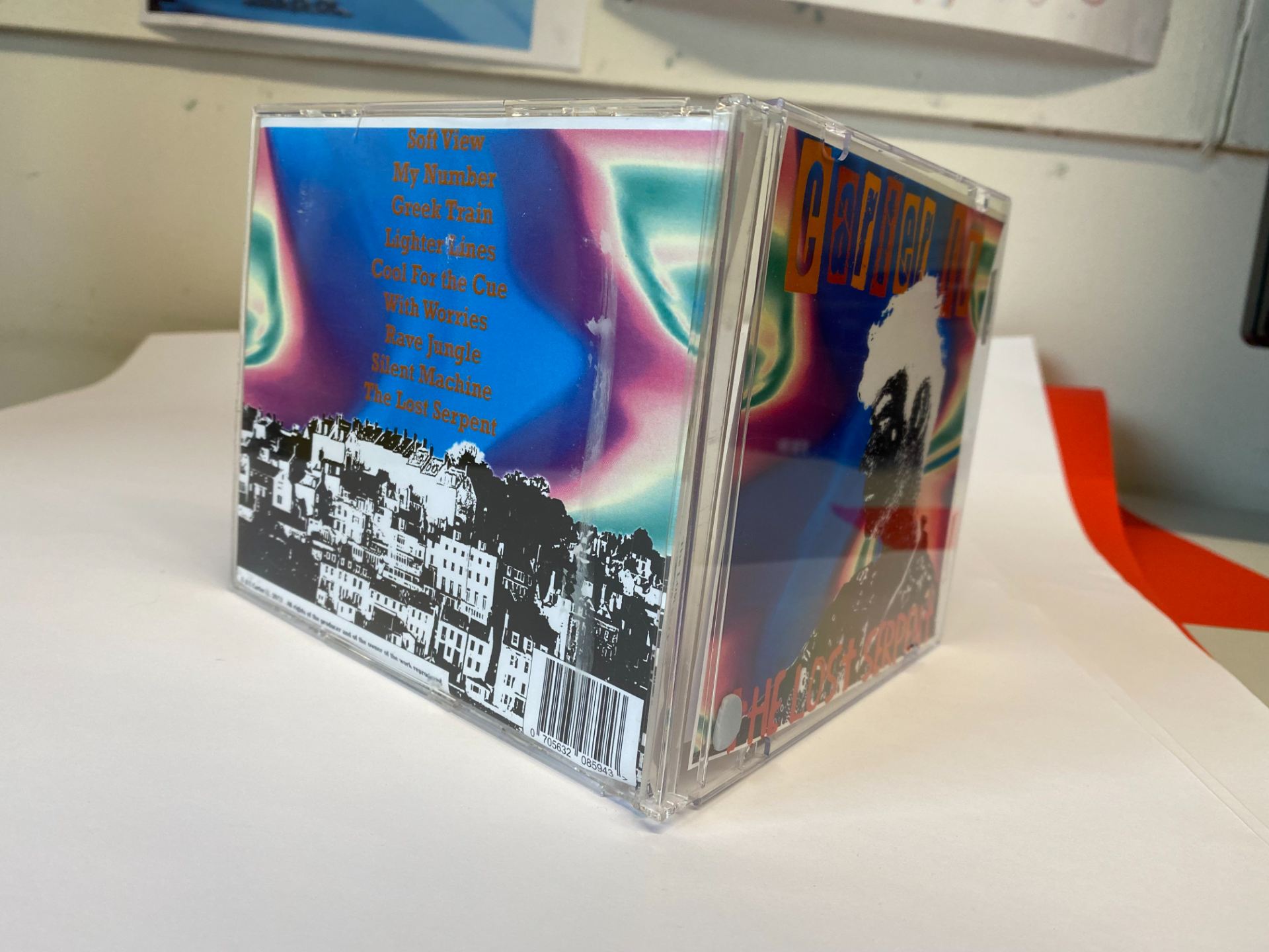


Here is our third draft of our digipak in a physical format of an album. From our screencastify feedback from our teacher, this is what we changed:
- Changed the background on the back cover to have more coherence with the front cover.
- Changed the colours of the artists name to match the colours in the inside pages.
- Put a threshold filter on the front cover star.
- Tried to make the snake link more in the inside covers.
I asked peers outside of media to get an honest opinion as they will have no idea what genre my group worked on. When I asked 15 of my peers outside of media for their opinions this is what genre they believed the album was from:
Indie – 5
Rock – 3
EDM – 4
Pop – 3
Rap – 0
These results were quite promising as our genre was indie rock and therefore if people were identifying our digipak as these genres. This shows that some of our conventions were successful in representing the genre. I think that people may have thought that the genre was EDM or Techno because of the very colourful background which is associated with EDM however it was used to challenge the genre and be unique amongst other indie rock albums.
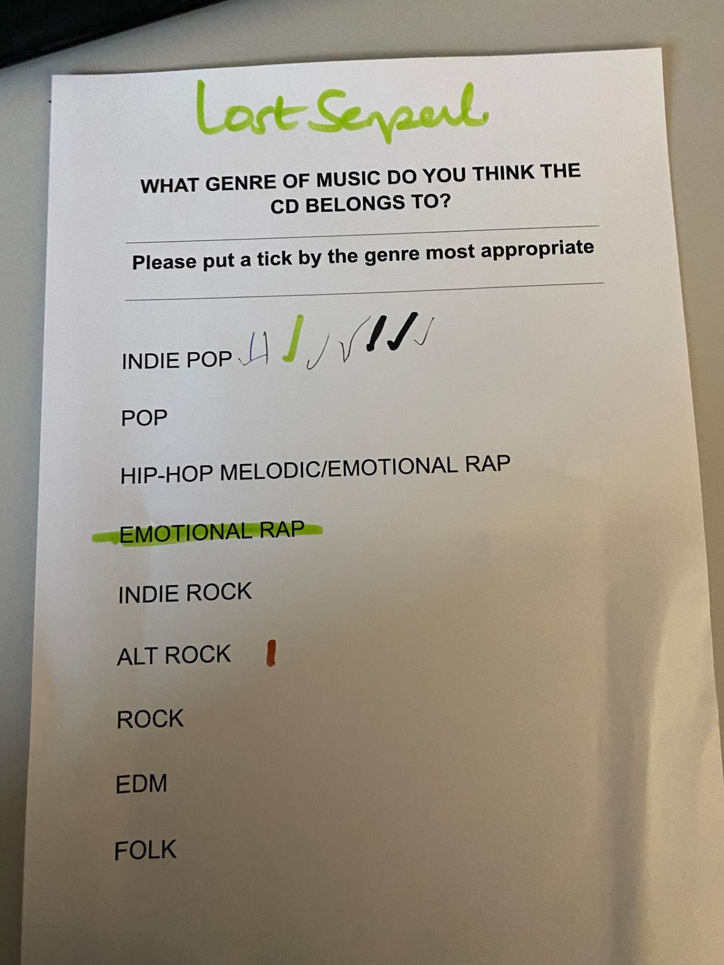
Our teacher also conducted a survey with another group who had no idea who had made the digipak and what genres have been worked with, below is a photo with the results:

It isn’t quite the result that we expected as the majority identified the album as an indie pop album. I strongly believe this is due to the neon background, which is what was confusing the respondents. This would possibly be an area to work on if we were to do this again, as it is conventional to more upbeat genres than indie rock.