To answer this question, I created an infographic using the website Piktochart.

Loading…
To answer this question, I created an infographic using the website Piktochart.
Loading…
This is my response to the Creative Critical Reflection 3. I wrote a draft of the script first and then I created a slideshow as well to illustrate my response. I then combined the two to create a slideshare for future A level students in helping them to choose their subjects.
This is my response to Creative Critical Reflection 2 in the form of a Screencastify.
This is my response to Creative Critical Reflection 1. I presented it using an online presentation software called Emaze.

WHAT’S NEW:
Rotated the pug
Made the star image and the masthead larger
Moved barcode to the right
Added saxophone logo
Capital I for issue
Moved main cover line
WHAT’S NEXT:
Capital N for November
Bring star image down – out from under masthead
Move ‘Jazzfest’ coverline down
Make 100 bigger
Add a price
Add another smaller coverline
Bevel and emboss ‘Joey Jazz Jr’
WHAT’S NEW:
Added editor’s note
Added page number
Moved inset image to the bottom right
Added a caption to the inset
Added another bold yellow caption
Added another cover line
Changed font of title
WHAT’S NEXT:
Work on coherency between cover lines
Fix the top coverline
Bigger editors note box
Page 3 on the other side
Remove inset image
Add drop shadow to contents
Changed the font of the quote
Made the main image bigger
Made the song names bigger
Centered the numbers
Page numbers in the right place
Fixed the layout of the introduction
Made inset image smaller to fit the layout
WHAT’S NEXT:
Move orange quote off of image.
Make sure page numbers are the same as contents page
Center questions and answers
Try justifying text boxes to the left and the right
Work on coherency of numbers
Experiment with inset size
Make ‘elliots favourite hits from 2020’ box bigger
Put Dark October in the final paragraph in a different colour
Drop shadow on the orange box
This is the screencastify which outlines my targets for my final draft of my magazine.

Even though I won’t be marked on it, I decided to select some adverts to go in my magazine as I recognised that they are a conventional feature of a magazine. I have chosen this advert for my magazine because Frank Sinatra is heavily associated with the jazz genre and the readers of my magazine are at an age and have interests which will allow them to recognise him. I also believe that my target audience are of an age and demographic that they will drink whiskey and own lots of whiskey and by combining the two I can attract their audience and potentially attract them enough to buy some of the whiskey upon reading my magazine.

I chose this tour poster as another advert to be featured in my magazine because it promotes a jazz festival. This poster is very relevant to my magazine as it is for a jazz festival and this will succeed in attracting my audience and making sales for the company running the festival. I also chose it because I feel like the poster fits the cartoon jazz aesthetic which will appeal to the jazz enthusiasts who will be reading the magazine.
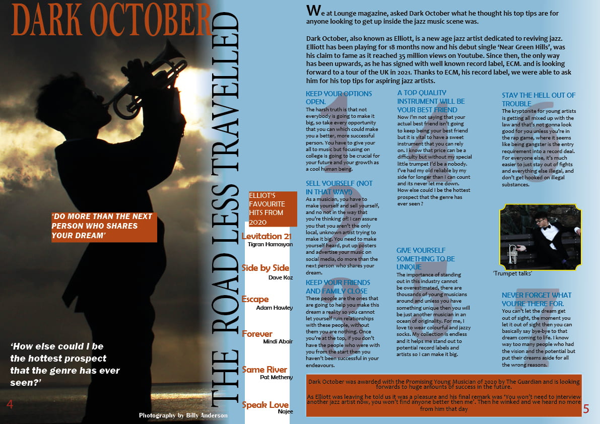
This is my second draft for my double page spread. I used the feedback given for my first draft and made changes to make it more conventional and appealing.
WHAT’S NEW:
WHAT’S NEXT:
This is my second draft for the contents page of my jazz magazine ‘Lounge’. I used the feedback from my first draft and made some alterations to improve the quality.
WHAT’S NEW:
WHAT’S NEXT:
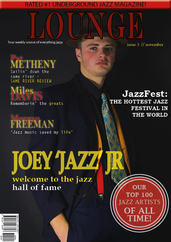
This is my updated draft of my magazine front page. I made changes from the feedback I received to create a better front page as it is crucial that my front page attracts the attention of potential customers.
WHAT’S NEW:
New cover star image which includes a new background colour
New masthead font and centered the masthead
Added another cover line to fill blank space
Edited pug to center the text more to look more professional
Slightly altered the shape of the pug to be more circular
Changed the colour of ‘hall of fame’ from light blue to white
WHAT’S NEXT:
Angle the pug
Numbers in pug a different colour
Coverlines move to the left a little
Make masthead bigger
Make him larger
Is the photo manipulated enough in photoshop
Try the typewriter font for some of the smaller lines
Something at the bottom
Move barcode to the right and pug to the left
Capital I for issue
what about a sax logo somewhere?
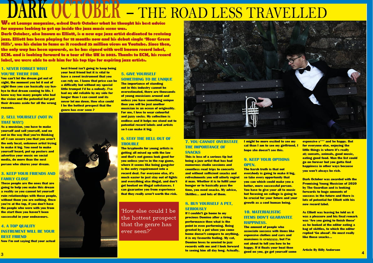
This is the first draft of my double page spread. I am trying to embody the jazz genre in this double page spread for my magazine and I chose different features and conventions to make my magazine portray the genre successfully.
These are my targets for my second draft of my double page spread.